8 years ago Hans Rosling demoed on TED the Motion Chart, using Gapminder’s Trendalizer. 7 years ago Google bought Trendalizer and incorporated into Google Charts.
A while ago, for my own education and for demo purposes, I implemented various Motion Charts using:
- Tableau (see it here: http://public.tableausoftware.com/views/MotionChart_0/Motion#1 ; for automatic Motion please download it and run it within Free Tableau Reader),
- Qlikview ( Qlikview Demo application can be downloaded from: https://sites.google.com/site/pandre/files/MotionChart.qvw?attredirects=0&d=1 ),
- Google Charts ( see my blogpost here: https://apandre.wordpress.com/dv-by-pandre/motion-chart-demo/ )
- etc.
To implement Motion Chart in Tableau, you can use Page Shelf and place there either a Timing dimension (I used Dimension “Year” in Tableau example above) or even Measures Names (Average Monthly Home Value per ZIP Code) in my implementation of Motion Map Chart below.
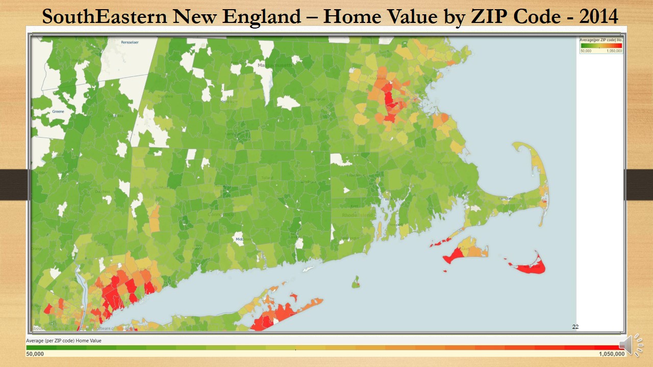
Tableau’s ability to move through pages (automatically when Tableau Desktop or Tableau Reader are in use and manually when Data Visualization hosted by Tableau Server and accessed through Web Browser) enabling us to create all kind of Motion Charts, as long as Visualization Author will put onto Pages a Time, Date or Timestamp variables, describing a Timeline. For me the most interesting was to make a Filled Map (Chart Type supported by Tableau, which is similar to Choropleth Map Charts) as a Motion Map Chart, see the result below.
As we all know, 80% of any Data Visualization are Data and I found the appropriate Dataset @Zillow Real Estate Research here: http://www.zillow.com/blog/research/data/ . Dataset contains Monthly Sales Data for All Homes (SFR, Condo/Co-op) for entire US from 1997 until Current Month (so far for 12604 ZIP Codes, which is only 25% of all USA ZIP codes) – average for each ZIP Code area.
This Dataset covers 197 Months and contains about 2.5 millions of DataPoints. All 5 Dimensions in Dataset are very “Geographical”: State, County, Metro Area, City and ZIP code (to define the “Region” and enable Tableau to generate a Longitude and Latitude) and each record has 197 Measures – the Average Monthly Home Prices per Given Region (which is ZIP Code Area) for each available Month since 1997.
In order to create a Motion Filled Map Chart, I put Longitude as Column and Latitude as Row, Measure Values as Color, Measure Names (except Number of Records) as Pages, States and Measure Names as Filters and State and ZIP code as Details and finally Attribute Values of County, Metro Area and City as Tooltips. Result I published on Tableau Public here:
http://public.tableausoftware.com/views/zhv/ZillowHomeValueByZIP_1997-2013#1 ,

January 16, 2014 at 6:15 pm
I suspect that the pager automated animation functionality was not originally supported in Tableau Server because of the time needed to render a view.
As you know, until Tableau 8, Tableau Server sent an image to render to the browser, which induces some latency.
The new in-browser rendering introduced by Tableau 8 should however make possible faster rendering allowing the automation of the pager animation on limited marks (a few thousands as you know since I read this info on your blog a while ago). I don’t see any solution for making it possible on more marks.
I agree that it would be nice that Tableau add the support of automated motion charts. Firstly, because your view should qualify this requirement. Secondly, because it also means we should be (and hopefully will be) able to do real-time visualization which can be interesting in some use case.
Tableau lacks this capacity of real-time rendering that Spotfire and Panopticon have been doing for a long time.
January 16, 2014 at 6:36 pm
Hi Damien:
yes I talked about local rendering on my blog here: https://apandre.wordpress.com/2013/02/09/local-rendering/ – default setting for Tableau Server is 5000 DataPoints.
However, if you have your Tableau Server running on very capable hardware behind corporate Firewall and you have Gigabit Ethernet connection, it is possible to change the default Threshold or just send repainting old way as pictures. Prove of that is the Youtube Video (URL is http://www.youtube.com/watch?v=5lIryDaPyp8 ) I published above, when/where every Repaint step happened every 3 seconds (over Internet). If you are behind firewall, chances are that your connection to your corporate Tableau Server is much faster then Internet and you can see this auto-repaint as often as every second or even 30 Frames per Second as a real movie. Of course, some changes on Tableau Server need to be done…
And yes Datawatch (which is the owner of Panopticon now) doing it for a while and Spotfire doing similar, but I suspect not as fast as Datawatch and not as many Datapoints Per Seconds as Datawatch (if we are talking real-time). It will be nice if somebody can do a benchmarking and comparison of Datawatch’s and Spotfire’s capabilities in this area.
March 19, 2014 at 10:23 am
[…] Motion Map Chart https://apandre.wordpress.com/2014/01/12/motion-map-chart/ […]
December 29, 2015 at 8:33 am
[…] Tableau finally became 64-bit (no limit for 4GB RAM now – it was way overdue) multi-threaded product and added support for SAML. Among new features: some integration with R, copy content between […]