141226-Developing-a-Creative-Platform-Course

The reading pointers below I borrowed from my Google+ microblogs “Data Visualization” (https://plus.google.com/111053008130113715119/posts , 7090+ followers) and “Data Visualization with Tableau” (https://plus.google.com/112388869729541404591/posts , 1010+ followers).

1. Is the Avoidance of 3-D Bar Graphs a Knee-Jerk Reaction?

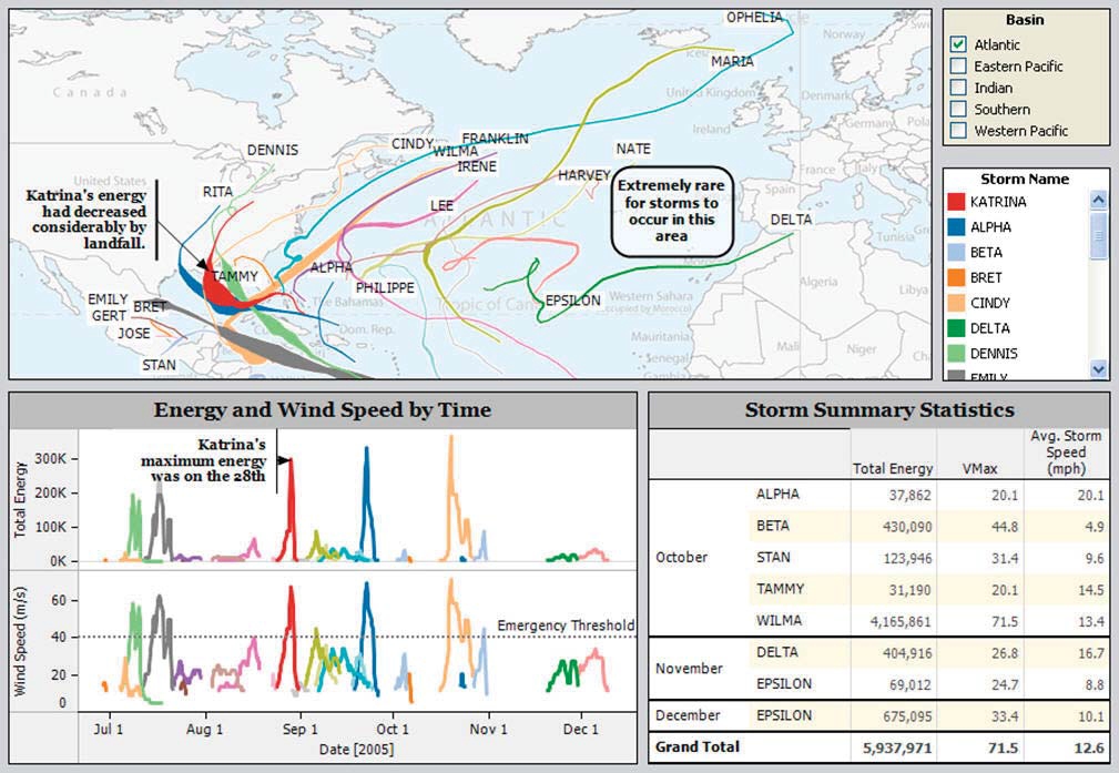
2. A modern view of Minard’s Map:

https://qonnections2016-charts.qlikcloud.com/57279cd9c22f280100294eaa/chart.html

3. Averages Aren’t What They Used to Be and Never Were

4. 6 questions with Burn-Murdoch:

http://www.visualisingdata.com/2015/09/six-questions-with-john-burn-murdoch/

5. Visart’s Demos: http://www.visart.io/demos/

6. Can We Trust Salesforce for Business in the Cloud?

https://marksmith.ventanaresearch.com/2016/05/14/can-we-trust-salesforce-for-business-in-the-cloud/

7. Pump Up Your Bump with Ranked Bars

http://www.datarevelations.com/pumpyourbump.html

8. Dashboard Improvement Opportunities – Surface Observations

9. New in Tableau 9.3:

http://www.theinformationlab.co.uk/2016/03/24/11-new-features-to-look-forward-to-in-tableau-9-3/

also: http://www.thedataschool.co.uk/nai-louza/tableau-9-3-easier-mapbox-customization/

and http://databoss.starschema.net/version-control-revision-history-tableau-9-3/

DogInGreen

10. Persuasion?

http://global.qlik.com/us/blog/posts/donald-farmer/direct-and-indirect-persuasion

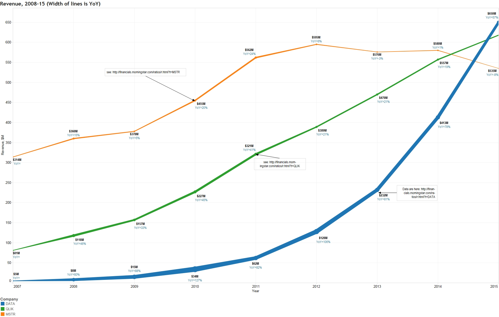
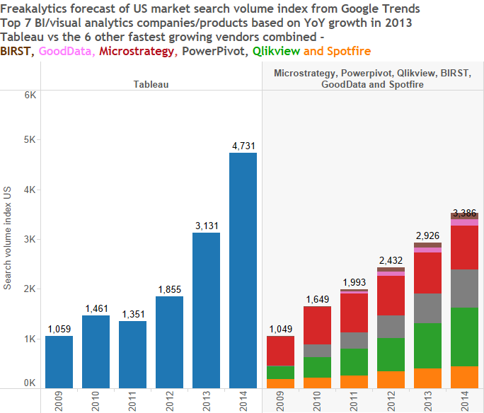
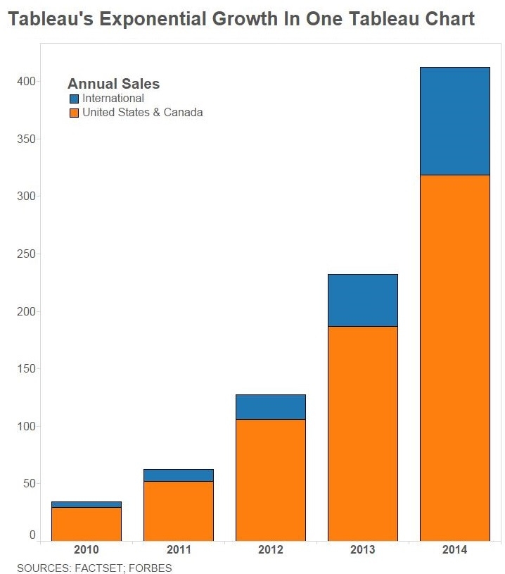
11. How Tableau Built a $3 Billion Data Empire On Top Of Beautiful Charts:

http://www.forbes.com/sites/briansolomon/2016/05/04/how-tableau-built-a-3-billion-data-empire-on-top-of-beautiful-charts/#cfd85d446bbf

12. Tableau plus HyPer: “Something up their sleeve”

http://www.datadoodle.com/2016/03/22/tableau-plus-hyper-something-sleeve/

also http://bi-review.blogspot.com/2016/03/thoughts-on-tableau-acquiring-hyper.html
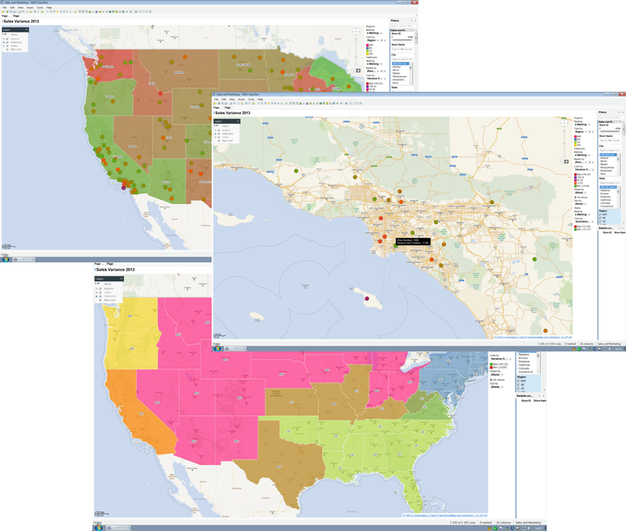
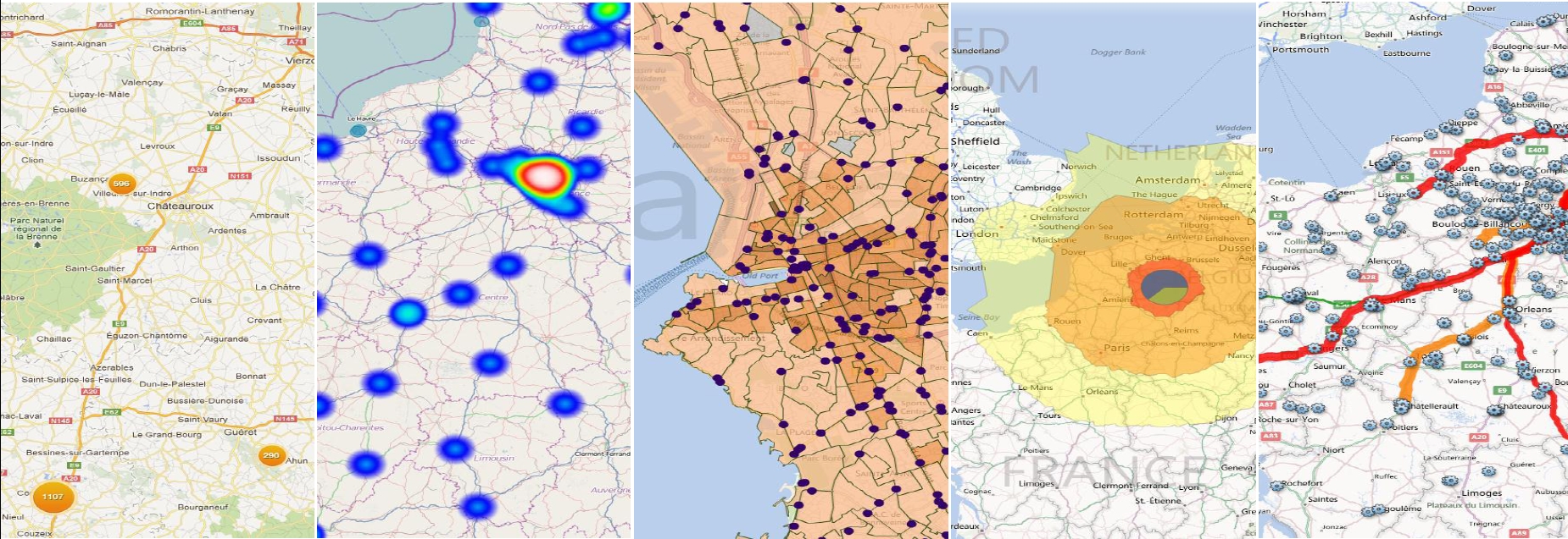
13. DV and mapping:

http://global.qlik.com/us/blog/posts/patrik-lundblad/data-visualization-foundations-mapping

14. DV Digest for March 2016:

http://www.visualisingdata.com/2016/05/best-visualisation-web-march-2016/

15. Farewell: http://blog.stephenwolfram.com/2016/01/farewell-marvin-minsky-19272016/

16. Wolfram about himself:

http://blog.stephenwolfram.com/2016/04/my-life-in-technology-as-told-at-the-computer-history-museum/

17.David Raab about SAS:

http://customerexperiencematrix.blogspot.com/2016/04/sas-by-sip-sas-viya-offers-open-apis-to.html

18. Dimensionality Reduction:

https://www.knime.org/blog/seven-techniques-for-data-dimensionality-reduction

19. More about color: http://redheadedstepdata.io/color-innovation/

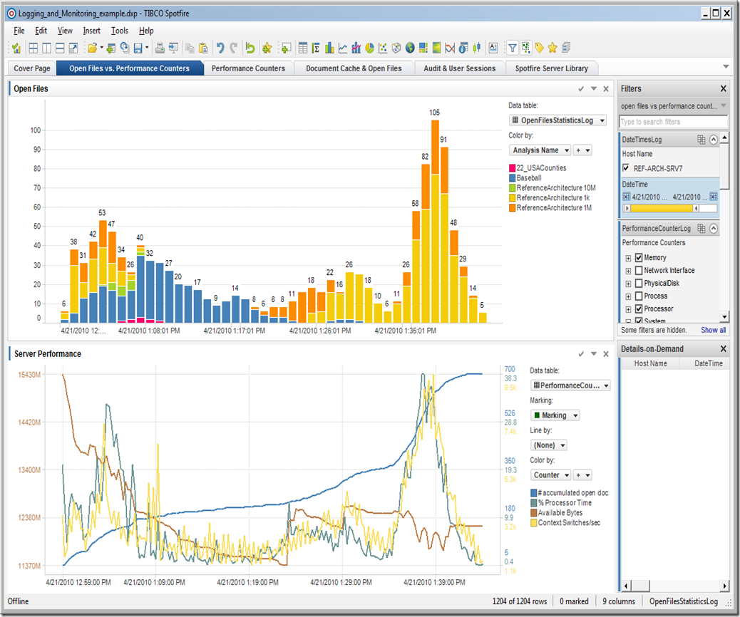
20. New in Spotfire 7.5:

also https://www.linkedin.com/pulse/new-tibco-ghislain-c%C3%B4t%C3%A9

and
http://www.tibco.com/company/news/releases/2016/tibco-announces-key-analytics-advances-in-2016

21. 37 QLIK blogs: http://www.askqv.com/blogs/
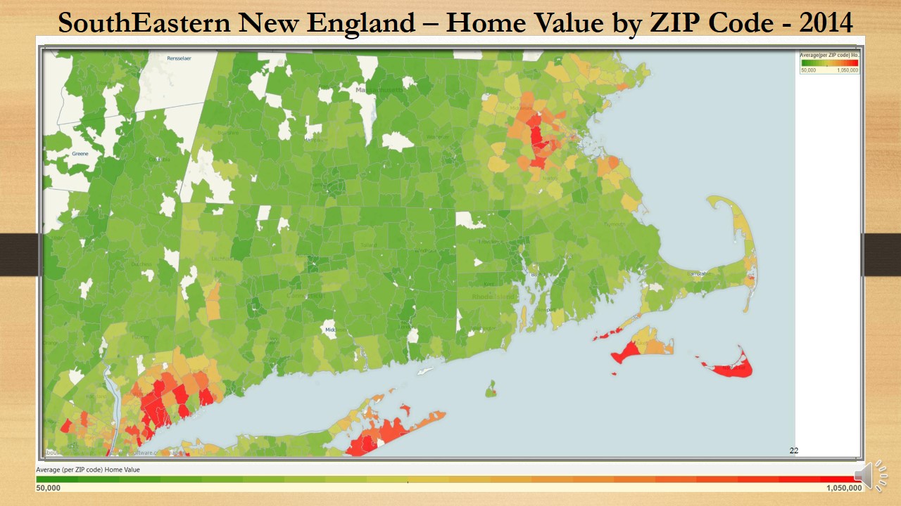
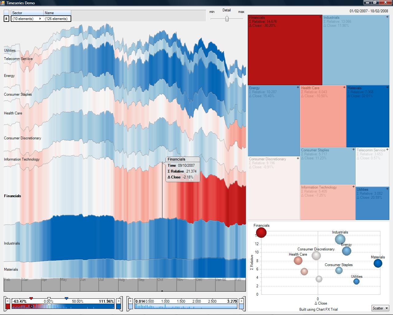
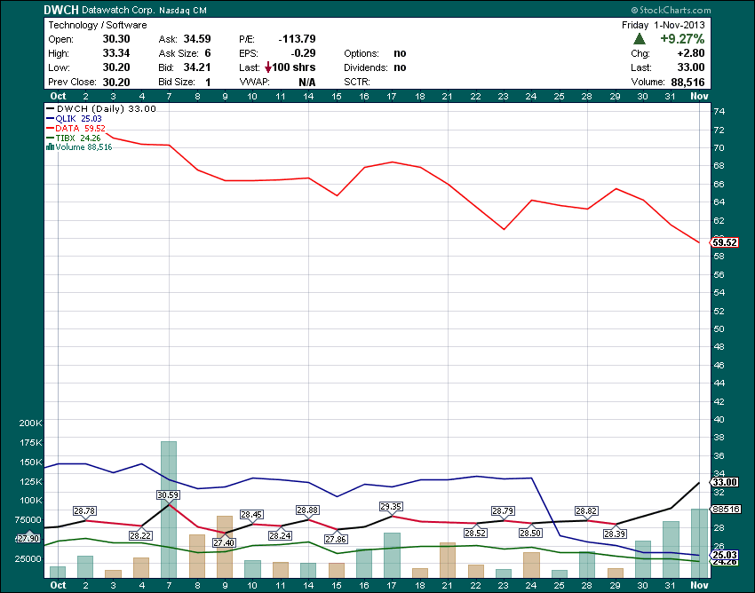
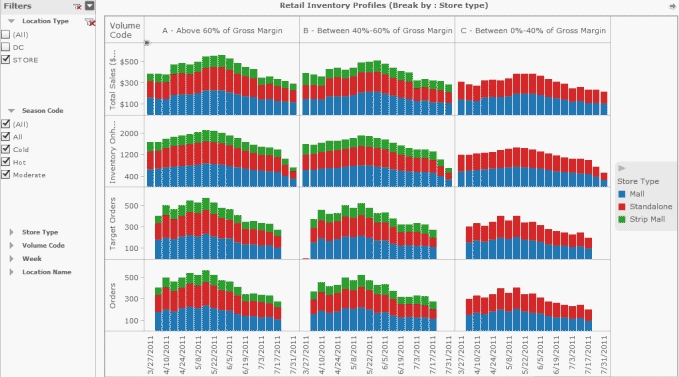
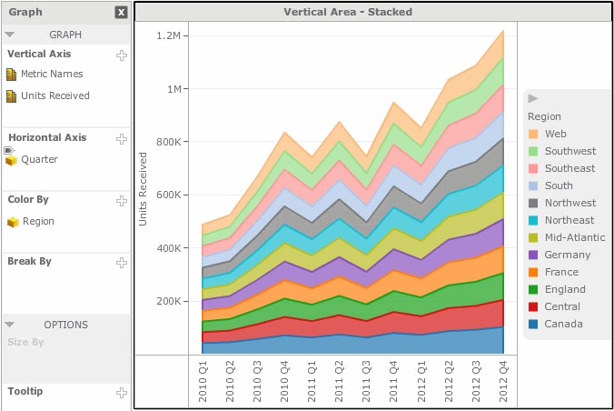
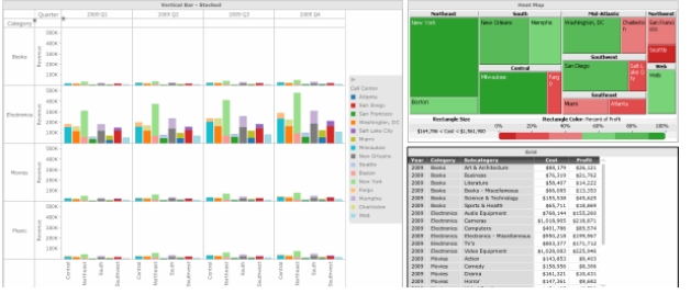
22. Text Tables:

http://www.tableau.com/about/blog/2016/4/if-you-must-use-text-table-follow-these-5-design-tips-53766?es_p=1735424

23. 167 years ago: https://www.propublica.org/nerds/item/infographics-in-the-time-of-cholera

24. QlikSense 3.0:

25. Pareto: http://vizwiz.blogspot.com/2016/05/the-data-school-gym-timeline-pareto.html

26. Tableau 10: https://www.tableau.com/about/blog/2016/5/tableau-10-unification-54263

also:

https://www.interworks.com/blog/kfontenot/2016/05/02/tableau-10-beta-first-impressions

and http://tabsoft.co/1NkVLes

and cross-DB filtering:

https://www.tableau.com/about/blog/2016/5/requested-you-can-filter-across-data-sources-tableau-10-54330

and cross-DB joins: http://mkt.tableau.com/video/10.0_cross_database_join_-_wildcard_union.mp4

27. Qonnection 2016:

28. Tableau tips: https://www.tableau.com/about/blog/2016/5/5-tips-effective-visual-data-communication-54174

also:

https://www.tableau.com/about/blog/2016/5/culture-innovation-starts-self-reliant-team-members-54110

29. Directional Lollipops: http://vizwiz.blogspot.com/2016/05/tableau-tip-tuesday-how-to-create.html

30. Oracle DV Desktop:

http://www.oracle.com/technetwork/middleware/bi-foundation/dvdarena-2997628.jpg

also http://www.siebelhub.com/main/2016/05/oracle-data-visualization-desktop.html

and

http://beyond-just-data.blogspot.com/2016/04/oracle-data-visualization-desktop-dvd.html

and

31. Tile Maps:

http://sirvizalot.blogspot.com/2016/05/how-to-small-multiple-tile-map-in.html?m=1

32. Trillion Rows:

33. Power BI is trying hard:

https://www.linkedin.com/pulse/5-reasons-why-power-bi-taking-over-tableau-best-tool-tacoronte

34. Advizor Solutions Overview (http://www.advizorsolutions.com/software/products/ ):

I stopped comparing DV (Data Visualization) products in 2012, when Qliktech stopped updating Qlikview. Since popularity of this blog started with that comparison, visitors kept asking me, especially when Gartner releases its Magic Quadrant (see generic MQ description here:

http://www.gartner.com/technology/research/methodologies/research_mq.jsp

GenericMQ

for BI every February of every year). MQ idea is obviously damn, because you cannot fit multi-dimensional relationship into 2-dimensional space.

However 2016 Gardner Report here:

https://www.gartner.com/doc/reprints?id=1-2XXET8P&ct=160204&st=sb

contains a lot of ”useful” info, like list of competitors and factors defining their positions on market. Gartner finally removed Spotfire, IBM, SAS, SAP and Microstrategy for the list of Leaders, leaving among leaders only 3 – obvious one (Tableau, especially Tableau 10), buzzword-rich Microsoft (PowerBI) and losing QLIK (Qlik Sense will not save it). To express my opinion, I simply reshuffle all competitors and placed them in order obvious to me (X – functionality, Y – “ability to execute”, color – the ease to use, size is popularity; I also included D3 but I am not comparing it!):

Data Visualization Leaders, Visionaries, Challengers and Niche Players

I found more useful for me the Gartner’s Analysis of Ownership cost of BI Platform:

https://www.gartner.com/doc/reprints?id=1-312NMXM&ct=160315&st=sb

Also if you interested to review historical changes in “MQ”, see this:

https://public.tableau.com/profile/kasper7429#!/vizhome/GartnerBIAnalyticsQuadrant2016/MagicQuadrant

and here:

http://blog.atscale.com/gartner-magic-quadrant-for-business-intelligence-bi-2016-the-good-the-bad-the-ugly

Update for April 2016: vendor’s inclusion into Gartner’s MQ may decrease vendor’s market capitalization.

As usual, the reading pointers below I borrowed from my Google+ microblogs “Data Visualization” (https://plus.google.com/111053008130113715119/posts , 7090+ followers) and “Data Visualization with Tableau” (https://plus.google.com/112388869729541404591/posts , almost 1000 followers). Again, sometimes the reading is more important then doing or writing.

Map of Scientific collaboration:

http://olihb.com/2014/08/11/map-of-scientific-collaboration-redux/

Onliners

MicroStrategy vs. Tableau:

http://www.bryanbrandow.com/2014/05/microstrategy-vs-tableau.html

Brain Capacity: http://www.forbes.com/sites/jvchamary/2016/01/28/brain-capacity

brain

Qlikview 12 finally released:

http://www.prisma-informatik.de/newsroom/tag/qlikview-12/

http://www.it-director.com/blogs/bloor-im-blog/2016/1/reconsidering-qlik/

Looker: http://www.looker.com/docs/exploring-data/visualizing-query-results

Amazon QuickSight: https://aws.amazon.com/quicksight/

DataInCloud

Engagement: http://www.perceptualedge.com/blog/?p=2197

American Panorama: http://dsl.richmond.edu/panorama/

Statistica 13:

http://en.community.dell.com/techcenter/information-management/b/weblog/archive/2015/10/27/lucky-13-new-version-of-statistica-ups-the-stakes-for-predictive-analytics

Wolfram Community:

http://blog.wolfram.com/2015/10/20/wolfram-community-is-turning-10000/

Recreation of Statistical Atlas:

http://news.nationalgeographic.com/2015/07/20150709-data-points-steampunk/

Pantones

Social Colors: https://www.materialui.co/socialcolors

Pantone’s Language of Color:

http://www.fastcodesign.com/3050240/how-pantone-became-the-definitive-language-of-color

Urban Growth:

http://www.citylab.com/work/2015/12/mapping-65-years-of-explosive-urban-growth/419931/

USgrowth

How many people ever lived:

Stephen Curry: http://fivethirtyeight.com/features/stephen-curry-is-the-revolution/

Free book: http://web.stanford.edu/~hastie/StatLearnSparsity/index.html

Errol Morris: How Typography Shapes Our Perception of Truth

http://www.fastcodesign.com/3046365/errol-morris-how-typography-shapes-our-perception-of-truth

http://www.fastcodesign.com/1670556/are-some-fonts-more-believable-than-others

Animation and Visualization:

https://medium.com/@EvanSinar/use-animation-to-supercharge-data-visualization-cd905a882ad4#.oducwdjjd

Visualizing Sentiment and Inclination

http://www.datarevelations.com/sentiment.html

Compare JS libraries: http://www.jsgraphs.com/

TabJolt, part 1: http://tableaulove.com/the-mondo-tabjolt-post/

TabJolt, part 2: http://tableaulove.com/the-mondo-tableau-server-tabjolt-series-part-2/

Plus 1000 in 2016:

http://www.geekwire.com/2015/tableau-software-set-hire-another-1000-employees-2016-ceo-says-business-flourishing/

Correlations in Tableau:

http://www.thedataschool.co.uk/nai-louza/correlations-trend-lines-formulas-tableau/

Unions in Tableau:

https://www.tableau.com/about/blog/2016/1/combine-your-data-files-union-tableau-93-48891

Mapbox and Tableau:

https://public.tableau.com/s/blog/2016/01/how-connect-mapbox-tableau

https://www.tableau.com/about/blog/2015/11/go-deeper-mapping-tableau-92-46154

http://blog.scamihorn.com/post/135405608545/mapbox-maps-in-tableau-10-easy-steps


escher_staircase_falling

Happy New 2016 Year from Andrei

It deserved to be mentioned that since May 17, 2013 until December 31 of 2015 (last trading day of 2015) share price of Tableau (symbol DATA, in orange color on chart below) in average grew 7 cents per day while share price of its main competitor QLIK oscillating around $32 for entire period of 662 trading days (see green line/area on chart below):
DataQlik2015b

As of December of 2015, Tableau employs about 2800 people (Happy New Year to them!) and planning to hire 1000 more in 2016. Also (among those 2800) the company employs about 500 people across eight international locations.

Since inception in 2009, this blog had more than million visitors (Happy New Year to all of them!), averaging (it was more than 600000 pageviews total during 2014-15) lately about 25000 pageviews per month.

Tremendous success of TC15 convinced me to return to my blog to write about Tableau’s history. Part 1 “Self-Intro” covers 2003-7 from version 1 to 3, Part 2 “Catching-up” covers 2008-10 from versions 4 to 6, Part 3 “Competition” covers 2011-13 from version 6 to 8 and Part 4 “Tableau the Leader” covers 2013-15 from version 8.1 to 9.2.

During last 25 months Tableau published 6(!) releases: 8.1, 8.2, 8.3, 9.0, 9.1 and 9.2 – in average one release per 4 months, leaving competitions far behind (version 9.3 expected in Q1 of 2016 and 10.0 in the summer(?) of 2016). [For comparison the QLIK released only one new update (Qlikview 12 in December of 2015) in last 4 years and as result lost its leading position (I do not consider Qlik Sense as competitive product)]. By end of 2015 Tableau became the leader in sales and in number of employees, while keeping the highest YoY growth among competitors.

As true and wise leader, Tableau made its software available to millions of people for free: each student, teacher, and even each member of administration of academic organization can use it for free and each small non-profit organization can use it for free too! Tableau Public vastly increased its capacity, allowing its users to save up to 10 million rows and even protect their workbooks from download.

8.1. November 2013. Tableau finally became 64-bit (no limit for 4GB RAM now – it was way overdue) multi-threaded product and added support for SAML. Among new features: some integration with R, copy content between workbooks, Box-and-Whisker Plot:

679boxplots8.2. June 2014. Native Tableau Desktop for Mac is released to please many snobs, Story Points (along with worksheets and dashboards) available now for data-storytelling (need for PowerPoint is much less now), new data connectors to text, excel, SAP HANA, Splunk, API for Google BigQuery and REST API, new Data Window:

connections-content

new map designs (together with Stamen) and map server, worldwide zoom level, high DPI displays:

maps-content

8.2.2. September 2014. Tableau Customer conference 2014.

8.2.5. November 2014. This historical release enabled the non-administrative user to use remote “READONLY” user (of Tableau’s administrative PostgreSQL database) to be used for creating dashboards, monitoring Tableau Server, its users, HTTP traffic, workbooks usage and data extracts.

8.3. December 2014. Added Single Sign-On and Delegated Access with Kerberos for enterprise security.

9.0. April 2015. Now you can view proximity in the radial selection tool:

radial-selection

Also 9.0 directly connects now to statistical files from SAS, SPSS and R, new data connectors added for Spark SQL, Amazon Elastic MapReduce, Amazon Redshift, improved performance of Salesforce connector, added Data Interpreter and Pivot-split cross tab:

pivot-split

Tableau 9 accelerated execution of queries (enabled parallel, consolidated and reused queries, cashing), added analytics pane:

analytics-pane

, fast marks and tooltips,

fast-marks

level-of-details (LOD) expressions:

lod-expressions

Here is a video with review of Tableau 9.0 features:

Here is a demo of new LASSO selector:
lasso

9.1. September 2015. New Data Connectors: Web Data Connector, Amazon Aurora, Google Cloud SQL, Microsoft Azure, SAP BW, Tableau SDK for creating and publishing data extracts (C, C++, Python, Java). Also free iPad app “Vizable” was part of 9.1 release and announced on TCC15.

9.2. December 2015. Tableau 9.2 added new Tableau Mobile app for iPhone (still Android was ignored!), added integration with Mapbox:

mapbox

Added hierarchical treemaps; placement of totals at top, bottom, left and right; using any worksheet as filter:

useasfilterfinal

and making permission granularity not just for workbooks and datasources, but for projects as well.

I wish a Happy New Year to all visitors of this blog, to members of Tableau Community and to 2016 Tableau Zen Masters:2016ZenMasters

and of course I wish Tableau 10.0 to be released as soon as possible, because I hope to get rid of all this

idiotic data blending,

which Tableau forcing us to do for many years and I wish to start using cross-DB join statements, cross-DB filters and everything cross-DB (it was promised on TCC15!). And I hope eventually Tableau will implement its own internal in-memory database with support for columnstore (that will take away from QLIK the last argument it has). 

This is Part 3 of the short history of Tableau, inspired by huge success of TC15. Previous blogposts can be found here (Part 1, self-intro): https://apandre.wordpress.com/2015/10/24/tableau-self-intro-2003-7/ and Part 2 (catching-up) here:  https://apandre.wordpress.com/2015/11/08/tableau-catching-up-2008-10/ . After reviewing this article I have to acknowledge that the big contributor to Tableau success was (in addition to Tableau itself) … Qliktech. Judge it for yourself:

6.0. July 2010. Qliktech’s IPO created $2B-$3B public company, legitimized the Data Visualization Market and proved that traditional BI tools (like Microstrategy, Cognos and Business Objects) are in deep decline. In short it created the fertile ground for future (2013, 3 years after QLIK’s IPO) Tableau’s IPO. Please note (see chart below) that QLIK’s YoY growth was below 100% even in pre-IPO years (as oppose to much faster YoY growth for Tableau).

QVYoY116.0. October 2010. Around 10/10/10 the Qliktech released Qlikview 10 which sets the high bar for Data Visualization competitors and only 2 of them were able to pass it: Spotfire and Tableau.

TBvsQVvsSF

6.0. January 2011. Success of Qlikview 10 convinced the BI thought leader Mr. Donald Farmer to leave Microsoft for leading role @Qliktech and for exciting opportunity to define the future of Qliktech’s products.

Donald-Farmer-Photo-FIVE

In my humble opinion Donald led (of course it was team “efforts”) Qliktech from the winning product (Qlikview) to cool, wonderful but losing product (Qlik.Next or Qlik Sense) and unintentionally helped Tableau to become a leader and the winner. It was amusing to see that Donald’s title changed from VP of Product Management to VP of “Innovation and Design” approximately the same time when Qlik Sense was initially released (summer of 2014).

6.1. November 2011. Around 11/11/11 the Qliktech released Qlikview 11, which turned to be the last functional update of Qlikview until December of 2015, when Qlikview 12 was finally released after 4 years of unjustifiable and self-defeating delays.

7.0. December 2012. Qlikview 12 was not released on 12/12/12 as expected (that was huge gift to Tableau). Instead Qliktech started the development of new product Qlik.Next (much later released as Qlik Sense) in hope that it will replace Qlikview and Qlikview community will migrate to Qlik Sense.

8.0. May 2013. Tableau’s IPO created initially $3+B public company, which quickly double its capitalization and become the leader of Data Visualization market. Tableau was and is only company on this market, who was able to keep 75%-100% (or more) YoY growth for many years until 2015.

8.0. October 2013. In its self-defeating announcement Qliktech declared it is not in rush to release Qlikview 12 and instead it will focus it development on Qlik.Next (which will be eventually released as Qlik Sense), completely yielding the leadership position (in Data Visualization market) to Tableau, see part 4 of this series. That announcement convinced me to stop comparing (at least on my blog) “leading” Data Visualization products – since the release of Tableau 8.1 (new leader in my opinion) in November of 2013 everybody else was just trying to catch-up and so far Tableau managed to be ahead of competition.

6.1. August 2011. Tableau 6.1 introduced the “mobile BI” in form of iPad app (that created bad Tableau’s habit to ignore more popular Android as mobile environment) and support of mobile Safari browser.

ipad61

Tableau 6.1 Server views are automatically touch-enabled and filters, parameters, pages and even highlighting all accommodate finger selection and resized accordingly, all scrollable areas can be dynamically scrolled with a finger swipe, all zoomable areas like maps can be zoomed in or out by pinching the screen.

In version 6.1 Tableau added localization to French and German; postcodes for AUS, CA, FR, Germany, NZ and out codes for UK; Pan and Zoom inside maps; Custom layout legends; Links on dashboard images etc.

Tableau wrote own text file parser which is faster than previously used JET parser; new parser can work with files of any size as oppose to 4GB limit, imposed by JET. Version 6.1 added the ability to append data extract from file:

AppendData61

enables an incremental refresh of data extract by adding only new records from data source by identifying new rows by some special (preferably containing only unique values for each record) data field, like timestamp:

IncrementalExtract61

and added the ability to refresh (in one operation) all data extracts used in workbook (very useful).

7.0. January 2012. Tableau 7.0 added new chart types like area charts, filled and wrapped maps, parameter functions, new statistical capabilities (for example t-values and p-values for trend modeling, exponential modeling for trend lines, summary stats, confidence bands), NULL values management.

Version 7 introduced Data Server, which allows the publication of shared data extracts, pass-through data connections and metadata, central location for all data sources, easy management of schedules for data extracts. Tableau server 7.0 supports now multi-tenancy in form of multiple sites where sites users, workbooks and data separated by site “firewalls”.

Tableau 7.0 added “Show Me” Dialog box:

showme71

8.0. March 2013. Among new features in Tableau 8.0: Web and Mobile Authoring/Editing: http://www.tableau.com/new-features/drag-and-drop-editing , support for local rendering, filtering, highlighting and even local URL actions:

679x300_localrendofmarks

Tableau Server now dynamically determines where to best perform rendering and interactive updates – on the server or in your local browser. Tableau decides on-the-fly whether it will be faster to perform actions right in your browser with local rendering, or query Tableau Server. This behavior is automatic, so you don’t have to think about it. Local rendering can speed up your analysis dramatically, especially when on a slow connection to Tableau Server.

Tableau 8 provides an application programming interface (API) to enable developers to directly create a Tableau Data Extract (TDE) file.

679x300_dataengineapi

The API works with C/C++, Java, and Python and can be used from Windows. Developers can use this API to generate TDE files from on-premise software and software-as-a-service. Tableau can then connect natively to these extract files. After you open a TDE file in Tableau Desktop, you can publish the extract to Tableau Server. This API lets you systematically get data into Tableau when there is not a native connector to the data source you are using. You can explore the Tableau Data Extract API documentation and get started by downloading the API itself , also see

8.0. July 2013 – Tableau Online: see spec and demos here: http://www.tableau.com/products/cloud-bi and video overview is here:

and here:

Tableau intentionally limited its cloud product to workgroup usage with 100 GB total per account storage, shared between limited number of users ($500 per user per year).  Tableau sales openly suggesting that Tableau online can be used by group with no more than 35 users.

This is the Part 2 of my post about Tableau’s history. Part1 “Tableau self-intro: 2003-7” was published on this blog earlier. The text below is based on Tableau’s attempt to re-write own history, version by version. What is below is said by Tableau, but interpreted by me. Part 1 “Intro” covers 2003-7 from version 1 to 3, Part 2 (this article) “Catching-up” covers 2008-10 from versions 4 to 6. Recent Q3 of 2015  ($171M revenue) financial results showing that Tableau keeps growing faster than anybody in industry, so interest to its history remaining high among visitors of my blog.

In 2010, Tableau reported revenue of $34M, $62M in 2011 (82% YoY), $128M in 2012 (106% YoY). The company’s 2013 revenue reached $232M, an 81% growth over 2012’s $128M.  2014 revenue exceeded $413M (78% YoY) and in 2015 Tableau expected $650M revenue (57% YoY), more than QLIK:

revenue7to15

In Multi-line Chart above (data are from Morningstar, for example: http://financials.morningstar.com/ratios/r.html?t=MSTR) the width of the each line reflects the value of Year-over-Year growth for given company for given year (Tableau is blue, Qliktech is green and Microstrategy is orange; unfortunately Spotfire sales data are not available since 2008, thanks to TIBCO). Here is Tableau’s revenue for last 5 quarters:

DATA-Revenues

Tableau’s success has many factors but in my opinion the 5 main contributors are:

  • In 2007 TIBCO bought Spotfire, making it incapable to lead;
  • Both Spotfire and Qliktech left their R&D in Sweden while scattered other offices in US;
  • Release of free Tableau reader in 2008 – brilliant marketing move;
  • Release of free Tableau Public in 2010 – another brilliant marketing move;
  • Gift from Qliktech in 2011-2015 (more about that in Part 3 or 4 of this blog post).

4.0. 2008. Integrated Maps added: “Data elements such as city, state and country are now automatically recognized as mappable dimensions, and users can also assign geospatial rules to selected dimensions. Once maps are created, users can also change the way data is presented and drill down into the underlying information without a need to understand map layers or complex geographic parameters”.

“Other upgrades in Tableau 4.0 include support for embedding visualizations within Web applications, Web sites and portals such as Microsoft SharePoint. Conversely, Web applications can also be embedded into Tableau”.

In 2008 Tableau released the free Tableau Reader and enables server-less distribution of visualization with full Windows UI experience. “Getting an unlimited free trial into the hands of thousands of people raises awareness among people who are interested in analyzing data, while at the same time training them in its use”. Also see old video here:

5.0. 2009. Tableau enables Views and Dashboards to act Visual Filters, which improves tool’s ability to drill-down data. Such actions can be local and global. Tableau Server now is capable of multi-threading and it can be distributed among multiple hardware boxes or virtual machines, greatly improve scalability and performance.

New Data sources and connectors introduced: Postgres 8.3, Oracle 11g, MySQL 5.1, Vertica v3, Teradata 13, DB2 v9.5 ; Tab, Space, Colon and Pipe delimited flat files, custom geocodes.

5.1. 2010. Added reference lines, bands and distributions, added bullet charts and box-and-whisker charts, expanded set of available pallets, enabled the customization of titles, annotations, tooltips, dashboard sizes,

DahbLayout5_1

actions and filters. Tableau 5.1 extended the support for Teradata and Essbase.

Tableau Public. 2010. In its 2nd brilliant marketing move (1st was the release of free Tableau Reader in 2008) the free Tableau Public was released and that instantly made Tableau as the leader in Data Visualization field.

6.0. 2010. The evil Data Blending was introduced in version 6 due an inability of Tableau to join tables from multiple databases and datasources. This architectural bug will be partially fixed in 2016 (Tableau 9.2 or later – it was not clear from TC15 announcement), but real solution can be achieved only when Tableau will implement own internal in-memory DBMS (preferably capable to support columnstore).

Data Engine was introduced as the separate process, which in theory is capable to optimize the creation of Data Extracts and the usage of available RAM as well as take advantage of available disk space so Data Extract can be larger than available RAM. Among new features are improved server management; parameters, which can accept user’s input; suite of table calculations; and drag-and-drop UI for creating Ad-hoc hierarchies.

Below is a screenshot of my drill-down dashboard I did originally in Qlikview and then redid in Tableau 6 to prove that Tableau can do as much drill-down as Qlikview can (using Tableau’s Dashboard Actions):

TableauDashboard2

Image above has an interesting “story”: since it was published on this blog more than 4 years ago it was copy-pasted (in many cases “stolen” without credit to me!) and used as the showcase for Tableau by many blogposts, articles and other publications and “authors”, who disrespect the elementary quoting/crediting rules since internet allows copy/paste operations and leaving up to those people to be polite or disrespectful.

The indirect prove of the brilliancy of Tableau’s marketing moves (free Tableau Reader and free Tableau Public) in 2008-2010 is the volume of the internet searches (thanks to Freakalytics.com) for Tableau and its 6 nearest competitors in 2009-14:

2014-BI-growth-forecast-by-freakalytics-top-5-tableau-versus-next-6

In follow-up I am planning the Part 3: Tableau competes, 2011-13 and Part 4: Tableau the leader, 2013-15.

I was accused by many that I like Tableau too much. That is wrong: in fact I love Tableau but I will try to show below that love can be “objective”. Tremendous success of TC15 (with 10000+ attendees, unmatched by any competitor; 1st conference in 2008 attracted only 187 people) convinced me to return to my blog to write about Tableau’s history – it is interesting how it came to be.

keynote_dev_002_3

Tableau was spun out of Stanford in 2003, from project Polaris, led by professor Pat Hanrahan and Chris Stolte. It was originated at Stanford as a government-sponsored (DoD) research project to investigate new ways for users to interact (including VizQL) with relational and OLAP databases. In 2004 Tableau got $5M from VCs. In 2005, Hyperion (now Oracle owns Hyperion) began to offer a Tableau under the name “Hyperion Visual Explorer“.

By end of 2010 Tableau had 4 products: Tableau Desktop ($1999 for Pro edition), Tableau Server ($10000 for 10 users), Tableau (free) Reader and Tableau (free web service) Public. In 2010 Tableau had about $34M revenue and was one of the fastest growing software companies in the world (123% YoY). Even in Q3 of 2015 Tableau’s revenue was $171M, 64% up from Q3 of 2014 and it was twice more than entire Tableau’s revenue over period of 2003-10. Overall for last 5 years Tableau had explosive (and unsustainable by industry standards) 75% or above growth; that YoY revenue growth (and Tableau expects $650M for entire 2015) presented in bar chart below:

tableauGrowth

The text below is based on recent Tableau’s attempt to re-write own history, version by version. Also I reused some posts from this blog – I already covered in my blog versions 6.0 (in 2010) and then 6.1, 7.0, 8.0, 8.0 Desktop, 8.0 server8.1, 8.2, Tableau Online, Tableau Reader, Tableau Public.

I will follow this pattern with one exception (and I promise to avoid the marketing BS like “revolutionary innovation”). I will start with something which is still is not here yet at the end of 2015. Noted by me before: No MDI, no re-sharing of workbook infrastructure with other workbooks, no internal DB (ugly data blending instead), no in-memory columnstore, wrong approach to partners etc.

What is below is said by Tableau version by version, but interpreted by me (my blog, my opinions, my interpretation). Part 1 “Intro” covers 2004-7 from version 1 to 3, Part 2 “Catching-up” covers 2008-10 from versions 4 to 6, Part 3 “Competition” covers 2011-13 from version 6 to 8 and Part 4 “Leading the field” covers 2013-15 from version 8.1 to 9.1, including Tableau Online.

1.0. 2004.

Introduction of VizQL allowed less coding (but required a lot of drag-drops, clicks, resizing and other gymnastics with mouse, which seems more acceptable to wider population – Tableau insists on “anyone, anywhere”). Tableau 1.0 can access to Access, Excel, Microsoft Analysis Services Cubes!), MySQL, SQL Server 2000. Data from multiple tables have to be denormalized (this proved overtime to be the weakest part of the tool) into one table before importing into Tableau.

I am not sure why even in 2015 the Tableau insists on its own self-assessment that it works as fast as you can think – that is offensive to thinkers.

Tableau1

Tableau 1.0 was available in three editions. The $999 Standard Edition can connect to Microsoft Excel, Microsoft Access, or plain text files. The $1299 Professional (MySQL) edition adds MySQL to the list of supported data sources, while the $1799 Professional edition extends the list to include Microsoft SQL Server and SQL Server Analysis Services.

2.0. 2006.

Tableau 2.0 added the ability to join tables in the same database. Added the ability to create Data Extracts and work offline without live connection to data. New features: Distinct Counts and Median aggregations, new “Size” shelf (marks will be sized proportionally to the value of the field in that shelf), new “Page” shelf (useful for animations, see example of it I did a while ago):

Here the content of this video as the presentation with 24 Slides:

Tableau 2.0 also added optional trend and reference lines, calculated fields (can be used with formulas, with all functions and with custom SQL and MDX expressions). 3 Screenshots below preserved for us by Stephen Few in his reviews of Tableau 2.0 and 3.0.

tableau2

Tableau 2.0 is priced at $995 for the standard edition and $1,799 for the professional edition, including one year of software maintenance and unlimited technical support.

3.0. 2007.

Tableau Server introduced so people can see visualizations through browser over intranet or internet. When visualization application is published from Windows Desktop to Tableau Server (which is in fact, application server), it will be converted to web application: no downloads, plugins or coding required and all related data-sources will be published on that server.

Among other new features: new Sorting “shortcuts”,

tableau3

as well as Ad-hoc grouping, Auto-calculated reference lines, annotations and most importantly, dashboards with global filters. Tableau missed the opportunity to introduce the MDI into multi-view dashboards and this design bug persisted even now in 2015 – tool still using non-MDI containers (panels) instead of MDI child-windows for each chart. Another problem (in Tableau 3.0) was that views in dashboard updated sequentially and not in-parallel.

tableau3dash

By 2007 Tableau employed just 50 people but it was just a beginning:

tbGrowth

In 2007 the Tableau Software company got lucky, because TIBCO bought Spotfire that year and it greatly restricted the ability of Spotfire to lead Data Visualization field. Another luck for Tableau was a strategic mistake by both Qliktech and Spotfire to leave development teams in Sweden while placing their HQs, sales, marketing etc. elsewhere in multiple US locations. Tableau got lucky one more time later thanks to gift from Qliktech but I will discuss it later in Part 3 or 4 of this blog-post. As mentioned above, I am planning the Part 2 of this post: Tableau is catching-up, 2008-10, then Part 3: Tableau competes, 2011-13 and finally the Part 4: Tableau the leader, 2013-15

Reading pointers below I borrowed from my Google+ microblogs “Data Visualization” (https://plus.google.com/111053008130113715119/posts , 7000+ followers) and “Data Visualization with Tableau” (https://plus.google.com/112388869729541404591/posts , almost 1000 followers). Sometimes the reading is more important then doing or writing. The reading on the beach (like below) can be even more…

PlaceToRead

  1. How Scalable Do Analytics Solutions Need to Be? http://www.perceptualedge.com/blog/?p=2097
  2. The Data Visualization Catalogue. http://blog.visual.ly/the-data-visualization-catalogue and http://datavizcatalogue.com/
  3. The Evolution of SQL Server BI, https://www.simple-talk.com/sql/reporting-services/the-evolution-of-sql-server-bi/
  4. Abela’s Folly – A Thought Confuser. http://www.perceptualedge.com/blog/?p=2080
  5. TIBCO Spotfire Promotes an Insidious Myth. http://www.perceptualedge.com/blog/?p=2035
  6. User Ideas Turned into Product Features: https://www.tableau.com/about/blog/2015/8/community-contributes-again-ideas-released-91-41812
  7. Is Data Is, or Is Data Ain’t, a Plural? http://blogs.wsj.com/economics/2012/07/05/is-data-is-or-is-data-aint-a-plural and http://www.theguardian.com/news/datablog/2010/jul/16/data-plural-singular?es_p=662983
  8. Talk: How to Visualize Data, https://eagereyes.org/talk/talk-how-to-visualize-data#more-8879
  9. Pillars Of Mapping Data To Visualizations, http://global.qlik.com/us/blog/authors/patrik-lundblad
  10. Radar Chart can be useful(?), https://www.tableau.com/about/blog/2015/7/use-radar-charts-compare-dimensions-over-several-metrics-41592
  11. Visualization Publication Data Collection, http://www.vispubdata.org/site/vispubdata/
  12. Visual Representation of SQL Joins, http://www.codeproject.com/Articles/33052/Visual-Representation-of-SQL-Joins and http://www.theinformationlab.co.uk/2015/02/05/joining-data-tables-tableau-alteryx/

Visual_SQL_JOINS_orig

  1. Example of stupidity of the crowd: http://about.g2crowd.com/press-release/best-business-intelligence-platforms-summer-2015/
  2. Reviving the Statistical Atlas of the United States with New Data, http://flowingdata.com/2015/06/16/reviving-the-statistical-atlas-of-the-united-states-with-new-data/
  3. Exploring the 7 Different Types of Data Stories: http://mediashift.org/2015/06/exploring-the-7-different-types-of-data-stories
  4. Set Your Own Style with Style Templates: http://www.tableau.com/about/blog/2015/6/saving-time-style-templates-39932
  1. A Look at Choropleth Maps , http://visualoop.com/blog/84485/a-look-at-choropleth-maps
  2. Mountain Chart for different categories (profiles) of web visits: https://public.tableau.com/profile/andrei5435#!/vizhome/MountainChart/MountainChart

MountainChart

  1. To the point: 7 reasons you should use dot graphs, http://www.maartenlambrechts.be/to-the-point-7-reasons-you-should-use-dot-graphs/
  2. Rant: A Tableau Faithful’s View On Qlik , http://curtisharris.weebly.com/blog/rant-a-tableau-faithfuls-view-on-qlik
  3. Too Big Data: Coping with Overplotting, http://www.infragistics.com/community/blogs/tim_brock/archive/2015/04/21/too-big-data-coping-with-overplotting.aspx
  4. Too much data to visualize? Data densification in Tableau 9 , https://www.linkedin.com/pulse/too-much-data-visualize-densification-tableau-9-kris-erickson
  5. The Architecture of a Data Visualization, https://medium.com/accurat-studio/the-architecture-of-a-data-visualization-470b807799b4 , also see https://medium.com/@hint_fm/design-and-redesign-4ab77206cf9
  6. Filter Views using URL Parameters , http://kb.tableau.com/articles/knowledgebase/view-filters-url

space-time

  1. Building a Visualization of Transit System Data Using GTFS , http://datablick.com/2015/05/05/building-a-visualization-of-transit-system-data-using-gtfs/
  2. A Look At Box Plots , http://visualoop.com/blog/32470/a-look-at-box-plots
  3. Custom Tableau Server Admin Views , http://ugamarkj.blogspot.com/2014/08/custom-tableau-server-admin-views.html
  4. Circular and Hive Plot Network Graphing in Tableau , http://datablick.com/2015/04/13/circular-and-hive-plot-network-graphing-in-tableau-by-chris-demartini/
  5. Hexbins in Tableau , http://www.theinformationlab.co.uk/2015/05/12/hexbins-in-tableau/
  6. Tableau Public Goes Premium for Everyone; Expands Access to 10 Million Rows of Data , http://investors.tableau.com/investor-news/investor-news-details/2015/Tableau-Public-Goes-Premium-for-Everyone-Expands-Access-to-10-Million-Rows-of-Data/default.aspx

LookFromReadingPost

2 year ago the IPO instantly created almost $3B of market capitalization for Tableau Software Inc. and since then it almost tripled, making Tableau the most “valuable” Data Visualization company (click on image to enlarge):

MCap150606b

Tableau more then doubled the number of its Full-Time employees (almost 2200 now, roughly the same (or more?) as QLIK has) and more then doubled its Revenue (again, roughly the same as QLIK has). Tableau’s YoY growth still in range of 77%-100% per year, which is far, far more then any competition:

tableauGrowth

Combination of that growth with technological progress and new features of Tableau’s products led to huge growth of its share price – it reached in 1st week of June 2015 $115, while Qlik’s share price is hovering around $37 or even below (click on image to enlarge):

data150606

Visitors to this blog kept asking me of what is most impressive (for me) about Tableau and what are my concerns. I will list just 3 of each:

  • most impressive: YoY (Year-over-Year growth ratio); migration to 64-bit (finally) and performance improvements; and  increasing capacity of Tableau Public to 10 million rows and 10 GB storage.
  • concerns: rumors that price of Tableau Server will be increased (I heard doubled; that can slow down the growth and the popularity of Tableau); moving CEO to Europe away from HQ (repeating of mistake of Spotfire and Qliktech, who had/have R&D in Europe – away from american HQ);  and limited capacity of Tableau Online (basically it can be good only for small workgroup).

Not all of its huge success can be contributed to Tableau itself:

QLIK for example did not release Qlikview version 12 for last 4 years (but kept updating the last version, recently with release 11 (!) of Qlikview version 11.2). Another help Tableau got from TIBCO, who kept Spotfire inside strict corporate cage and went private with little change for Spotfire to be a spin-off. As a result, competition for Tableau during last 2 years was weaker then before its IPO and we are witnessing a massive migration to Tableau from competitive products.

Don’t assume that Tableau is slowing down: I visualized (using Tableau Public of course, see it here: https://public.tableau.com/profile/andrei5435#!/vizhome/Data2Months/TableausMarketCap ) the Tableau’s Market capitalization during last 52 business days and it keeps growing at least as fast as last 2 years:

Tableau's Market Cap

Update 6/7/15: finally, just check the number of Job Openings @Tableau – 344 (as of today 6/7/15), @QLIK – 116 (3 times less then Tableau!), and only 1 (ONE!) opening for Spotfire… If you still think that Microstrategy can compete with Tableau, then please keep this in mind: as of today Microstrategy’s total number of Job Openings is … 50.

NewYear2015Greeting2


My best wishes in 2015 to visitors of this Data Visualization blog!

2014 was very unusual for Data Visualization Community. Most important event was the huge change in market competition where Tableau was a clear winner, QLIK lost it leadership position and Spotfire is slowly declining as TIBCO went private. Pleasant surprise was Microsoft, who is finally trying to package Power BI separately from Office. In addition other competitors like Microstrategy, Panorama and Datawatch were unable to gain bigger share in Data Visualization market.

2014 again was the year of Tableau: market capitalization exceeded $6B, YoY growth was highest again, sales approaching $0.5B/year, number of employees almost the same as @QLIK, LinkedIn index exceeded 90000, number of Job Openings increased again and as of today it is 337! I personally stopped comparing Data Visualization products for last few months, since Tableau is a clear winner overall and it will be difficult for others to catch-up unless Tableau will start making mistakes like QLIK and Spotfire/TIBCO did during last few years.

2014 was very confusing for many members of QLIK community, me included. Qlik.Next project resulted in new Qlik Sense Product (I don’t see too much success for it) and Qlikview 12 is still not released, while prices for both QLIK products are not public anymore. Market Capitalization of QLIK is below $3B despite still solids sales (Over $0.5B/year) and YoY growth is way below of Tableau’s YoY. Qlikview’s LinkedIn index now around 60000 (way below Tableau’s) and Qlik Sense’s LinkedIn index is only 286…  QLIK has only 124 Job opening as of today, almost 3 times less then Tableau!

Curiously, BI Guru Mr. Donald Farmer, who joined QLIK 4 years ago (a few months before the release of Qlikview 11) and who was the largest propagandist of Qlik.Next/Qlik Sense, was moved from VP of Product Management position to new “VP of Innovation” @QLIK just before the release of Qlik Sense and we hear much less from Donald now. Sadly, during these 4 years Qlikview 12 was never released, and QLIK never released anything similar to free Tableau Reader, free Tableau Public and Tableau Online (I am still hoping for Qlikview in Cloud) and all Qlikview prices were unpublished…

As a member of Spotfire community, I was sad to see the failure of Spotfire (and its parent TIBCO) to survive as public company: on December 5, Vista Equity Partners completed the acquisition of TIBX for $4.3 billion. I estimate Spotfire sales around $200M/year (assuming it is 20% of TIBCO sales). LinkedIn index of Spotfire (is way below Tableau’s and Qlikview’s) is around 12000 and number of Job Openings is too small. I hope Vista Equity Partners will spinoff the Spotfire in IPO as soon as possible and move all Spotfire’s Development, Support, Marketing and Sales into one American location, preferably somewhere in Massachusetts (e.g. back to Somerville).

Here is a farewell Line Chart (bottom of Image) to TIBX symbol, which was stopped trading 3 weeks ago (compared to DATA and QLIK Time Series (upper and middle Line Charts) for entire 2014):

data_qlik_tibx_2014

Tableau Server works as a team of multiple processes, processors, programs and applications, like data engine, data server, VizQL Server, bacgrounder, application server etc.: http://onlinehelp.tableausoftware.com/v8.3/server/en-us/processes.htm
ServerStatus
Each of those processes generates LOG files with data about user activities, data connections, queries and extractions, errors, views repaintings and interactions, etc.: http://onlinehelp.tableausoftware.com/v8.3/server/en-us/logs_loc.htm
Those data parsed regularly and stored into PostgreSQL-based Tableau Server Administrative Database, called “Workgroup” and also known as Tableau Server Repository.

PostgreSQL Server containing Workgroup DB usually runs on the same Windows Server as Main Tableau Server or (if Tableau Server runs on multimode cluster with Worker Tableau Server(s)) on other Windows Server, which runs Worker Tableau Server and uses non-standard TCP/IP port 8060.

During installation Tableau Server will create the almost empty Workgroup Repository with the main DB Schema called “public”, 100+ tables, 900+ columns (about 100 of them used as Keys), 300+ Joins, 16+ Views and 4 pre-approved users ( 2 internal (repository and rails), 1 SuperAdmin ( tblwgadmin ) and 1 default user ( tableau, which has read-only access to 16 views (click on image to enlarge):
wg82TableauViews
and nothing else). Similar Schema (with linkage between Keys for Tableau 7.0 Repository) is here (Originally published by great Russell Christopher) :
DataDictionary70

None of these pre-approved Workgroup users available outside of Tableau Server environment (unless designated static IP address(es) will be added (this may violate your Tableau License) to pg_hba.conf PostgreSQL configuration file, except “tableau” user (and new default “readonly” user) who can be given a privilege to connect to Workgroup Repository remotely as described here:
http://onlinehelp.tableausoftware.com/current/server/en-us/help.htm#adminview_postgres_access.htm

In November 2014 Tableau Software introduced (Release 8.2.5) a new, 2nd default user, named “readonly” with read access to all Tables and Views of Workgroup Repository: http://www.tableausoftware.com/support/releases/8.2.5

New “readonly” user enables us (if/when migration to Tableau 8.2.5+ or 8.3 happened) to create custom Operational Dashboards and monitor the usage and state of Tableau Server in Enterprise environment. TABADMIN utility’s command DBPASS now has new parameter “—username” which can enable remote access for “readonly default user:

tabadmin dbpass –username readonly p@ssword

Tableau Software also introduced and published the Data Dictionary and Documentation for entire Repository, its DB Schema, Tables, Views and other details here:
http://onlinehelp.tableausoftware.com/samples/en-us/data_dictionary/data_dictionary_8.2.5.html
and here:

http://onlinehelp.tableausoftware.com/current/server/en-us/data_dictionary.html

Please find below the list of all tables, columns, their data types:

Tableau 8.2 Repository: tables and columns

or you can see it here: https://public.tableausoftware.com/profile/andrei5435#!/vizhome/shared/4WQSHR642

and the portion of Diagram of “public” DB Schema for Tableau Server Repository (click on image to enlarge):
wg82L

Russell Christopher originally posted the portion of DB Schema of Tableau Server Repository for v.7.0. here: http://tableaulove.tumblr.com/post/50438516817/better-late-than-never-tableau-7-data-dictionary and then added awesome articles about History Tables in Data Dictionary for v. 8 here: http://tableaulove.tumblr.com/post/50529179435/tableau-server-v8-history-tables and here: http://tableaulove.tumblr.com/post/51220703630/tableau-server-v8-history-tables-part-3-the

Tableau’s IPO on May 17 2013 instantly created the most valuable (in terms of Market Capitalization) Data Visualization Vendor. Since then Tableau kept having the best in “BI industry” YoY growth and its sales skyrocketing, almost reaching the level of QLIK sales. During summer of 2014 DATA (stock symbol for Tableau) shares were relatively low and as one visitor to my blog cynically put it, TCC14 (Tableau Customer Conference for 2014) can be easily justified, since it raised DATA Stock and added (indirectly) to Market Cap of Tableau more than $1B to the level of more than $5B. Below is entire history of DATA prices (click on image to enlarge):

DataQlikTibxMstrSinceIPO

Tableau’s IPO on May 17 2013 instantly created the most valuable (in terms of Market Capitalization) Data Visualization Vendor. Since then Tableau kept having the best in “BI industry” YoY growth and its sales skyrocketing, almost reaching the level of QLIK sales. During summer of 2014 DATA (stock symbol for Tableau) shares were relatively low and as one visitor to my blog cynically put it, TCC14 (Tableau Customer Conference for 2014) can be easily justified, since it raised DATA Stock and added (indirectly) to Market Cap of Tableau more than $1B to the level of more than $5B. Below is entire history of DATA prices (click on image to enlarge):

For me the more indicative then the stock prices, market capitalization and a number of participants in customer conferences are numbers of job openings for competing vendors and Tableau has 270+ of them (more than 20% of its current number of employees), QLIK has 120+ (about 7% of its number of employees) and TIBCO has only about 2 dozens of openings related to Spotfire (unless I misread some other openings). For the quarter finished June 30, 2014, the company posted a year-over-year revenue increase of 82% with just over $90 million in revenue. Headcount was up 62% year-over-year to 1,532 employees worldwide.

As a background for Tableau growing sales (and tremendous YoY) you can see slow growth of QLIK sales (QLIK also delayed for almost 3 years the release of new product: we will not see Qlikvew 12, we still waiting for release of QLIK.NEXT and only recent release is Qlik Sense, which does not make too much sense to me) and almost no changes in Spotfire sales. I am guessing that Tableau is taking all those sales away from competition…

Keynotes and sessions of TCC14 were packed (you cannot find available seats on images below) and full of interesting info and even entertainment for new users and customers.

tableau-keynote-2014

These 2 fresh multimillionaires (see below, not sure why Christian’s face looks unhappy – I guess it is just me) opened TCC14 as usual, with exciting keynote.

2MultiMillionairs

You can find their keynote either on TCC14 website (link below) or on Youtube (below TCC14 link). Keynote contains 3+ parts: two speeches from co-founders (this year Christian choose theme of “Data Art” – I am not sure if it help sales,  but nevertheless entertaining and very speculative topic) and the rest of keynote about new features in upcoming release of Tableau (8.3 and 9.0?).

http://tcc14.tableauconference.com/keynote

As you see from slide below, Tableau is positioning new features in 7 groups, and I will try to mention those.

tcc-keynote-features

Let’s start with most interesting to me: potential performance gain 2x or even 4x, mostly because better usage of multithreading and 64-bit code and I quote here: “Vice President of Product Development Andrew Beers takes his turn next, speaking about Performance. He shows breakthroughs in the Viz Engine, flying through a visualized painting, seamlessly panning, zooming, and selecting. Switching into data more likely to be representative, he shows a live connection to a database of 173 million taxi rides in New York City, and dives in showing results easily four times faster than the same calculations run on the same machine running Tableau 8.2, leveraging a change in the Data Engine to use multiple CPU cores in parallel. Database queries will likewise be parallelized, with cited examples reducing 15 second queries to three, and more complex ones reduced from nearly a minute to as little as seven seconds.”

tab_conf_pan

Among other features, Chris introduced “Lasso & Radial Selections”:  these selections allow interactors to select points in shapes other than just a square. In Stolte’s keynote, he used a map as an example. He only wanted to lasso points in a city from the northwest to the southeast, not selecting some along the way. The shape ended up being like a figure eight. This was impressive.

Vice-President of Product Marketing Ellie Fields talked about new developments forthcoming in Cloud computing with Tableau, featuring Tableau Online as a platform for connecting Cloud data warehouses and applications in conjunction with on-premise data which can be presented in web browsers, on mobile devices, or even encapsulated in embedded applications.

Of course the star of TCC14 was Prof. Hans Rosling – as keynoter as well as part of the excited crowd.

HansKeynotingAtTCC14Hans stars even in cafeteria (could not resist to include his picture seating at table with right hand raised).

HansAtTCC14Another memorable event was “ZEN Masters of 2014” –

zens14

this is a living prove of huge and very capable Tableau community

ZenMastersTCC14

Tableau provided during TCC14 a lot of classes and training sessions – almost all of them were well prepared and packed. Expect many of them to be available online – many for free.

TCC14_TrainingSessionI included below two video interviews, showing insider’s take on Tableau as Sales Organization

and also Tableau’s approach to Product management with these priorities (I am curious if they always followed in real life): Quality – Schedule – Features.


While on Cape Cod this summer and when away from beach, I enjoyed some work-unrelated fun with Tableau. My beach reading included this article: http://www.theinformationlab.co.uk/2014/03/27/radar-charts-tableau-part-3/ by Andrew Ball and I decided to create my own Radar. When I show it to coworkers later, they suggested to me to publish it (at least the fun with Polygons, Path and Radars) on my blog. I may reuse this Radar chart for our internal Web Analytics. CloudsOverAtlantic

Natural Order of Points and Segments in Line.

Many visualization tools will draw the line chart, its datapoints and connecting line segments between datapoints in natural progressing order – repainting them from left to right (horizontal ordering by Axis X) or from bottom to upside
(vertical ordering by Axis Y) or vice versa.

Path as the method to break the Natural Order.

Some demanding visualizations and users wish to break the natural repainting and drawing order and Tableau allows to do that by using the Path as the method to order the datapoints and line segments in Lines and Polygons. A Collection of increasing Ordering Numbers (Pathpoints) for each Datapoint in Line defined a Path for drawing and connecting datapoints and segments of that Line (or Polygon). Each Pathpoint can be predefined or calculated, depends on mplementation and business logic.
Changing the Natural Order can create “artificial” and unusual situations, when two or more datapoints occupying the same pixels on drawing surface but have very different Pathpoints (example can be a Polygon, when Line ends in the same point it starts) or when two or more Line Segments intersecting in the same Pixel on screen (example can be the Center of the letter X ).

Radar.

Radar Chart has 2 parts: Radar Grid (background) and Radar Polygons (showing repetitive Data Patterns, if linear timeline can be collapsed into circular “timeline”). Radar Grid has Radials (with common Center) and Concentric Rings.
Polygons optionally can be filled with (transparent) color. For future Discussion let’s use the RMax as the maximal possible distance between the Center of Radar Grid (in case of Radar Grid) or the Center of Radar Polygon (in case of Radar
Polygon) and the most remote Datapoint shown in Radar Grid or Polygon respectively. We will use the “normalized” statistics of Visits to typical Website to visualize the hourly and daily (by day of the week) patterns of Web Visitations. By
normalization we mean the removal of insignificant deviations from “normal” hourly and daily amounts of Web Visits. For complete obfuscation we will assume for Demo purposes that RMax = 144.

Radar Radial Grid.

Radial Grid contains a few Radiuses (equidistant from each other) and we will draw each Radius as 3-point line where Starting and Ending points of each line are identical to each other and collocated with the Center of Radar. For Demo Web Visitation Radar we will use Radial Grid with 8 Radiuses, corresponding to the following hours of the complete 24-hours day: 0, 3, 6, 9, 12, 15, 18, 21:
radials
For example see the Radius, corresponding to HOUR = 3 (below in light brown, other Radiuses greyed out on that image):
Radiuses3
And for that Radius we are using (redundantly) the following 3 datapoints:
Radius3Data

Concentric Rings for Radar Grid.

For Demo Radar we will use 4 Concentric Rings, corresponding to 25%, 50%, 75% and 100% levels of maximum visitation per hour:
Rings
Each ring is a line with 25 datapoints, where Starting and Ending Points collocated/equal. For example, dataset for external Ring (red line above) looks like this:
Ring1Data
When Radials and Concentric Rings collocated and overlaid they represent the Radar Grid, ready to be a background for Radar Chart:
Background

Radar Polygons.

For Demo purposes we use only 2 Polygons – one (largest) representing average Hourly Visits during Weekday and 2nd Polygon representing average Hourly Visits during Weekend day. For Websites which I observed the minimum number of visits happened around 1 AM, so you will see both Polygons are slightly rotated clockwise and slightly shifted up from the Center of Radar Grid to reflect the fact that the minimum number of visitors (even around 1 AM) is slightly more then 0. Each Radar Polygon (in our Demo) has 25 Data Points with Starting and Ending Points collocated at 1AM. Here is a Weekday Polygon, overlaid with Radar Grid:
weekday
Here are the data for Weekday Polygon: 

PolygonForWeekdayData

Here is a Polygon for Weekend day, overlaid with Radar Grid:

weekend

Radar Chart.

When Radar Grid and Radar Polygons overlaid (Polygons transparent but on top of
Grid) we will get the Radar Chart. Please note that Centers of Radar Grid and Radar
Polygons can have different locations:

RadarChart


I published Tableau workbook with this Demo Radar Chart and Radar Data here: 

https://public.tableausoftware.com/profile/andrei5435#!/vizhome/radar/Radar

Visitors to this blog keep asking me to estimate Tableau Software prices (including for Tableau Online), even Tableau published all non-server prices on its website here: https://tableau.secure.force.com/webstore However this does not include discounts, especially for enterprise volume of buying no pricing for servers of any kind (at least 2 kinds of server licenses exist) and no pricing for consulting and training.

Thanks to website of Tableau Partner “Triad Technology Partners” we have a good estimate of all Tableau prices (they are always subject of negotiations) in form of so called GSA Schedule (General Services Administration, Federal Acquisition Service, Special Items: No. 132-33 Perpetual Software Licenses, No. 132-34 Maintenance of Software as a Service, No. 132-50 Training Courses) for Tableau Software Products and Services, see it here:

http://www.triadtechpartners.com/vendors/tableau-software/ here (for example it includes prices for IBM Cognos and others):
http://www.triadtechpartners.com/contracts/ and specific Tableau Prices here:
http://www.triadtechpartners.com/wp-content/uploads/Tableau-GSA-Price-List-April-2013.pdf

I grouped Tableau’s Prices (please keep in mind that TRIAD published GSA schedule in April 2013, so it is 1 year old prices, but they are good enough for estimating purposes)  in 5 groups below: Desktop, Server with licensing for Named Users (makes sense if you have less then hundred “registered” users), Core Licenses for Tableau Server (recommended when you have more then 150 “registered” users), Consulting and Training Prices:

Google sheet for spreadsheet above is here:

https://docs.google.com/spreadsheets/d/1oCyXRR3B6dqXcw-8cE05ApwsRcxckgA6QdvF9aF6_80/edit?usp=sharing
and image of it – for those who has misbehaved browsers is below:
TableauPrices2013

Again, please keep in mind that above just an estimate for prices (except for Tableau Online), based on 2013 GSA Schedule, and a good negotiator can always get a good discount (I got it each time I tried). You may also wish to review more general article from Boris Evelson here:

http://blogs.forrester.com/boris_evelson/14-04-22-a_common_denominator_for_pricing_and_negotiating_business_intelligence_bi_and_analytics_software#comment-27689

Note about choice between Core License and Server License with Named Users: I know organizations who choose to keep Named Users Licensing instead of switching to Core License even with more then 300 registered users, because it allows them to use much more capable hardware (with much more CPU Cores).

Observing and comparing multiple (similar) multidimensional objects over time and visually discovering multiple interconnected trends is the ultimate Data Visualization task, regardless of specific research area – it can be chemistry, biology, economy, sociology, publicly traded companies or even so called “Data Science”.

For purposes of this article I like the dataset, published by World Bank: 1000+ Measures (they called it World Development Indicators) of 250+ countries for over 50+ years – theoretically more then 10 millions of DataPoints:

http://data.worldbank.org/data-catalog/world-development-indicators?cid=GPD_WDI

Of course some DataPoints are missing so I restricted myself to 20 countries, 20 years and 25 measures (more reasonable Dataset with about 10000 DataPoints), so I got 500 Time Series for 20 Objects (Countries) and tried to imitate of how Analysts and Scientists will use Visualizations to “discover” Trends and other Data Patterns in such situation and extrapolate, if possible, this approach to more massive Datasets in practical projects. My visualization of this Dataset can be found here:

http://public.tableausoftware.com/views/wdi12/Trends?amp;:showVizHome=no

In addition to Trends Line Chart (please choose Indicator in Filter at bottom of the Chart, I added (in my Tableau Visualization above) the Motion Chart for any chosen Indicator(s) and the Motion Map Chart for GDP Indicator. Similar Visualization for this Dataset done by Google here: http://goo.gl/g2z1b6 .

As you can see below with samples of just 6 indicators (out of 1000+ published by World Bank), behavior of monitored objects (countries) are vastly different.

GDP trends: clear Leader is USA, with China is the fastest growing among economic leaders and Japan almost stagnant for last 20 years (please note that I use “GDP Colors of each country” for all other 1000+ indicators and Line Charts):

GDPTrends

Life Expectancy: Switzerland and Japan provide longest life to its citizens while India and Russian citizens are expected to live less then 70 years. Australia probably improving life expectancy faster than other 20 countries in this subset.

LifExpectancy

Health Expenditures Per Capita: Group of 4: Switzerland, Norway (fastest growing?), Luxemburg and USA health expenses about $9000 per person per year while India, Indonesia and China spent less then $500:

HealthExpenditurePerCapita

Consumer Price Index: Prices in Russia, India and Turkey growing faster then elsewhere, while prices in Japan and Switzerland almost unchanged in last 20 years:

CPI

Mobile Phones Per 100 Persons: Russia has 182 mobile phones per 100 people(fastest growing in last 10 years) while India has less then 70 cellular phones per 100 people.

CellPhonesPer100

Military Expenses as Percentage of Budget (a lot of missing data when it comes to military expenses!):  USA, India and Russia spending more then others – guess why is that:

MilitaryExpensesPercentageOfBudget


You can find many examples of Visual Monitoring of multiple objects overtime. One of samples is https://www.tradingview.com/ where over 7000 objects (publicly traded companies) monitored while observing hundreds of indicators (like share prices, Market Capitalization, EBITDA, Income, Debt, Assets etc.). Example (I did for previous blog post): https://www.tradingview.com/e/xRWRQS5A/

Data Visualization Readings, Q1 2014, selected from Google+ extensions of this blog:
http://tinyurl.com/VisibleData and
http://tinyurl.com/VisualizationWithTableau

dvi032914

Data Visualization Index (using DATA+QLIK+TIBX+MSTR; click on image above to enlarge):
Since 11/1/13 until 3/15/14: DATA stock grew 50%. QLIK 11%, MSTR – 6%, TIBX – lost 1%.
Current Market Capitalization: Tableau – $5.5B, QLIK – $2.6B, TIBCO – 3.5B, Microstrategy – $1.4B
Number of Job Openings Today: Tableau – 231, QLIK – 135, Spotfire (estimate) – 30, Microstrategy – 214
However during last 2 weeks of March of 2014 DATA shares lost 24%, QLIK lost 14%, TIBX and MSTR both lost about 10%

Why use R? Five reasons.
http://www.econometricsbysimulation.com/2014/03/why-use-r-five-reasons.html

Studying Tableau Performance Characteristics on AWS EC2
http://tableaulove.tumblr.com/post/80571148718/studying-tableau-performance-characteristics-on-aws-ec2

Head-to-head comparison of Datawatch and Tableau
http://datawatch.com/datawatch-vs-tableau

Diving into TIBCO Spotfire Professional 6.0
http://www.jenunderwood.com/2014/03/25/diving-into-tibco-spotfire-professional-6-0/

TIBCO beats Q1 2014 estimates but Spotfire falters
http://diginomica.com/2014/03/20/tibco-beats-estimates-spotfire-falters/

Qlik Doesn’t Fear Tableau, Oracle In Data Analytics
http://news.investors.com/031314-693154-qlik-focuses-on-easy-to-use-data-analytics.htm?p=full

Best of the visualisation web… February 2014
http://www.visualisingdata.com/index.php/2014/04/best-of-the-visualisation-web-february-2014/

Datawatch: ‘Twenty Feet From Stardom’
http://seekingalpha.com/article/2101513-datawatch-twenty-feet-from-stardom

Tableau plans to raise $345M — more than its IPO — with new stock offering
http://venturebeat.com/2014/03/16/tableau-plans-to-raise-345m-more-than-its-ipo-with-new-stock-offering/

TIBCO Spotfire Expands Connectivity to Key Big Data Sources
http://www.marketwatch.com/story/tibco-expands-connectivity-to-key-big-data-sources-2014-03-11

Tableau and Splunk Announce Strategic Technology Alliance
http://www.splunk.com/view/SP-CAAAKH5?awesm=splk.it_hQ

The End of The Data Scientist!?
http://alpinenow.com/blog/the-end-of-the-data-scientist/

bigData

Data Science Is Dead
http://slashdot.org/topic/bi/data-science-is-dead/

Periodic Table of Elements in TIBCO Spotfire
http://insideinformatics.cambridgesoft.com/InteractiveDemos/LaunchDemo/?InteractiveDemoID=1

Best of the visualisation web… January 2014
http://www.visualisingdata.com/index.php/2014/03/best-of-the-visualisation-web-january-2014/

Workbook Tools for Tableau
http://powertoolsfortableau.com/tableau-workbooks/workbook-tools/

Tapestry Data Storytelling Conference
http://www.tapestryconference.com/attendees
http://www.visualisingdata.com/index.php/2014/03/a-short-reflection-about-tapestry-conference/ ReadingLogo

URL Parameters in Tableau
http://interworks.co.uk/business-intelligence/url-parameters-tableau/

Magic Quadrant 2014 for Business Intelligence and Analytics Platforms
http://www.gartner.com/technology/reprints.do?id=1-1QLGACN&ct=140210&st=sb

What’s Next in Big Data: Visualization That Works the Way the Eyes and Mind Work
http://insights.wired.com/profiles/blogs/what-s-next-in-big-data-visualization-that-works-the-way-the-eyes#axzz2wPWAYEuY

What animated movies can teach you about data analysis
http://www.cio.com.au/article/539220/whatanimatedmoviescanteachaboutdata_analysis/

Tableau for Mac is coming, finally
http://www.geekwire.com/2014/tableau-mac-coming-finally/

Authenticating an External Tableau Server using SAML & AD FS
http://www.theinformationlab.co.uk/2014/02/04/authenticating-external-tableau-server-using-internal-ad/

Visualize this: Tableau nearly doubled its revenue in 2013
http://gigaom.com/2014/02/04/visualize-this-tableau-nearly-doubled-its-revenue-in-2013/

Qlik Announces Fourth Quarter and Full Year 2013 Financial Results
http://investor.qlik.com/releasedetail.cfm?ReleaseID=827231

InTheMiddleOfWinter2

Tableau Mapping – Earthquakes, 300,000,000 marks using Tableau 8.1 64-bit
http://theywalkedtogether.blogspot.com/2014/01/tableaumapping-earthquakes-300000000.html

Data Science: What’s in a Name?
http://www.linkedin.com/today/post/article/20130215205002-50510-the-data-scientific-method

Gapminder World Offline
http://www.gapminder.org/world-offline/

Advanced Map Visualisation in Tableau using Alteryx
http://www.theinformationlab.co.uk/2014/01/15/DrawingArrowsinTableau

Motion Map Chart
https://apandre.wordpress.com/2014/01/12/motion-map-chart/

One of Bill Gates’s favorite graphs redesigned
http://www.perceptualedge.com/blog/?p=1829

Authentication and Authorization in Qlikview Server
http://community.qlik.com/blogs/qlikviewdesignblog/2014/01/07/authentication-and-authorization

SlopeGraph for QlikView (D3SlopeGraph QlikView Extension)
http://www.qlikblog.at/3093/slopegraph-for-qlikview-d3slopegraph-qlikview-extension/

Revenue Model Comparison: SaaS v. One-Time-Sales
http://www.wovenware.com/blog/2013/12/revenue-model-comparison-saas-v-one-time-sales#.UyimffmwIUo

Scientific Data Has Become So Complex, We Have to Invent New Math to Deal With It
http://www.wired.com/wiredscience/2013/10/topology-data-sets/all/

Posting data to the web services from QlikView
http://community.qlik.com/docs/DOC-5530

It’s your round at the bar
http://interworks.co.uk/tableau/radial-bar-chart/

Lexical Distance Among the Languages of Europe
http://elms.wordpress.com/2008/03/04/lexical-distance-among-languages-of-europe/

SnowInsteadOfRainJan2014-SNOW

For this weekend I got 2 guest bloggers (one yesterday and other today) sharing their thoughts about Cloud Services for BI and DV. I myself published recently  a few articles about this topic, for example here: https://apandre.wordpress.com/2013/08/28/visualization-as-a-service/ and here:

https://apandre.wordpress.com/2013/12/14/spotfire-cloud-pricing/ . My opinions can be different from Guest Bloggers. You can find many providers of DV and BI Cloud Services, including Spotfire Cloud, Tableau Online, GoodData, Microstrategy Cloud, Bime, Yellofin, BellaDati, SpreadsheetWEB etc.

Let me introduce my 2nd guest blogger for this weekend: Ugur Kadakal is the CEO and founder of Pagos, Inc. located in Cambridge, MA. Pagos is the developer of SpreadsheetWEB which transforms Excel spreadsheets into web based Business Intelligence (BI) applications without any programming. SpreadsheetWEB can also convert PowerPivot files into web based dashboards. It provides advanced Data Visualization (DV) to SQL Analysis Services (Tabular) cubes without SharePoint. Mr. Kadakal published a few articles on this blog before with great feedback, so he is a serial Guest Blogger.

SaaSCost

Before (or after) you read article of Mr. Kadakal, I suggest to review the article, comparing 5+ scenarios of revenue of Cloud Service vs. Traditional One-Time Sale of software, see it here: http://www.wovenware.com/blog/2013/12/revenue-model-comparison-saas-v-one-time-sales#.UyikEfmwIUp . Illustration above is from that article.

Traditional BI versus Cloud BI

Over the past several years, we have been witnessing numerous transformations in the software industry, from a traditional on-premise deployment model to the Cloud. There are some application types for which cloud makes a lot of sense while it doesn’t for some others. BI is somewhere in between.

Before I express my opinion on the subject of Traditional BI versus Cloud BI, I would like to clarify my definitions. I define traditional BI as large enterprise implementations which connect with many data sources in real-time.  These projects have many phases and require large teams to implement. These projects could take years and cost millions of dollars to implement.

Many people define cloud BI as deployments on a proprietary, third-party, multi-tenant environment managed by a vendor. My definition is somewhat different and broader. Cloud BI is more about ease of deployment, use and management. While Cloud BI can be hosted and managed by a vendor, it can also be deployed on a private Cloud infrastructure like Amazon or Microsoft Azure. With the advancement of cloud infrastructure technologies like OpenStack, deploying and managing private cloud infrastructure is becoming easier for many enterprises. As a result, whether Cloud BI is deployed on a multi/single-tenant environment on vendor infrastructure, a third party cloud infrastructure like Amazon, Azure, etc. or on internal private cloud, it becomes more of a business decision rather than a technical limitation.

DataCloud

One main distinction between Traditional BI and Cloud BI is data management. Traditional BI implementations can have real-time data as they can connect to the original data sources directly. I don’t believe that Cloud BI should deal with real-time data, even if implemented on internal private cloud infrastructure. Supporting real-time data is a requirement that makes any BI project complicated and costly. Hence Cloud BI solutions should include simple utilities i.e. ETL, residing on local computers to push internal data into Cloud BI’s data model periodically. Since Cloud BI should not deal with real-time data scenarios, this data synchronization can be configured by the business user accordingly.

Another distinction is the ease of implementation. Regardless of where it is deployed, Cloud BI solutions should take no more than a few hours to implement and configure. Some BI vendors already support images on Amazon cloud to simplify this process.

Traditional BI model typically requires significant upfront investments. Part of this investment is internal while the rest is BI licensing and implementation fees. But the very nature of Cloud BI requires agility from deployment to data management and dashboard creation. Cloud BI project can be deployed easily and it can also be modified and shut down with equal ease. Hence traditional business model of large upfront investments doesn’t make sense here. Cloud BI business model should be subscription based regardless of whether it is implemented on a vendor infrastructure or on an on-premise private cloud infrastructure. Customers should be able to pay what they use and for how long they use it. Such simplicity will also eliminate vendor lock-in risks that most enterprises have to mitigate.

DVinCloud2

In summary, there are many BI projects that will require traditional BI implementation. These projects typically require real-time data and connectivity to many different data sources. Cloud BI should not attempt to handle these types of projects. But there are many other BI projects that require neither real-time data nor the data which comes from different systems that should be connected. Cloud BI can handle these projects quickly and cost effectively, by empowering business users to manage the whole process without IT or external support. From discovery to data synchronization to dashboard creation and management, every activity can be handled by business users.

For this weekend I got 2 guest bloggers (one today and second tomorrow) sharing their thoughts about Cloud Services for BI and DV. I myself published recently  a few articles about this topic, for example here: https://apandre.wordpress.com/2013/08/28/visualization-as-a-service/ and here:

https://apandre.wordpress.com/2013/12/14/spotfire-cloud-pricing/ . My opinions can be different from Guest Bloggers (see my comment below this article). You can find many providers of DV and BI Cloud Services, including Spotfire Cloud, Tableau Online, GoodData, Microstrategy Cloud, Bime, Yellofin, BellaDati, SpreadsheetWEB etc.

Let me introduce my 1st guest blogger for this weekend: Mark Flaherty is Chief Marketing Officer at InetSoft Technology,  a BI (Business Intelligence) software provider founded in 1996, headquartered in Piscataway, New Jersey with over 150 employees worldwide. InetSoft’s flagship BI application Style Intelligence enables self-service  BI spanning dashboarding, reporting and visual analysis for enterprises and technology providers. The server-based application includes a data mashup engine for combining data from almost any data source and browser-based design tools that power users and developers can use to quickly create interactive DV (Data Visualizations).

DVinCloud

Are public BI cloud services really going to overtake the traditional on-premise deployment of BI tools?

(Author: Mark Flaherty. Text below contains Mark’s opinions and they can be different from opinions expressed on this blog).

It’s been six years since public BI cloud services came to be. Originally termed SaaS BI, public BI cloud services refers to commercial service providers who host a BI application in the public cloud that accesses corporate data housed in the corporate private cloud and/or other application providers’ networks. As recently as last month, an industry report from TechNavio said, “the traditional on-premise deployment of BI tools is slowly being taken over by single and multi-tenant hosted SaaS.” I have a feeling this is another one of those projections that copies a historical growth rate forward for the next five years. If you do that with any new offering that starts from zero, you will always project it to dominate a marketplace, right?

I thought it would be interesting to discuss why I think this won’t happen.

DVinCloud3

In general, there is one legitimate driving force for why companies look to cloud solutions that helps drive the demand for cloud BI services specifically: outsourcing of IT. The types of companies for whom this makes the most sense are small businesses. They have little or no IT staff to set up and support enterprise software, and they also have limited cap-ex budgets so software rentals fit their cash flow structure better. While this is where most of the success for cloud BI has happened, this is only a market segment opportunity. By no means do small companies dominate the IT marketplace.

Another factor for turning to public cloud solutions is expediency. Even at large companies where there is budget for software purchases, the Business sometimes becomes frustrated with the responsiveness of internal IT, and they look outside for a faster solution. This makes sense for domain-specific cases where there is a somewhat narrow scope of need, and the application and the data are self-contained.  Salesforce.com is the poster child for this case, where it can quickly be set up as a CRM for a sales team. Indeed the fast success of salesforce.com is a big reason why people think cloud solutions will take off in every domain.

But business intelligence is different. A BI tool is meant to span multiple information areas, from finance to sales to support and more. This is where it gets complicated for mid-sized and global enterprises. The expediency factor is nullified because the data that business users want to access with their cloud BI tool is controlled by IT, so they need to be involved. Depending on the organization’s policies and politics, this can either slow down such a move or kill it.

The very valid reason why enterprise IT would kill the idea for a public cloud BI solution is why ultimately I think public BI cloud services has such a limited opportunity in the overall market. One of IT’s responsibilities is ensuring data security, and they will rightly point out the security risks of opening access to sensitive corporate data to a 3rd party. It’s one thing to trust a vendor with one set of data like website visitor traffic, but trusting them with all of a company’s financial and customer data is where almost all companies will draw the line.  This is a concern I don’t see ever going away.

What are some pieces of evidence that public BI cloud services have a limited market opportunity? When BI cloud services first came onto the scene, all of the big BI vendors dabbled in it. Now many no longer champion these hosted offerings, or they have shuttered or demoted them. IBM’s Cognos Express is now only an on-premise option. SAP BusinessObjects BI OnDemand can’t be found from SAP’s main site, but has its own micro site. Tibco’s Spotfire Cloud and Tableau Software’s Tableau Online are two exceptions among the better known BI providers that are still prominently marketed. However, Tibco positions this option for small businesses and workgroups and omits certain functionality.

Our company, too, experimented with a public BI cloud offering years ago. It was first targeted at salesforce.com customers who would want to mash up their CRM data with other enterprise-housed data. We found mostly small, budget challenged companies in their customer base, and the few large enterprises that we found balked at the idea, asking instead, for our software to be installed on-premise where they would connect to any cloud-hosted data on their own. Today the only remaining cloud offering of ours is a free visualization service called Visualize Free which is similar to Tableau Public or IBM’s Many Eyes.

Another observation to make, while there have been a handful of pure-play cloud BI vendors, one named “Lucidera,” came and went quite quickly. Birst is one that seems to have got a successful formula.

In summary, yes, there is a place for public BI cloud services in the small business market, but no, it’s not going to overtake traditional on-premise BI.

GoogleDataCenterInGeorgiaWithCloudsAboveIt2

For last 6 years every and each February my inbox was bombarded by messages from colleagues, friends and visitors to this blog, containing references, quotes and PDFs to Gartner’s Magic Quadrant (MQ) for Business Intelligence (BI) and Analytics Platforms, latest can be found here: http://www.gartner.com/technology/reprints.do?id=1-1QLGACN&ct=140210&st=sb .

Last year I was able to ignore these noises (funny enough I was busy by migrating thousands of users from Business Objects and Microstrategy to Tableau-based Visual Reports for very large company), but in February 2014 I got so many questions about it, that I am basically forced to share my opinion about it.

  • 1st of all, as I said on this blog many times that BI is dead and it replaced by Data Visualization and Visual Analytics. That was finally acknowledged by Gartner itself, by placing Tableau, QLIK and Spotfire in “Leaders Quarter” of MQ for 2nd year in a row.

  • 2ndly last 6 MQs (2009-2014) are suspicious for me because in all of them Gartner (with complete disregard of reality) placed all 6 “Misleading” vendors (IBM, SAP, Oracle, SAS, Microstrategy and Microsoft) of wasteful BI platforms in Leaders Quarter! Those 6 vendors convinced customers to buy (over period of last 6 years) their BI software for over $60B plus much more than that was spent on maintenance, support, development, consulting, upgrades and other IT expenses.

There is nothing magic about these MQs: they are results of Gartner’s 2-dimensional understanding of BI, Analytics and Data Visualization (DV) Platforms, features and usage. 1st Measure (X axis) according to Gartner is the “Completeness of Vision” and 2nd Measure (Y axis) is the “Ability to Execute”, which allows to distribute DV and BI Vendors among 4 “Quarters”: RightTop – “Leaders”, LeftTop -“Challengers”, RightBottom – “Visionaires” and LeftBottom – “Niche Players” (or you can say LeftOvers).

mq2014

I decided to compare my opinions (expressed on this blog many times) vs. Gartner’s (they wrote 78 pages about it!) by taking TOP 3 Leaders from Gartner, than taking 3 TOP Visionaries from Gartner (Projecting on Axis X all Vendors except TOP 3 Leaders) than taking 3 TOP Challengers from Gartner (Projecting on Axis Y all Vendors except TOP 3 Leaders and TOP 3 Visionaries ) than TOP 3 “Niche Players” from the Rest of Gartner’s List (above) and taking “similar” choices by myself (my list is wider then Gartner’s, because Gartner missed important to me DV Vendors like Visokio and vendors like Datawatch and Advizor Solutions are not included into MQ in order to please Gartner’s favorites), see the comparison of opinions below:

12DVendorsIf you noticed, in order to be able to compare my opinion, I had to use Gartner’s terms like Leader, Challenger etc., which is not exactly how I see it. Basically my opinion overlapping with Gartner’s only in 25% of cases in 2014, which is slightly higher then in previous years – I guess success of Tableau and QLIK is a reason for that.

BI Market in 2013 reached $14B and at least $1B of it spent on Data Visualization tools. Here is the short Summary of the state of each Vendor, mentioned above in “DV Blog” column:

  1. Tableau: $232M in Sales, $6B MarketCap, YoY 82% (fastest in DV market), Leader in DV Mindshare, declared goal is “Data to the People” and the ease of use.

  2. QLIK: $470M in Sales, $2.5B MarketCap, Leader in DV Marketshare, attempts to improve BI, but will remove Qlikview Desktop from Qlik.Next.

  3. Spotfire: sales under $200M, has the most mature Platform for Visual Analytics, the best DV Cloud Services. Spotfire is limited by corporate Parent (TIBCO).

  4. Visokio: private DV Vendor with limited marketing and sales but has one of the richest and mature DV functionality.

  5. SAS: has the most advanced Analytics functionality (not easy to learn and use), targets Data Scientists and Power Users who can afford it instead of free R.

  6. Revolution Analytics: as the provider of commercial version and commercial support of R library is a “cheap” alternative to SAS.

  7. Microsoft: has the most advanced BI and DV technological stack for software developers but has no real DV Product and has no plan to have it in the future.

  8. Datawatch: $33M in sales, $281M MarketCap, has mature DV, BI and real-time visualization functionality, experienced management and sales force.

  9. Microstrategy: $576M in sales, 1.4B MarketCap; BI veteran with complete BI functionality; recently realized that BI Market is not growing and made the desperate attempt to get into DV market.

  10. Panorama: BI Veteran with excellent easy to use front-end to Microsoft BI stack, has good DV functionality, social and collaborative BI features.

  11. Advizor Solutions: private DV Veteran with almost complete set of DV features and ability to do Predictive Analytics interactively, visually and without coding.

  12. RapidMiner: Commercial Provider of open-source-based and easy to use Advanced Analytical Platform, integrated with R.

Similar MQ for “Advanced Analytics Platforms” can be found here: http://www.gartner.com/technology/reprints.do?id=1-1QXWEQQ&ct=140219&st=sg – have fun:

mq2014aap

In addition to differences mentioned in table above, I need to say that I do not see that Big Data is defined well enough to be mentioned 30 times in review of “BI and Analytical Platforms” and I do not see that Vendors mentioned by Gartner are ready for that, but may be it is a topic for different blogpost…

Update: 

We were told (5+ month ago) what to expect from Tableau 8.2 (originally @TCC13 they said Release can be before the end of the winter of 2014; however in the latest Earnings Call here: http://seekingalpha.com/article/1994131-tableau-softwares-ceo-discusses-q4-2013-results-earnings-call-transcript CEO acknowledged the delay: 8.2 in Q2 of 2014, and v.9 in “first half of 2015”, many months later then original plan), including:

  • Tableau for MAC (very timely at time when QLIK about to abandon the Qlikview Desktop in favor of HTML5 Client),
  • Story Points (new type of worksheet/dashboard with mini-slides as story-points, so bye-bye to Powerpoint),
  • seamless access to data via data connection interface to visually build a data schema, including inner/left/right/outer joins,
  • ability to beautify the columns names.

306151016_640

I am sure Tableau already has a Roadmap for Tableau 9 and beyond, but I accumulated a list of wishes for it (may be it is not too late to include some of it to Roadmap?). This Wishlist is rather about backend than about front-end Eye Candies (the nature of the Large Enterprise dictates that). Here it is:

  • Visual ETL functionality and Data Quality Validation/Cleaning;
  • (thanks to Larry Keller): Enterprise Repository for pre-Validated Sharable Regularly Refreshed Data Extracts, Data Connections and Data Sources;
  • Ability to collect Data automatically (say Machine-generated or/and transactional Data) and Visually (say from Humans, filling Data-Entry Forms), both tied to already predefined and/or modifiable Data Extracts;
  • Visual Data Modeling;
  • Free Tableau Reader for Mac (since we are going to have Tableau Desktop for Mac in Tableau 8.2 anyway), iOS, Android and Linux;
  • Real-Time Visualization, support (Spotfire and Datawatch have it!) for Complex Event Processing (CEP), Visual Alerts and Alarms;
  • Scripting for Visual Predictive Modeling and Visual Data Mining with ability to do it in Visual IDE and minimal Coding;
  • Better integration with R (current integration is limited to 4 functions passing parameters to R Server), with Visual IDE and minimal or NO Coding.
  • Enterprise-wide source control and change management.
  • Please allow to share Data Visualizations (read-only) from Tableau Online for free (learn from Spotfire Cloud, it called Public Folder!), otherwise it will be too much of usage of free Tableau Reader.  Currently, in order to access to published on Tableau Online workbooks Tableau by default requiring the extra subscription, which is wrong from my point of view, because you can just publish it on Public Folder of such site (similar to what Spotfire Cloud does). By default Tableau Online does not allow the usage of Public Folder, which contradicts the spirit of Tableau Reader and creates unnecessary negative feeling toward Tableau.
  • Enterprise-wide reuse of workbooks and visual designs etc.

preTableau

Since Tableau is going into enterprise full speed (money talks?) then it needs to justify its pricing for Tableau Server, especially if Tableau wish to stay there for long. Feel free to add to this list (use comments or email for it). The first addition I got in a few hours after posting the Wishlist above from Mr. Damien Lesage, see 3 additions from Damien below and his entire comment below of this blogpost:

  • Tableau Server for Linux (I actually advocated it for a while since Microsoft changed (made CALs more expensive, now it looks to me as unwarranted taxation) its Client Access Licensing for Window Server 2012). For comparison Spotfire Server for Linux and Solaris existed for years: http://support.spotfire.com/sr_spotfireserver60.asp , and it is one of reasons why large enterprises may choose Spotfire over Tableau or Qlikview;
  • Extra visualization capability: hierarchical, network and graph representations of data (do we need an approval of Stephen Few for that?);
  • Ability for extract engine to distribute extracts between different servers to allow to load them more quickly and support bigger datasets (I suggest additional ability to do it on workstations too, especially with Tableau Desktops installed and it means they have TABLEAU.COM executable installed anyway)

Suggestion from Mike Borner (see his comment below):

  • ability to report metadata/calculated fields

Now I can extend my best wishes for you onto 2015 due the delay of Tableau 9!

Google+

Tableau Software (symbol DATA) did something that nobody or almost nobody in BI and/or Data Visualization (DV) field did before with this or larger size of Revenue. Tableau in their last Quarter of 2013 Fiscal Year (reported last week) increased their Year-over-Year Ratio for both Quarterly accounting (95%) and Yearly accounting (82%, way above all DV and BI competitors) while dramatically increased their Revenue to $232M per Year, see it here: http://investors.tableausoftware.com/investor-news/investor-news-details/2014/Tableau-Announces-Fourth-Quarter-and-Full-Year-2013-Financial-Results/default.aspx.

You can compare on diagram below the growth of 3 competitors over last 6 years (2008-2013, Spotfire sales unavailable since TIBCO (symbol TIBX) bought it): BI veteran Microstrategy (bluish line slowing down last 2+ years), largest DV vendor Qliktech (symbol QLIK, red line, decreasing Year-over-Year growth) and fastest growing DV Vendor Tableau (yellow line with Record Year-over-Year growth):

DVMomentum2008_2013a

Tableau stock was and is overpriced since its IPO (e.g. today EPS is -0.19 and P/E ratio is very high, see it here: http://ycharts.com/companies/DATA/pe_ratio). If you follow Warren Buffet (Buy Low, Sell High), today is a good day to sell a DATA stock, unless you intend to hold it for long or forever. However many people ignore Warren and volume of buying for last few days was above average (780K for DATA) and above 1 million shares per day (e.g. on 2/5/14 it was 4.4M of shares). On OpenInsider you can find at least 2 people, who agreed with Warren and sold during last few days 700000 Tableau’s shares for total $62M+ (guess who it can be? Chris and Christian – part of 1% since 5/17/13 IPO…):

http://openinsider.com/screener?fd=0&td=365&s=DATA&o=&sicMin=&sicMax=&t=s&minprice=&maxprice=&v=0&sortcol=0&maxresults=500

As the result, the $DATA (Tableau’s Symbol) jumped up $10+ from already overvalued share price to $97+ after 2/14/14, today it added $5 (click on image below to enlarge it) to share price and keeps going up:

DATAvsQLIKvsTIBXvsDWCH_110413to021414

BY end of 2/14/14 Tableau’s Market Capitalization went over $5.96B, twice more then Qliktech’s MarketCap (which is almost the same as a year ago) and $2B more then TIBCO’s MarketCap (which is almost the same as a year ago)! Basically, Tableau’s MarketCap as of end of trading day today is almost the same as combined MarketCap of QLIK and TIBX.

For me the more important indicator of company’s growth is a “HRI” (Hiring Rate Indicator as the ratio of the number of open positions to the number of Full-Time employees of the company). As of today, Tableau has 216 job openings (current estimate is has about 1100 employees), Qliktech has 101 openings (while employed 1700 people) and Spotfire has about 34 open positions (current estimate of number of Spotfire Employees is difficult because it is completely inside TIBCO, but probably still below 500). It means that Tableau’s HRI is 19.6%, Qliktech’s HRI is 5.9% and Spotfire’s HRI is below 6.8%.

Analytics extrapolates Visible Data to the future (“predicts”) and enables us to see more then 6-dimensional subsets of data with mathematical modeling. The ability to do it visually, interactively and without programming … vastly expands the number of potential users for Visual Analytics. I am honored to present the one of the most advanced experts in this area – Mr. Gogswell: he decided to share his thoughts and be the guest blogger here. So the guest-blog-post below is written by Mr. Douglas Cogswell, the Founder, President and CEO of ADVIZOR Solutions Inc.

Formed in 2003, ADVIZOR combines data visualization and in-memory-data-management expertise with usability knowledge and predictive analytics to produce an easy to use, point and click product suite for business analysis. ADVIZOR’s Visual Discovery™ software spun out of a distinguished research heritage at Bell Labs that spans nearly two decades and produced over 20 patents.

Mr. Cogswell is the well known thought leader and he is discussing below the next step in Data Visualization Technology, when limitation of human eye prevents users to comprehend the multidimensional (say more than 6 dimensions) Data Patterns or estimate/predict the future trends with Data from the Past. Such Multidimensional “Comprehension” and Estimations of the Future Trends requires a Mathematical Modeling in form of Predictive Analytics as the natural extension of Data Visualization. This is in turn, requires the Integration of Predictive Analytics and Interactive Data Visualization. Such Integration will be accepted much easier by business and analysts , if it will require no coding.

Mr. Cogswell discussing the need and possibility of that in his article (Copyright ADVIZOR Solutions, 2014) below.

no-code2

Integrating Predictive Analytics and Interactive Data Visualization WITHOUT any Coding!

It’s a new year, and many organizations are mulling over how and where they will make new investments. One area  getting a lot of attention these days is predictive analytics tools. The need  to better understand the present and predict what might happen in the future for competitive advantage is enticing many to look at what these tools can do. TechRadar spoke with James Fisher, who said 85 percent of the organizations that have adopted these tools believe they have positively impacted their business.

Fast Fact Based Decision Making is Critical.

“Businesses are collecting information on their customers’ mobile habits, buying habits, web-browsing habits… The list really does go on,” he said. “However, it is what businesses do with that data that counts. Analytics technology allows organizations to analyze their customer data and turn it into actionable insights, in a way that benefits business.”

Interest in predictive analytics by businesses is expected to continue to grow well beyond this year, with Gartner reporting in early 2013 that approximately 70 percent of the best performing enterprises will either manage or have a view of their processes with predictive analytics tools by 2016. By doing this, businesses will gain a better sense of what is happening within their own networks and corporate walls, which actions could have the best impact and give increased visibility across their industries. This will give situational awareness across the business, making operating much easier than it has been in past years.

Simplicity and Ease of Use are Key.

Analytics is something every business should be figuring out.  There are more software options than ever, so executives will need to figure out which solution will work best for them and their teams. According to InformationWeek’s Doug Henschen, the “2014 InformationWeek Analytics, Business Intelligence, and Information Management Survey” found that business users and salespeople need easy-to-use, visual data analytics that is intuitive and easily accessible from anywhere, any time. . These data visualization business intelligence tools can give a competitive edge to the companies adopting them.

“The demand for these more visual analytics tools leads to one of the biggest complaints about analytics,” he said. Ease-of-use challenges have crippled the utilization rate of this software.  But that is changing.  “Analytics and BI vendors know that IT groups are overwhelmed with requests for new data sources and new dimensions of data that require changes to reports and dashboards or, worse, changes to applications and data warehouses,” he wrote. “It’s no wonder that ‘self-service’ capabilities seem to be showing up in every BI software upgrade.”

A recent TDWI research report titled “Data Visualization and Discovery for Better Business Decisions” found that companies do have their future plans focused on these analytics and how they can use them. In fact, 60 percent said their organizations are currently using business visualization for snapshot reports, scorecards, or display. About one-third are using it for discovery and analysis and 26 percent for operational alerting. However, companies are looking to expand how they use the technology, as 45 percent are looking to adopt it for discovery and analysis, and 39 percent for alerts.

“Visualization is exciting, but organizations have to avoid the impulse to clutter users’ screens with nothing more than confusing ‘eye candy’,” Stodder wrote. “One important way to do this is to evaluate closely who needs what kind of visualizations. Not all users may need interactive, self-directed visual discovery and analysis; not all need real-time operational alerting.”

Data Visualization & Predictive Analytics Naturally Complement Each Other.

Effective data visualizations are designed to complement human perception and our innate ability to see and respond to patterns.  We are wired as humans to perceive meaningful patterns, structure, and outliers in what we see.  This is critical to making smarter decisions and improving productivity, and essential to the broader trend towards self-directed analysis and BI reporting, and tapping into new sources of data.

Visualization also encourages “storytelling” and new forms of collaboration.  It makes it really easy to not only “see” stories in data, but also to highlight what is actionable to colleagues. 

On the other hand, the human mind is limited in its ability to “see” very many correlations at once.  While visualization is great for seeing patterns across 2, or 4 or maybe 6 criteria at a time, it breaks down when there are many more variables than that.  Very few people are able to untangle correlations and patterns across, say, 15 or 25 or 75 or in some cases 300+ criteria that exist in many corporate datasets.

Predictive Analytics, on the other hand, is not capacity constrained!!  It uses mathematical tools and statistical algorithms to examine and determine patterns in one set of data . . . in order to predict behavior in another set of data.  It integrates well with in-memory-data and data visualization, and leads to faster and better decision making.

Making it Simple & Delivering Results.

The challenge is that most of the predictive analytics software tools on the market require the end-user to be able to program in SQL in order to prep data, and have some amount of statistics background to build models in R … or SPSS … or SAS.  At ADVIZOR Solutions our vision has been to empower business analysts and users to build predictive models without any code or statistics background.

NoCode

The results have been extremely promising — inquisitive and curious-minded end-users with a sense for causality in their data can easily do this — and are turning around models in just a few hours.  The result is they are using data in new and powerful ways to make better business decisions.

Three Key Enablers to a Simple End-User Process.

The three keys to making this happen are:  (1) having all the relevant data offloaded from the database or datamart into RAM, (2) allowing the business user to explore it visually, and (3) providing a really simple modeling interface.

Putting the data in RAM is key to making it easy to condition so that the business user can create modeling factors (such as time lags, factors from data in multiple tables, etc.) without having to go back and condition data in the underlying databases — which is usually a time consuming process that involves coordinating with IT and/or DBAs. 

Allowing the business user to explore it visually is key to hypothesis generation and vetting about what really matters, before building and running models.

Providing really simple interfaces that automate the actual statistics part of the process lets the business user focus on their data, not the statistics of the model.  That simple modeling process includes:

  • Select the Target & Base Populations
    • The “target” is the group you want to study (e.g., people who responded to your campaign)
    • The “base” is the group you want to compare the target to (e.g., everybody who received the campaign)
  • Visually Explore the data and develop Hypotheses
    • This helps set up which explanatory fields to include …
    • … and which additional ones may need to be added
  • Select list of Explanatory Fields
    • The “explanatory fields” are the factors in your data that might explain what makes the target different from other entities in your data
  • Build Model
  • Iterate
  • Understand and Communicate what the model is telling you
  • Predict / Score Base Population
  • Get lists of Scored potential targets

Check out how you can do this with no code in this 8 min YouTube video.

Best Done In-house with Your Team.

In our experience this type of work is best done in-house with your team.  That’s because it’s not a “black box”, it’s a process.  And since your team knows the data and its context better than anybody else, they are the ones best suited to discuss, interpret, and apply the results.  In our experience, over and over again it has been proven that knowing the data and context is the key factor  … and that you don’t need a statistics degree to do this.

IncrementalSalesTrends

Quick Example: Consumer Packaged Goods Sales.

In recent client work a well known consumer packaged goods company was trying to untangle what was driving sales.  They had several key questions they were attempting to answer:

  • What factors drive sales?
  • How do peaks in incremental sales relate to the Social Media spikes?
    • For all brands
    • By each brand
  • How does it vary by media provider?  By type of post?
  • Can we use this data to forecast incremental sales? Which factors have the biggest impact?

They had lots of data, which included sales by brand by week, and a variety of potential influences which included:  a variety of their own promotions, call center stats, social media posts, and mined sentiment from those social media posts (e.g., was the post “positive”, “neutral”, or “negative”).   The key step in creating the right explanatory fields was developing time lags for each of these potential influences since the impact on sales was not necessarily immediate — for example, positive Twitter posts this week may have some impact on sales, but more likely the impact will be on sales +1 week, or maybe +2 weeks, or +4 weeks, etc. 

Powerful Results.

What we learned was that there were multiple influences and their intensity varied by brand. Seasonality was no longer the major driver.  New influences — including social media posts and online promotions — were now in the top spot.  We also learned that the key influences can and should be managed.  This was critical — there are lags between the impact of, for example, a negative Twitter post and when it hits sales. As a result, a quick positive response to a negative post can heavily offset that negative post.

In Summary.

An easy to use data discovery and analysis tool that integrates predictive analytics with interactive data visualization and which is then placed in the hands of business analysts and end-users can make huge differences in how data is analyzed, how fast that can happen, and how it is then communicate to and accepted by the decision makers in an organization.

And, stay tuned.  We’ll next be talking about the people side of predictive analytics — if there is now technology that lets you create and use models without writing any code, then what are the people skills and processes required to do this well?

This is a repost from Data Visualization Consulting Page.

Visitors of this blog generated a lot of requests for my Data Visualization “Advice” (small projects for a few hours or days, no NDA [Non-Disclosure Agreement] involved), for Data Visualization Consulting projects (a few weeks or months; I tend to avoid the NDAs as they can interfere with my blogging activities) and even for Full-time work (for example my latest full-time job I got because my employer often visited and read my blog; NDA needed).

Additionally, sometimes I am doing free-of-charge work, if involved projects are short, extremely interesting for me and beneficial for my Data Visualization Blog, like this project:

https://apandre.wordpress.com/2014/01/12/motion-map-chart/

Obviously all these projects can be done only when I have spare time either from full-time work and/or other projects, duties and activities.

I also cannot relocate or travel, so I can do it mostly from my home office – telecommuting (RDP, Skype, phone, WebEx, GoToMeeting etc.) or if client is local to Massachusetts, then sometime I can visit Client’s site, see below the Map of my Local “Service Area” – part of Middlesex County between Routes 495, 3 and 20 – where I can commute to Client’s Location (please click on map below to enlarge the image) :

DVServiceArea

If I do have time for short-term advisory projects (from 2 hours to 2 weeks), clients usually pay by the highest rate, similar to what Qliktech, Spotfire, Tableau or IBM charging for their Consulting Services (I consider my consulting as better service than theirs…). If you will go to this thread on Tableau Community:

http://community.tableausoftware.com/thread/127338 then you will find these Indicative Rates for Consulting Tableau Work (Qlikview and Spotfire Rates are very similar):

Low $125,  Max $300,  Average around $175 per hour.

Here are the most popular requests for my Advisory work:

  • Visual Design and Architectural Advice for Monitoring or Operational Dashboard(s);
  • Review of Data Visualization Work done by my Clients;
  • Prototyping of Data Visualizations (most requested by my visitors);
  • My opinion on Strengths and Weaknesses of Data Visualization Vendor/Product, requested by trader, portfolio or hedge fund manager(s)
  • Advice about what Hardware to buy (say to get the most from Tableau License client has);
  • Advice what Charts and Filters to use for given Dataset and Business Logic;
  • Technical Due Diligence on Data Visualization Startup for Venture Capitalists investing into that Start-up.
  • Etc…

3Paths4Options

For mid-size projects (from 2 weeks to 6 months) clients getting a “Progressive” discount – the longer the project then the larger the discount. Here are the most popular requests for my Consulting Data Visualization Work:

  • Comparing Data Visualization Product vs. Other Visualization Product for specific Client’s needs and projects;
  • Comparing Clients’s Visualization Product vs. Competitor(s) Visualization Product (most requested);
  • Benchmarking one or more Visualization Product(s) vs. specific data and application logic.
  • Managed Clients migration of their Reporting and Analytical IT Infrastructure from obsolete BI Platforms like Business Objects, Cognos and Microstrategy to modern Data Visualization Environments like Tableau, Qlikview and Spotfire.
  • Etc.

Solution

Full-time work (1 year or more engagements) is not exactly a Consulting but Full-time job when clients asking me to join their company. These jobs are similar to what I had in the past: Director of Visual Analytics, Data Visualization Director, VP of Data Visualization, Principal Data Visualization Consultant, Tableau Architect etc. Here are samples of full-time projects:

  • Created, Maintained and Managed the Data Visualization Consulting Practices for my company/employer;
  • Led the growth of Data Visualization Community (the latest example – 4000 strong Tableau Community) with own Blog, Portal and User Group behind the corporate firewall, created Dozens of near-real-time Monitoring Dashboards for Analytical and Data Visualization Communities;
  • Designed and Implemented myself hundreds of Practical Data Visualizations and Visual Reports, which led to discovery of trends, outliers, clusters and other Data Patterns, Insights and Actions;
  • Created hundreds of Demos, Prototypes and Presentations for Business Users;
  • Designed Data Visualization Architecture and Best Practices for Dozen of Analytical Projects;
  • Significantly improved the Mindshare and increased the Web Traffic to website of my company, Created and Maintained the Data Visualization blog for it.

You can find more observations about relationship between Full-Time salary and Hourly Rate for consulting in my previous post (from 6 months ago) here: https://apandre.wordpress.com/2013/07/11/contractors-rate/

8 years ago Hans Rosling demoed on TED the Motion Chart, using Gapminder’s Trendalizer. 7 years ago Google bought Trendalizer and incorporated into Google Charts.

A while ago, for my own education and for demo purposes, I implemented various Motion Charts using:

To implement Motion Chart in Tableau, you can use Page Shelf and place there either a Timing dimension (I used Dimension “Year” in Tableau example above) or even Measures Names (Average Monthly Home Value per ZIP Code) in my implementation of Motion Map Chart below.

AverageHomeValuePerZipCode

Tableau’s ability to move through pages (automatically when Tableau Desktop or Tableau Reader are in use and manually when Data Visualization hosted by Tableau Server and accessed through Web Browser) enabling us to create all kind of Motion Charts, as long as Visualization Author will put onto Pages a Time, Date or Timestamp variables, describing a Timeline. For me the most interesting was to make a Filled Map (Chart Type supported by Tableau, which is similar to Choropleth Map Charts) as a Motion Map Chart, see the result below.

As we all know, 80% of any Data Visualization are Data and I found the appropriate Dataset @Zillow Real Estate Research here: http://www.zillow.com/blog/research/data/ . Dataset contains Monthly Sales Data for All Homes (SFR, Condo/Co-op) for entire US from 1997 until Current Month (so far for 12604 ZIP Codes, which is only 25% of all USA ZIP codes) – average for each ZIP Code area.

This Dataset covers 197 Months and contains about 2.5 millions of DataPoints. All 5 Dimensions in Dataset are very “Geographical”: State, County, Metro Area, City and ZIP code (to define the “Region” and enable Tableau to generate a Longitude and Latitude) and each record has 197 Measures – the Average Monthly Home Prices per Given Region (which is ZIP Code Area) for each available Month since 1997.

In order to create a Motion Filled Map Chart, I put Longitude as Column and Latitude as Row, Measure Values as Color, Measure Names (except Number of Records) as Pages, States and Measure Names as Filters and State and ZIP code as Details and finally Attribute Values of County, Metro Area and City as Tooltips. Result I published on Tableau Public here:

http://public.tableausoftware.com/views/zhv/ZillowHomeValueByZIP_1997-2013#1 ,

so you can review it online AND you can download it and use it within Tableau Reader or Tableau Desktop as the automated Motion Map Chart.

For Presentation and Demo purposes I created the Slides and Movie (while playing it don’t forget to setup a Video Quality to HD resolution) with Filled Map Chart colored by Home Values for entire USA in 2013 as a Starting points and with 22 follow-up steps/slides: Zoom to Northeast Map, colored by 2013 Values, Zoom to SouthEastern New England 2013, start the Motion from Southeastern New England, colored  by 1997 Home Values per each ZIP Code and then automatic Motion through all years from 1997 to 2014, then Zoom to Eastern Massachusetts and finally Zoom to Middlesex County in Massachusetts, see movie below:

Here the content of this video as the presentation with 24 Slides:

Now I think it is appropriate to express my New Year Wish (I repeating it for a few years in a row) that Tableau Software Inc. will port the ability to create AUTOMATED Motion Charts from Tableau Desktop and Tableau Reader to Tableau Server. Please!

Data Visualization readings – last 4 months of 2013.

(time to read is shrinking…)

0. The Once and Future Prototyping Tool of Choice
http://tableaufriction.blogspot.com/2013/07/the-once-and-future-prototyping-tool-of.html

1. Block by Block, Brooklyn’s Past and Present
http://bklynr.com/block-by-block-brooklyns-past-and-present/

2. Data Visualization and the Blind
http://www.perceptualedge.com/blog/?p=1756

3. WHY ABRAHAM LINCOLN LOVED INFOGRAPHICS
http://www.newyorker.com/online/blogs/elements/2013/10/why-abraham-lincoln-loved-infographics.html#

4. Old Charts

5. Back To Basics
http://www.quickintelligence.co.uk/back-to-basics/

6. In-Memory Data Grid Key to TIBCO’s Strategy
http://www.datanami.com/datanami/2013-10-21/in-memory_data_grid_key_to_tibco_s_strategy.html

7. Submarine Cable Map
http://visual.ly/submarine-cable-map?view=true

8. Interview with Nate Silver:
http://blogs.hbr.org/2013/09/nate-silver-on-finding-a-mentor-teaching-yourself-statistics-and-not-settling-in-your-career/

9. Qlikview.Next will be available in 2014
https://apandre.wordpress.com/2013/09/25/qlikview-next/

10. Importance of color?
http://www.qualia.hr/why-is-color-so-important-in-data-visualization/#

11. Qlikview.Next has a gift for Tableau and Datawatch
https://apandre.wordpress.com/2013/10/24/qlik-next-has-gift/

12. (October 2013) Tableau posts 90% revenue gain and tops 1,000 staffers, files for $450 million secondary offering
http://www.geekwire.com/2013/tableau-software/#

13. The Science Of A Great Subway Map
http://www.fastcodesign.com/3020708/evidence/the-science-of-a-great-subway-map

14. SEO Data Visualization with Tableau
http://www.blastam.com/blog/index.php/2013/10/how-to-create-awesome-seo-data-visualization-with-tableau/

15. John Tukey “Badmandments”
http://www.kdnuggets.com/2013/11/john-tukey-badmandments-lessons-from-great-statistician.html#
Tukey

Supplementary BADMANDMENTS:

  • 91. NEVER plan any analysis before seeing the DATA.
  • 92. DON’T consult with a statistician until after collecting your data.
  • 94. LARGE enough samples always tell the truth

16. Thinking about proper uses of data visualization.
http://data-visualization-software.com/finally-some-clear-thinking-about-proper-uses-of-data-visualization/

17. Big BI is Stuck: Illustrated by SAP BusinessObjects Explorer
http://www.perceptualedge.com/blog/?p=727

18. IBM (trying to catch up?) bets on big data visualization
http://www.zdnet.com/ibm-bets-on-big-data-visualization-7000022741/

19. Site features draft designs and full views of the Treemap Art project (By Ben Shneiderman)
http://treemapart.wordpress.com/
http://www.cs.umd.edu/hcil/treemap-history/
http://www.cs.umd.edu/hcil/treemap/
http://treemapart.wordpress.com/full-views/
http://treemapart.wordpress.com/category/draft-designs/
img_6560

20. A Guide to the Quality of Different Visualization Venues
http://eagereyes.org/blog/2013/a-guide-to-the-quality-of-different-visualization-venues

21. Short History of (Nothing) Data Science
http://www.forbes.com/sites/gilpress/2013/05/28/a-very-short-history-of-data-science/

22. Storytelling: Hans Rosling at Global Health – beyond 2015

23. DataWatch Quarterly Review: Rapid Growth Finally Materializing
http://seekingalpha.com/article/1872591-datawatch-quarterly-review-rapid-growth-finally-materializing

24. QlikView Extension – D3 Animated Scatter Chart
http://www.qlikblog.at/2574/qlikview-extension-animated-scatter-chart/

AnimatedScatterChart-500x328

25. SlopeGraph for QlikView (D3SlopeGraph QlikView Extension)
http://www.qlikblog.at/3093/slopegraph-for-qlikview-d3slopegraph-qlikview-extension/

26. Recipe for a Pareto Analysis
http://community.qlikview.com/blogs/qlikviewdesignblog/2013/12/09/pareto-analysis

27. Color has meaning
http://www.juiceanalytics.com/design-principles/color-has-meaning/#
Meaning-in-color-e1328906744180

28. TIBCO’s Return To License Growth Frustratingly Inconsistent
http://seekingalpha.com/article/1909571-tibcos-return-to-license-growth-frustratingly-inconsistent

29. Automated Semantics and BI
http://www.forbes.com/sites/danwoods/2013/12/30/why-automated-semantics-will-solve-the-bi-dashboard-crisis/

30. What is wrong with definition of Data Science?
http://www.kdnuggets.com/2013/12/what-is-wrong-with-definition-data-science.html
mout-stats-cs-database

31. Scientific data became so complex, we have to Invent new Math to deal with it
http://www.wired.com/wiredscience/2013/10/topology-data-sets/

32. Samples

Selected Tableau Readings after TCC13 (since September 18, 2013)

sometimes reading is better then doing or writing…

0. Top 10 sessions from TCC13:
http://www.tableausoftware.com/about/blog/2013/12/top-10-sessions-tcc13-27292

1. Dual Color Axis:
https://www.interworks.com/blogs/wjones/2013/09/18/create-dual-color-axis-tableau

2. Evaluate models with fresh data using Tableau heat maps:
http://cooldata.wordpress.com/2012/07/12/evaluate-models-with-fresh-data-using-tableau-heat-maps/

3. Tableau Throws a Brick at Traditional BI:
http://www.datanami.com/datanami/2013-09-11/tableau_throws_a_brick_at_traditional_bi.html

4. Easy Empty Local Extracts:
http://www.tableausoftware.com/about/blog/2013/9/easy-empty-local-extracts-25152

5. Tableau 8.1: Sophisticated Analytics for Sophisticated People:
http://www.tableausoftware.com/about/blog/2013/9/tableau-81-sophisticated-analytics-sophisticated-people-25177

6. Tableau 8.1 and R (can be interesting for at least 5% of Tableau users):
http://www.tableausoftware.com/about/blog/2013/10/tableau-81-and-r-25327
also see:
https://www.interworks.com/blogs/trobeson/2013/11/27/using-r-tableau-81-getting-started
and here:
http://www.tableausoftware.com/about/blog/r-integration

7. Tableau, When Are You Going to Fix This?
http://www.datarevelations.com/tableau-when-are-you-going-to-fix-this.html

8. Automated PDF Email Distribution of Tableau Views Using PowerShell and Tabcmd:
http://www.interworks.com/blogs/tladd/2013/08/22/automated-pdf-email-distribution-tableau-views-using-powershell-and-tabcmd

9. Geocoding Addresses Directly in Tableau 8.1 Using Integration with R:
http://www.dataplusscience.com/Geocoding%20in%20Tableau%20using%20R.html

10. Best Practices for Designing Efficient Workbooks (and white Paper about it):
http://www.tableausoftware.com/about/blog/2013/10/best-practices-designing-efficient-workbooks-25391

11. Tableau Mapping Architecture:
http://urbanmapping.com/tableau/mapping-architecture.html

12. Story Points in Tableau 8.2 presentation mode:
http://eagereyes.org/blog/2013/story-points

13. Truly Global: Filtering Across Multiple Tableau Workbooks with the JavaScript API:
https://www.interworks.com/blogs/tladd/2013/10/24/truly-global-filtering-across-multiple-tableau-workbooks-javascript-api

14. Tableau 8.1 Worksheet, Dashboard menus improved, still room for more:
http://tableaufriction.blogspot.com/2013/10/tv81-beta-3-worksheet-dashboard-menus.html

15. Lollipops Charts in Tableau:
http://drawingwithnumbers.artisart.org/lollipops-for-quality-improvement/

16. Was Stephen Few Right?
http://www.datarevelations.com/was-stephen-few-right-my-problems-with-a-companys-iron-viz-competition.html

17. Precision Inputs Required In Addition To Analog Controls:
http://tableaufriction.blogspot.com/2013/11/precision-inputs-required-in-addition.html

18. Google Spreadsheets to Tableau connector – a working driver:
http://community.tableausoftware.com/thread/135281

19. Leveraging Color to Improve Your Data Visualization:
http://www.tableausoftware.com/public/blog/2013/10/leveraging-color-improve-your-data-visualization-2174

20. Workbook acts as a container for multiple Tableau-based Charts – 114
Samples and Visualization Types:
http://www.alansmitheepresents.org/2013/07/team-geiger-rides-again.html

21. The New Box-and-Whisker Plot:
http://www.tableausoftware.com/public/blog/2013/11/box-and-whisker-plots-2231

22. The Tableau Workbook Library:
http://www.tableausoftware.com/about/blog/2013/11/tableau-workbook-library-27004

23. Customizing Tableau Server Experience (Parts 1, 1.5, 2):
http://ugamarkj.blogspot.com/2013/11/customizing-tableau-server-experience.html
http://ugamarkj.blogspot.com/2013/12/customizing-tableau-server-experience.html
http://ugamarkj.blogspot.com/2013/12/customizing-tableau-server-experience_15.html

24. SAML Integration in Tableau 8.1:
https://www.interworks.com/blogs/daustin/2013/11/27/saml-integration-tableau-81

25. Tableau file types and extensions:
http://www.theinformationlab.co.uk/2013/12/02/tableau-file-types-and-extensions/

26. Tableau Server XML Information Files: The Master Class:
http://tableaulove.tumblr.com/post/69383091006/tableau-server-xml-information-files-the-master-class

27. Is it Transparency? Is it Opacity? Labeled one, works like the other:
http://tableaufriction.blogspot.com/2013/12/is-it-transparency-is-it-opacity.html

28. Viz Hall of Fame:
http://www.tableausoftware.com/about/blog/2013/12/viz-hall-fame-27270

29. Tableau Weekly Archive:
http://us7.campaign-archive1.com/home/?u=f3dd94f15b41de877be6b0d4b&id=d23712a896

30. 2013 Winners:
http://www.tableausoftware.com/public/blog/2013/12/2013-award-winners-2272
Happy New Year!
2014Cubes

My Best Wishes for 2014 to all visitors of this Blog!

New2014

2013 was very successful year for Data Visualization (DV) community, Data Visualization vendors and for this Data Visualization Blog (number of visitors per grew from average 16000 to 25000+ per month).

From certain point of view 2013 was the year of Tableau – it went public, Tableau has now the largest Market Capitalization among DV Vendors (more than $4B as of Today) and its strategy (Data to the People!) became the most popular among DV users and it had (again) largest YoY revenue growth (almost 75% !) among DV Vendors. Tableau already employed more than 1100 people and still has 169+ job openings as of today. I wish Tableau to stay the Leader of our community and to keep their YoY above 50% – this will not be easy.

Qliktech is the largest DV Vendor and it will exceed in 2014 the half-billion dollars benchmark in revenue (probably closer to $600M by end of 2014) and will employ almost 2000 employees. Qlikview is one of the best DV product on market. I wish in 2014 Qlikview will create Cloud Services, similar to Tableau Online and Tableau Public and I wish Qlikview.Next will keep Qlikview Desktop Professional (in addition to HTML5 client).

I wish TIBCO will stop trying to improve BI or make it better – you cannot reanimate a dead horse; instead I wish Spotfire will embrace the approach “Data to the People” and act accordingly. For Spotfire my biggest wish is that TIBCO will spin it off the same way EMC did with VMWare. And yes, I wish Spofire Cloud Personal will be free and enabled to read at least local flat files and local DBs like Access.

2014 (or may be 2015?) can witness new, 4th DV player coming to competition: Datawatch bought recently Panopticon and if it will complete integration of all products correctly and add features which other DV vendors above already have (like Cloud Services), it can be very competitive player. I wish them luck!

TibxDataQlikQwchFrom051713To122413

Microsoft released in 2013 a lot of advanced and useful DV-related functionality and I wish (I recycling this wish for many years now) that Microsoft finally will package the most its Data Visualization Functionality in one DV product and add it to Office 20XX (like they did with Visio) and Office 365 instead of bunch of plug-ins to Excel and SharePoint.

It is a mystery for me why Panorama, Visokio and Advizor Solutions still relatively small players, despite all 3 of them having an excellent DV features and products. Based on 2013 IPO experience with Tableau may be the best way for them to go public and get new blood? I wish to them to learn from Tableau and Qlikview success and try this path in 2014-15…

For Microstrategy my wish is very simple – they are only traditional BI player who realised that BI is dead and they started in 2013 (actually before then 2013) a transition into DV market and I wish them all success they can handle!

I also think that a few thousands of Tableau, Qlikview and Spotfire customers (say 5% of customer base) will need (in 2014 and beyond) more deep Analytics and they will try to complement their Data Visualizations with Advanced Visualization technologies they can get from vendors like http://www.avs.com/

My best wishes to everyone! Happy New Year!

y16_84590563

2 months ago TIBCO (Symbol TIBX on NASDAQ) announced Spotfire 6 at TUCON 2013 user conference. This as well a follow-up release  (around 12/7/13) of Spotfire Cloud supposed to be good for TIBX prices. Instead since then TIBX lost more then 8%, while NASDAQ as whole grew more then 5%:

TIBXvsNasdaqFrom1014To121313

For example, at TUCON 2013 TIBCO’s CEO re-declared “5 primary forces for 21st century“(IMHO all 5 “drivers” sounds to me like obsolete IBM-ish Sales pitches) – I guess to underscore the relevance of TIBCO’s strategy and products to 21st century:

  1. Explosion of data (sounds like Sun rises in the East);

  2. Rise of mobility (any kid with smartphone will say the same);

  3. Emergence of Platforms (not sure if this a good pitch, at least it was not clear from TIBCO’s presentation);

  4. Emergence of Asian Economies (what else you expect? This is the side effect of the greedy offshoring for more then decade);

  5. Math trumping Science  (Mr. Ranadive and various other TUCON speakers kept repeating this mantra, showing that they think that statistics and “math” are the same thing and they do not know how valuable science can be. I personally think that recycling this pitch is dangerous for TIBCO sales and I suggest to replace this statement with something more appealing and more mature).

Somehow TUCON 2013 propaganda and introduction of new and more capable version 6 of Spotfire and Spotfire Cloud did not help TIBCO’s stock. For example In trading on Thursday, 12/12/13 the shares of TIBCO Software, Inc. (NASD: TIBX) crossed below their 200 day moving average of $22.86, changing hands as low as $22.39 per share while Market Capitalization was oscillating around $3.9B, basically the same as the capitalization of 3 times smaller (in terms of employees) competitor Tableau Software.

As I said above, just a few days before this low TIBX price, on 12/7/13, as promised on TUCON 2013, TIBCO launched Spotfire Cloud and published licensing and pricing for it.

Most disappointing news is that in reality TIBCO withdrew itself from the competition for mindshare with Tableau Public (more then 100 millions of users, more then 40000 active publishers and Visualization Authors with Tableau Public Profile), because TIBCO no longer offers free annual evaluations. In addition, new Spotfire Cloud Personal service ($300/year, 100GB storage, 1 business author seat) became less useful under new license since its Desktop Client has limited connectivity to local data and can upload only local DXP files.

The 2nd Cloud option called Spotfire Cloud Work Group ($2000/year, 250GB storage, 1 business author/1 analyst/5 consumer seats) and gives to one author almost complete TIBCO Spotfire Analyst with ability to read 17 different types of local files (dxp, stdf, sbdf, sfs, xls, xlsx, xlsm, xlsb, csv, txt, mdb, mde, accdb, accde, sas7bdat,udl, log, shp), connectivity to standard Data Sources (ODBC, OleDb, Oracle, Microsoft SQL Server Compact Data Provider 4.0, .NET Data Provider for Teradata, ADS Composite Information Server Connection, Microsoft SQL Server (including Analysis Services), Teradata and TIBCO Spotfire Maps. It also enables author  to do predictive analytics, forecasting, and local R language scripting).

This 2nd Spotfire’s Cloud option does not reduce Spotfire chances to compete with Tableau Online, which costs 4 times less ($500/year). However (thanks to 2 Blog Visitors – both with name Steve – for help), you cannot use Tableau online without licensed version of Tableau Desktop ($1999 perpetual non-expiring desktop license with 1st year maintenance included and each following year 20% $400 per year maintenance) and Online License (additional $500/year for access to the same site, but extra storage will not be added to that site!) for each consumer. Let’s compare Spotfire Workgroup Edition and Tableau Online cumulative cost for 1, 2, 3 and 4 years for 1 developer/analyst and 5 consumer seats :


Cumulative cost for 1, 2, 3 and 4 years of usage/subscription, 1 developer/analyst and 5 consumer seats:

Year

Spotfire Cloud Work Group, 250GB storage

Tableau Online (with Desktop), 100GB storage

Cost Difference (negative if Spotfire cheaper)

1

$2000

$4999

-$2999

2

$4000

$8399

-$4399

3

$6000

$11799

-$5799

4

$8000

$15199

$7199

UPDATE: You may need to consider some other properties, like available storage and number of users who can consume/review visualizations, published in cloud. In sample above:

  • Spotfire giving to Work Group total 250 GB storage, while Tableau giving total 100 GB to the site. 2 or more subscriptions can be associated with the same site, but it will not increase the size of storage for the site from 100 GB to more (e.g. 200 GB for 2 subscribers). 
  • Spotfire costs less than Tableau Online for similar configuration (almost twice less!)

Overall, Spotfire giving more for your $$$ and as such can be a front-runner in Cloud Data Visualization race, considering that Qlikview does not have any comparable cloud options (yet) and Qliktech relying on its partners (I doubt it can be competitive) to offer Qlikview-based services in the cloud. Gere is the same table as above but as IMage (to make sure all web browsers can see it):

SFvsTBCloudPrice

It is important to consider another advantage of Spotfire Cloud: ability to share visualizations with everybody on internet by publishing them into Public Folder(s). By contrast, Tableau has limited licensing for this: in order to access to published workbooks on Tableau Online site, the Tableau Software by default requires the extra subscription, which is wrong from my point of view, because you can just publish it on Public Folder of such site (if such option allowed). By default (and without additional negotiations) Tableau Online does not allow the usage of Public Folder.

3rd Spotfire’s Cloud option called Spotfire Cloud Enterprise, it has customizable seating options and storage, more advanced visualization, security and scalability and connects to 40+ additional data sources. It requires an annoying negotiations with TIBCO sales, which may result to even larger pricing. Existence of 3rd Spotfire Cloud option decreases the value of its 2nd Cloud Option, because it saying to customer that Spotfire Cloud Work Group is not best and does not include many features. Opposite to that is Tableau’s Cloud approach: you will get everything (with one exception: Multidimensional (cube) data sources are not supported by Tableau Online) with Tableau Online, which is only the option.

Update 12/20/13:  TIBCO announced results for last quarter, ending 11/30/13 with Quarterly revenue $315.5M (only 6.4% growth compare with the same Quarter of 2012) and $1070M Revenue for 12 months ended 11/30/13 (only 4.4% growth compare with the same period of 2012). Wall Street people do not like it today and TIBX lost today 10% of its value, with Share Price ending $22 and Market Capitalization went down to less then $3.6B. At the same time Tableau’s Share Price went up $1 to $66 and Market Capitalization of Tableau Software (symbol DATA) went above $3.9B). As always I think it is relevant to compare the number of job openings today: Spotfire – 28, Tableau – 176, Qliktech – 71

My previous blogpost, comparing footprints of DV Leaders (Tableau 8.1, Qlikview 11.2, Spotfire 6) on disk (in terms of size of application file with embedded dataset with 1 million rows) and in Memory (calculated as RAM-difference between freshly-loaded (without data) application and  the same application when it will load appropriate application file (XLSX or DXP or QVW or TWBX) got a lot of feedback from DV Blog visitors. It even got mentioning/reference/quote from Tableau Weekly #9 here:

http://us7.campaign-archive1.com/?u=f3dd94f15b41de877be6b0d4b&id=26fd537d2d&e=5943cb836b and the full list of Tableau Weekly issues is here: http://us7.campaign-archive1.com/home/?u=f3dd94f15b41de877be6b0d4b&id=d23712a896

The majority of feedback asked to do a similar Benchmark – the footprint comparison for larger dataset, say with 10 millions of rows. I did that but it required more time and work,  because the footprint in memory for all 3 DV Leaders depends on the number of visualized Datapoints (Spotfire for years used the term Marks for Visible Datapoints and Tableau adopted these terminology too, so I used it from time to time as well, but I think that the correct term here will be “Visible Datapoints“).

3Footprints

Basically I used the same dataset as in previous blogpost with main difference that I took subset with 10 millions of rows as a opposed to 1 Million rows in previous Benchmarks. The Diversity of used Dataset with 10 Million rows is here (each row has 15 fields as in previous benchmark):

I removed from benchmarks for 10 million rows the usage of Excel 2013 (Excel cannot handle more the 1,048,576 rows per worksheet) and PowerPivot 2013 (it is less relevant for given Benchmark). Here are the DV Footprints on disk and in Memory for Dataset with 10 Million rows and different number of Datapoints (or Marks: <16, 1000, around 10000, around 100000, around 800000):

Main observations and notes from benchmarking of footprints with 10 millions of rows as following:

  • Tableau 8.1 requires less (almost twice less) disk space for its application file .TWBX then Qlikview 11.2 (.QVW) for its application file (.QVW) or/and Spotfire 6 for its application file (.DXP).

  • Tableau 8.1 is much smarter when it uses RAM then Qlikview 11.2 and Spofire 6, because it takes advantage of number of Marks. For example for 10000 Visible Datapoints Tableau uses 13 times less RAM than Qlikview and Spotfire and for 100000 Visible Datapoints Tableau uses 8 times less RAM than Qlikview and Spotfire!

  • THe Usage of more than say 5000 Visible Datapoints (even say more than a few hundreds Marks) in particular Chart or Dashboard often the sign of bad design or poor understanding of the task at hand; the human eye (of end user) cannot comprehend too many Marks anyway, so what Tableau does (in terms of reducing the footprint in Memory when less Marks are used) is a good design.

  • For Tableau in results above I reported the total RAM used by 2 Tableau processes in memory TABLEAU.EXE itself and supplemental process TDSERVER64.EXE (this 2nd 64-bit process almost always uses about 21MB of RAM). Note: Russell Christopher also suggested to monitor TABPROTOSRV.EXE but I cannot find its traces and its usage of RAM during benchmarks.

  • Qlikview 11.2 and Spotfire 6 have similar footprints in Memory and on Disk.

More than 2 years ago I estimated the footprints for the sample dataset (428999 rows and 135 columns) when it encapsulated in text file, in compressed ZIP format, in Excel 2010, in PowerPivot 2010, Qlikview 10, Spofire 3.3 and Tableau 6. Since then everything upgraded to the “latest versions” and everything 64-bit now, including Tableau 8.1, Spotfire 5.5 (and 6), Qlikview 11.2, Excel 2013 and PowerPivot 2013.

I decided to use the new dataset with exactly 1000000 rows (1 million rows) and 15 columns with the following diversity of values (Distinct Counts for every Column below):

Then I put this dataset in every application and format mentioned above – both on disk and in memory. All results presented below for review of DV blog visitors:

Some comments about application specifics:

  • Excel and PowerPivot XLSX files are ZIP-compressed archives of bunch of XML files

  • Spotfire DXP is a ZIP archive of proprietary Spotfire text format

  • QVW  is Qlikview’s proprietary Datastore-RAM-optimized format

  • TWBX is Tableau-specific ZIP archive containing its TDE (Tableau Data Extract) and TWB (XML format) data-less workbook

  • Footprint in memory I calculated as RAM-difference between freshly-loaded (without data) application and  the same application when it will load appropriate application file (XLSX or DXP or QVW or TWBX)

Since we approaching (in USA that is) a Thanksgiving Day for 2013 and shopping is not a sin for few days, multiple blog visitors asked me what hardware advise I can share for their Data Science and Visualization Lab(s). First of all I wish you will get a good Turkey for Thanksgiving (below is what I got last year):

Turkey2012

I cannot answer DV Lab questions individually – everybody has own needs, specifics and budget, but I can share my shopping thoughts about needs for Data Visualization Lab (DV Lab). I think DV Lab needs many different types of devices: smartphones, tablets, projector (at least 1), may be a couple of Large Touchscreen Monitors (or LED TVs connectable to PCs), multiple mobile workstations (depends on size of DV Lab team), at least one or two super-workstation/server(S) residing within DV Lab etc.

Smartphones and Tablets

I use Samsung Galaxy S4 as of now, but for DV Lab needs I will consider either Sony Xperia Z Ultra or Nokia 1520 with hope that Samsung Galaxy S5 will be released soon (and may be it will be the most appropriate for DV Lab):

sonyVSnokia

My preference for Tablet will be upcoming Google Nexus 10 (2013 or 2014 edition – it is not clear, because Google is very secritive about it) and in certain cases Google Nexus 7 (2013 edition). Until Nexus 10 ( next generation) will be released, I guess that two leading choices will be ASUS Transformer Pad TF701T

t701

and Samsung Galaxy Note 10.1 2014 edition (below is a relative comparison of the size of these 2 excellent tablets):

AsusVsNote10

Projectors, Monitors and may be Cameras.

Next piece of hardware in my mind is a projector with support for full HD resolution and large screens. I think there are many good choices here, but my preference will be BENQ W1080ST for $920 (please advise if you have a better projector in mind in the same price range):

benq_W1080ST

So far you cannot find too many Touchscreen Monitors for reasonable price, so may be these two 27″ touchscreen monitors (DELL P2714T for $620 or Acer T272HL bmidz for $560) are good choices for now:

dell-p2714t-overview1

I also think that a good digital camera can help to Data Visualization Lab and considering something like this (can be bought for $300): Panasonic Lumix DMC FZ72 with 60X optical zoom and ability to do a Motion Picture Recording as HD Video in 1,920 x 1,080 pixels – for myself:

panasonic_lumix_dmc_fz72_08

Mobile and Stationary Workstations and Servers.

If you need to choose CPU, I suggest to start with Intel’s Processor Feature Filter here: http://ark.intel.com/search/advanced . In terms of mobile workstations you can get quad-core notebook (like Dell 4700 for $2400 or Dell Precison 4800 or HP ZBook 15 for $3500) with 32 GB RAM and decent configuration with multiple ports, see sample here:

m4700

If you are OK with 16GB of RAM for your workstation, you may prefer Dell M3800 with excellent touchscreen monitor (3200×1800 resolution) and only 2 kg of weight. For a stationary workstation (or rather server) good choices are Dell Precision T7600 or T7610 or HP Z820 workstation. Either of these workstations (it will cost you!) can support up to 256GB RAM, up to 16 or even 24 cores in case of HP Z820), multiple high-capacity hard disks and SSD, excellent Video Controllers and multiple monitors (4 or even 6!) Here is an example of backplane for HP Z820 workstation:

HP-z820

I wish to visitors of this blog a Happy Holidays and good luck with their DV Lab Shopping!

Datawatch published today its 2013 (ending 9/30/13) yearly and quarterly results and its YoY growth is impressive 16% (2013-over-2012), which is better then TIBCO (less then 13%) ! See Earnings Call Transcript here: http://seekingalpha.com/article/1849661-datawatch-corporations-ceo-discusses-q4-2013-results-earnings-call-transcript?part=single and webcast available here: http://www.investorcalendar.com/IC/CEPage.asp?ID=171788

Since Datawatch bought recently well-known swedish Data Visualization vendor Panopticon (which had 112% YoY in 2012!) for $31M in stock, Panopticon’s sales for a first time added to Datawatch sales (at least $1.5M revenue per quarter), total Datawatch quarterly revenue (as expected) grew to almost $9M per quarter and to $30.3M per fiscal 2013 (ending 9/30/13).

You can compare “moving” Datawatch YoY index for last 6 quarters vs 2 Top DV Performers (Tableau above 70% YoY, Qlikview above 20%), vs similar (YoY-wise) DV Vendor (Spotfire about 12%) and finally vs 2 Traditional BI Vendors (Microstrategy and Actuate). The thickness of lines reflects Vendor’s ttm (the revenue for Trailing Twelve Months) – click on Image to Enlarge:

Year-over-Year Growth for Trailing Twelve Month (YoY4ttm)

Year-over-Year Growth for Trailing Twelve Month (YoY4ttm)

Datawatch founded in 1985(!), public (traded on NASDAQ as DWCH) since 1992; it has 44000+ customers (including 99 of Fortune 100) and 500000+ end users. Datawatch management team is experienced in BI space and includes veterans from IBM, Applix, Cognos etc. In last 3 years (since 10/1/10) DWCH shares increased in value more then 10 times:

ReturnIn3Years

2nd V for BigData: Data Variety.

The first version of main Datawatch software, called Monarch Professional was released in 1991 and developed by Math Strategies. Overtime Datawatch added a lot of features to this ETL software, including the support for the broadest variety of data types and data sources simultaneously—including traditional structured relational databases, semi-structured sources like reports, PDF files, EDI streams, print spools and documents stored in files systems or enterprise content management systems, with a  new mix of unstructured data such as machine data and social media stored in Big Data solutions or streaming directly from a host of real-time applications.

Datawatch Desktop does ETL from all above Data Sources and then extracts those data into Variety of Standard Formats: Excel spreadsheets, Access Databases, PDF reports, into Panopticon Workbooks etc. Simple example of how Monarch 11 does it you can see here:

or more professional and free video training you can find here: http://www.datawatch.com/information-optimization/item/196-guided-tour-monarch

The latest release of Monarch Professional is in version 12 and it has the new name as Datawatch Modeler; it also integrated and bundled together with Panopticon Desktop Designer under new name Datawatch Desktop and that bundle is available for $1895. As a result Datawatch created for itself an excellent up-sell opportunity: current customers on maintenance can trade-up to Datawatch Desktop for $366 (it also includes first year maintenance) – this is 5 times cheaper than Tableau Desktop professional. My understanding that maintenance of Datawatch Desktop is 22% per year of its price but you may get a better deal.

Monarch11

Datawatch Modeler v.12 has new Core engine with 16 External Lookups (was 9 in version 11), 512 Columns In Table (was 254), 100 Multi-Column Regions (was 40), Optimized for modelling large inputs Data Preview (work with first 100 records), has new PDF Engine, 10GB Internal Database size (was 2GB), Utilized 4 Cores for DB operations (was 2).

1st V for Big Data: Data Volume.

Math Strategies developed for Datawatch another tool – Monarch DataPump (recently renamed as Datawatch Automator or Datawatch Server – Automation Edition, currently in version 12). On 3/30/12 Datawatch acquired intellectual property for its underlying Monarch Report Analytics platform from Raymond Huger, d/b/a Math Strategies (Greensboro, NC).

Datawatch developed other editions of Datawatch Server:

  • Formerly Enterprise Server has new name now as Datawatch Server – Content Edition, version 12. Datawatch Server supports all Monarch functionality on server-side, integrates with web server(s) and related infrastructure, manages all users, their credentials, access rights, roles, privileges, user groups, manages and aggregates all content, data, data extracts etc.

  • Datawatch Server – Automation Edition (Data Pump) – automatically collects and refreshes all content, data and data extracts, both on-demand and on-schedule, manages all schedules etc.

  • Datawatch Server – Complete Edition includes Formerly Panopticon Server (manages all Data Visualizations and its users, converts Visualizations to web applications so they can be accessed through web browsers and HTML5 clients), Datawatch Enterprise Server and Data Pump.

V3

Theoretically Datawatch Server (with help from Datawatch Automator) can support up to 524 Petabytes (1015 bytes) of Data which I consider a very Big Data for 2013.

3rd V for Big Data: High Velocity

Datawatch/Panopticon in-memory data engine supports data visualization for real-time business dashboards and it has low-latency display of analytics that are based on streaming data as it arrives. This enables Datawatch to handle the demanding continuous-intelligence applications, where quick responses are required. This is a big differentiator. An in-memory, OLAP-based StreamCube is associated with each graphical display object. The system processes new data as it arrives, selects the subset of important data, recalculates the relevant sections of the model and refreshes the associated parts of the display immediately. The parts of the model and the display that are not affected by the new data are not touched. This is faster and more efficient than conventional data visualization tools that operate on batch-loaded snapshots of data, run less frequently, and then recalculate the model and rebuild the display for each iteration.

Somebody I know was able to refresh and REPAINT 25000+ datapoints per second per one Datawatch/Panopticon Chart and this is much faster then any competitor.

Datawatch platform integrated with message-oriented middleware, including ActiveMQ, Qpid, Sonic MQ and Tibco EMS. It has connectors to Complex Event-Processing platforms (CEP), such as kx kdb+tick, OneTick CEP, Oracle CEP, StreamBase Systems’ Event Processing Platform and Sybase Event Stream Processor. Datawatch also has interfaces for retrieving data from time series databases, conventional relational and columnar databases, files, Open Data Protocol (OData) sources and in-memory DBMSs. It can be customized for proprietary data sources (recent example is a Visualization Accelerator for Splunk) and even embedded within other applications. Like other leading data visualization tools, it  supports a wide range of charts. It has a development studio (Desktop Designer) for designing and implementing dashboards, and HTML5-based clients/support for mobile applications.

4th and most desirable V: Data Visualization

Datawatch is trying to get into Data Visualization (DV) field and it has potentials to be a 4th major Vendor here: it has a competitive DV Desktop, a competitive DV Server, an excellent HTML5 Client for it and set of differentiators like ready-to-use 3V triplet of features (see above) for Big Data and real-time DV. Datawatch Designer supports rich set of Graphs, Charts, Plots, Maps, Marks and other types of Visualizations, for example:

  • TIME SERIES Graphs: Candlestick, Horizon, Line, Needle, OHLC, Spread, Stack Area, Stacked / Grouped Needle, Table with Micro Charts, Sub Totals & Grand Totals, Timeseries Combo Charts, Timeseries Scatter Plot.

  • STATIC & TIME SLICE Graphs: Bullet, Heat Map, Heat Matrix, Horizontal/Vertical Bar, Horizontal/Vertical Dot Plot, Multi-Level Pie Chart, Numeric Line, Numeric Needle, Numeric Stacked Needles, Scatter Plot, Shapes / Choropleth, Surface Plot, Surface Plot 3D, Table with Micro Charts, Sub Totals & Grand Totals, Treemap.

  • many Visualization Demos still available here: http://www.panopticon.com/Advanced-Data-Visualization and here: http://www.panopticon.com/demos

3232161725_e648f09137_o

In my humble opinion in order to compete with leading DV vendor like Tableau I think that Datawatch needs a few gradual changes, some of them I listed below:

  • Gradually on as-needed basis add features which other 3 DV Vendors have and Datawatch does not (it needs serious R&D)

  • Create free Datawatch Public (cloud service) to make people to learn and compare it (similar to Tableau Public) and to win mindshare

  • Create Fee-based Datawatch Online cloud service (similar to Tableau Online and Spotfire Cloud services)

  • Add more DV-oriented Partners (similar to Qlikview Partner Program, which has now 1500+ partners)

  • Create fee-based Data Visualization Practice in order to help large clients to implement DV Projects with Datawatch Desktop and Server.

  • Add support for Visual Analytics and Data Science, including integration with R Library (similar to Spotfire’s S-Plus and TERR or at least the integration with R like Tableau 8.1 did today)

  • Add support for Storytelling, similar to what next versions of Tableau and Qlikview will have (soon) and communication abilities (similar to what Spotfire 6 has with TIBBR)

  • I may expand this list later as I see the fit, but Datawatch really has an unique opportunity here and large potential market!

Feedback 11/22/13 from multiple visitors of this blog:

I Quote the email from one of frequent visitors to my blog: “The fastest growing sales are in DV field (e.g. Panopticon revenue was 112% YoY in 2012). For example in 2006, when Qliktech’s Sales were $44M, its YoY was 81%; 4 years later, in 2010, when Tableau had $40M revenue, YoY was 106%, see it here: http://www.prnewswire.com/news-releases/tableau-software-doubles-revenue-with-2010-landmark-year-114913924.html and 4 years later, in 2014 history can repeat itself again if Datawatch will allow to unbundle its DV Products and sell them separately. Instead, currently Datawatch prevents its own salesforce to sell separately own DV products like Panopticon Desktop Designer (you may call it now as Datawatch Visualization Studio) and Panopticon Server (you can call it now as Datawatch Visualization Server). That artificial limitation has to be removed!” visitor said to me over email… All I can say: it is not my call… Additional links: 

In past Vikings discovered America, conquested or colonized parts of England, Russia, Ireland, Scotland, even Southern Italy and Iceland… But in 21st century (as far as this blog is concerned) Sweden became a Motherland of Data Visualization:

4SwedishDVVendorsLogosLet’s start with most famous Data Viking and most known Storyteller in Data Visualization field – prof. Hans Rosling from Karolinska Institutet and chairman of the Gapminder Foundation (in Stockholm). Gapminder’s team invented the popular and useful 6-dimensional Motion Chart and developed Trendalizer which was bought by Google in 2007, see it here: https://developers.google.com/chart/interactive/docs/gallery/motionchart . The recent example of Prof. Rosling Storytelling you can see  here:

In Stockholm you can find another Data Visualization Innovator – Panopticon is a leader in Complex Even Processing and real-time Visual Analytics. Among other innovation here is the example of Panopticon’s invention (by its senior developer Hannes Reijner) of Horizon Chart, see sample here:

HorizonGraph

and short video about it here:

In 2012 Panopticon posted 112% Year-Over-Year revenue growth (comparable with Tableau). In 2013 (the all stock deal closed by the end of September, 2013.) Datawatch bought Panopticon for $31.4M and I assume it will try to move some R&D from Sweden to Chelmsford, MA.

In  Göteborg/Gothenburg you can find R&D office of another DV Leader – Spotfire with 60+ Data Vikings. In 2007 TIBCO bought Spotfire for $195M but even now in 2013 unable to move R&D into USA. So now Spotfire actually has 3+ main offices: TIBCO Corporate Headquarters in California, Spotfire Headquarters in Somerville, MA (estimate is 15% of Spotfire workforce) and main R&D office in Sweden. In addition, lately TIBCO choose the strategy to buy rather then build new features, for example, just in 2013 they added to Spotfire portfolio the following new companies and as result they have even more distributed R&D team now:

  • Extended Results (PushBI) in Redmond, WA
  • MAPORAMA in Paris, France
  • StreamBase Systems, Inc. in Waltham, MA

As a result, despite the fact that Spotfire 6 is the most mature Data Visualization platform on market, people in TIBCO Corporate Headquarters running into risk of do not have enough knowledge of their own major Intellectual Properties.

In southern Sweden – Lund, we can find Swedish Headquarters of the major DV Leader – Qliktech, who occupied almost half of Data Visualization market in terms of sales. At least 140 Data Vikings located in Lund and may be another 200 elsewhere in Sweden. Qliktech’s Data Vikings are major innovators with features like the fastest in-memory Data Engine, most natural Visual Drill-down, Associative Query Language to name a few. This also presents a major problem for Qliktech, because they have Headquarter in Radnor, PA (where only 150+ employees work (estimate), which is less then 10% of Qliktech’s workforce!), Main marketing, sales and support office in Newton, MA (estimate: less then 5% of workforce) and most R&D in Lund (estimate: at least 10% of workforce).

This means that almost 500 technically advanced Data Visualization experts (engineers, developers, architects etc., which is at least 23% of total Qliktech+Spotfire workforce) are still in Sweden. The simple observation of Tableau’s TCC13 conference in September 2013 shows that Tableau’s top managers and officers know their product deeper and more intimately then their counterparts in Qliktech and Spotfire. That is very easy to explain: because 650+ Tableau’s employees (almost 65% of their workforce and most developers, managers and officers) work in the same Main HQ office in Seattle, WA and they obviously talking to each other in-person and often!

My humble advice to Qliktech, Spotfire and Datawatch is simple – gradually relocate as much Data Vikings from Sweden to appropriate headquarters in USA or find and hire local american equivalents of those Swedish geniuses…

As a background for this advice, please consider this information (updated on 11/17/13): statistics of job openings clearly showing that all 3 DV Leaders keep doing (by inertia) what they did in past with only difference that it worked recently for Tableau and does not work for Qliktech and Spotfire. Here are specific examples:

  • Tableau has 176 job openings (much more then Qlikview (only 80) and Spotfire(only 18) combined)!

  • 97 (55%) of Tableau openings are in Seattle, more then half of Tableau’s openings are engineering and technical positions!

  • Qliktech has 17 (21%) positions opened in Lund, only 10 (12%) in Radnor and 4 (5%) in Newton, MA. Only 11 (14%, 9 times less then at Tableau in absolute numbers) Qliktech’s openings are engineering and technical.

  • Spotfire has only 18 openings (1 in Göteborg, 5 in CA, 4 in MA) and only 4 Spotfire’s positions (out of 18, 22% that is) are engineering or technical.

This statistics clearly showing that neither Qliktech no TIBCO see the wrong pattern and huge problem here and that can be a reason for disruption in the future and the gradual  relocation of Data Vikings is only way to prevent the danger… And of course, if you can afford, find and hire equal talents in USA Headquarters then by all means keep geniuses in Sweden without relocation which is a half-similar to what Tableau does (HALF is because Tableau historically does not need to maintain the significant R&D office outside of USA)!

Something dramatic happened during October 2013 with Data Visualization (DV) Market and I feel it everywhere. Share Prices for QLIK went down 40% from $35 to $25, for DATA went down 20% from $72 to below $60, for MSTR went up 27% from $100 to $127 and for DWCH went up  25% from $27.7 to $34.5. This blog got 30% more visitors then usual and it reached 26000 visitors per month of October 2013!

dwchPlus3DVPricesOctober2013So in this blog post I revisited who are actually the DV leaders and active players in Data Visualization field, what events and factors important here and I also will form the DVIndex containing 4-6 DV Leaders and will use it for future estimate of Marketshare and Mindshare in DV market.

In terms of candidates for DV Index I need measurable players, so I will prefer public companies, but will mention private corporations if they are relevant. I did some modeling and it turned out that the best indicator for DV Leader if its YoY (Year-over-Year Revenue growth) is larger than 10% – it will separate obsolete and traditional BI vendors and me-too attempts from real DV Leaders.

Let’s start with traditional BI behemoths: SAP, IBM, Oracle and SAS: according to IDC, their BI revenue total $5810M, but none of those vendors had YoY (2012-over-2011) more then 6.7% ! These 4 BI Vendors literally desperate to get in to Data Visualization market (for example SAP Lumira, IBM is getting desperate too with Project Neo (will be in beta in early 2014), Rapidly Adaptive Visualization Engine (RAVE), SmartCloud Analytics-Predictive Insights, BLU Acceleration, InfoSphere Data Explorer or SAS Visual Analytics) but so far they were not competitive with 3 known DV Leaders (those 3 are part of DVIndex for sure) Qlikview, Tableau and Spotfire

5th traditional BI Vendor – Microsoft had BI revenue in 2012 as $1044M, YoY 16% and added lately a lot of relevant features to its Data Visualization toolbox: Power Pivot 2013, Power View, Power Query, Power Map, SSAS 2012 (and soon SQL Server 2014) etc. Unfortunately Microsoft does not have Data Visualization Product but pushing everything toward Office 365, SharePoint and Excel 2013, which cannot compete in DV market…

6th Traditional BI vendor – Microstrategy made during October 2013 a desperate attempt to get into DV market by releasing 2 free Data Visualization products: Microstrategy Desktop and Microstrategy Express, which are forcing me to qualify Microstrategy for a status of DV Candidate, which I will include (at least temporary) into DVIndex.  Microstrategy BI revenue for TTM (Trailing 12 months) was $574, YoY is below 5% so while I can include it into DVIndex, I cannot say (yet?) that Microstrategy is DV Leader.

Datawatch Corporation is public (DWCH), recently bought advanced Data Visualization vendor – Panopticon for $31M. Panopticon TTM Revenue approximately $7M and YoY was phenomenal 112%  in 2012! Combining it with $27.5M TTM Revenue of Datawatch (45% YoY!) giving us approximately 55% YoY for combined company and qualifying DWCH as a new member of DVIndex!

Other potential candidates for DVIndex can be Panorama (and their Necto 3.0 Product), Visokio (they have very competitive DV Product, called Omniscope 2.8), Advizor Solution with their mature Advizor Visual Discovery 6.0 Platform), but unfortunately all 3 companies choose to be private and I have now way to measure their performance and so they will stay as DV Candidates only.

In order to monitor the progress of open source BI vendors toward DV Market, I also decided to include into DVIndex one potential DV Candidate (not a leader for sure) – Actuate with their BIRT product. Actuate TTM revenue about $138M and YoY about 3%. Here is the tabular MarketShare result with 6 members of DVIndex:

MarketShareIndex

Please keep in mind that I have no way to get exact numbers for Spotfire, but I feel comfortable to estimate Spotfire approximately as 20% of TIBCO numbers. Indirect confirmation of my estimate came from … TIBCO’s CEO and I quote: “In fact, Tibco’s Spotfire visualization product alone boasts higher sales than all of Tableau.” As a result I estimate Spotfire’s YoY is 16% which is higher then 11% TIBCO has. Numbers in table above are fluid and reflect the market situation by the end of October 2013. Also see my attempt to visualize the Market Share of 6 companies above in simple Bubble Chart (click on it to Enlarge; where * X-axis: Vendor’s Revenue for last TTM: 12 trailing Months, * Y-axis: Number of Full-Time Employees, working for given Vendor, * Sized by Market Capitalization, in $B (Billions of Dollars), and * Colored by Year-Over-Year revenue Growth):

MarketShare

For that date I also have an estimate of Mindshare of all 6 members of DVIndex by using the mentioning of those 6 companies by LinkedIn members, LinkedIn groups, posted on LinkedIn job openings and companies with Linkedin profile:

MindShareIndex

Again, please see below my attempt to represent Mindshare of those 6 companies above with simple Bubble Chart ((click on it to Enlarge; here 6 DV vendors, positioned relatively to their MINDSHARE on LinkedIn and where * X-axis: Number of LinkedIn members, mentioned Vendor in LinkedIn profile, * Y-axis: Number of LinkedIn Job Postings, with request of Vendor-related skills, * Sized by number of companies mentioned them on LinkedIn and * Colored by Year-Over-Year revenue Growth):

MindShare

Among other potential DV candidates I can mention some recent me-too attempts like Yellowfin, NeitrinoBI, Domo, BIME, RoamBI, Zoomdata and multiple similar companies (mostly private startups) and hardly commercial but very interesting toolkits like D3. None of them have impact on DV Market yet.

Now, let’s review some of October events (may add more October events later):

1. For the fourth quarter, Qliktech predicts earnings of 28 cents to 31 cents a share on revenue between $156 million and $161 million. The forecast came in significantly lower than analysts’ expectations of 45 cents a share on $165.78 million in revenue. For the full year, the company projects revenue between $465 million and $470 million, and earnings between 23 and 26 cents a share. Analysts had expectations of 38 cents a share on $478.45 million. As far as I concern it is not a big deal, but traders/speculants on Wall Street drove QLIK prices down almost 40%

2. Tableau Software Files Registration Statement for Proposed Secondary Offering. Also Tableau’s Revenue in the three months ended in September rose to $61 million, 10 millions more then expected – Revenue jumped 90%! Tableau CEO Christian Chabot said the results were boosted by one customer that increased its contract with the company. “Our third quarter results were bolstered by a large multimillion-dollar deal with a leading technology company,” he said. “Use of our products in this account started within one business unit and over the last two years have expanded to over 15 groups across the company. “Recently, this customer set our to establish an enterprise standard for self-service business intelligence, which led to the multimillion-dollar transaction. This deal demonstrates the power and value of Tableau to the enterprise.” However DATA prices went down anyway in anticipation of a significant portion of these Shares Premium prices should quickly evaporate as the STOCK Options lock-up will expire in November 2013.

3. TIBCO TUCON 2013 conference somehow did not help TIBCO stock but in my mind brought attention to Datawatch and to the meteoric rise of DWCH stock (on Chart below compare it with QLIK and TIBX prices, which basically did not change during period of March-October of 2013) which is more then tripled in a matter of just 8 months (Datawatch bought and integrated Panopticon during exactly that period):

DWCHvsQLIKvsTIBXMar_Oct20134. Datawatch now has potentially better software stack then 3 DV Leaders, because of Datawatch Desktop is integrated with Panopticon Desktop Designer and Datawatch Server is integrated with Panopticon Data Visualization Server; it means that in addition to “traditional” BI + ETL + Big Data 3V features (Volume, Velocity, Variety) Datawatch has 4th V feature, which is relevant to DV Market: the advanced Data Visualization. Most visualization tools are unable to cope with the “Three V’s of Big Data” – volume, velocity and variety. However, Datawatch’s technology handles:

  • Data sources of any size (it has to be tested and compared with Qlikview, Spotfire and Tableau)

  • Data that is changing in real time (Spotfire has similar, but Qlikview and Tableau do not have it yet)

  • Data stored in multiple types of systems and formats

We have to wait and see how it will play out but competition from Datawatch will make Data Visualization market more interesting in 2014… I feel now I need to review Datawatch products in my next blog post…

Yesterday I got invited by Qliktech for their semi-annual New England QlikView Boston User Group meeting. It was so many participants, so Qliktech was forced to hold the Keynote (of course the presentation and the demo of Qlikview.Next) and 4 cool presentations by Customers and Partners (Ocean State Job Lot, Analog Devices, Cybex and Attivio) outside of its own office but in the same building  on the 1st floor @Riverside Offices in Newton, MA @Rebecca’s Cafe.

It was plenty of very excited people in a very large room and very promising demo and presentation of Qlikview.Next, which actually will not be generally available until 2014. Entire presentation was done using new and capable HTML5 client, based on functionality Qliktech got when it bought NComVA 6 months ago.

I was alarmed when presenter never mentioned my beloved Qlikview Desktop and I when I asked directly about it, the answer shocked and surprised me. One of the most useful piece of software I ever used will not be part of Qlikview.Next anymore. As part of Qlikview 11.2, it will be supported for 3 years and then it will be out of the picture! I did not believe it and asked one more time during demo and 2 more times after presentation in-person during Networking and Cocktail Hour inside Qliktech offices. While food and drink were excellent, the answer on my question was the same – NO!

LeafsAndNeedlesOnGrass

I have the utmost respect for very smart software developers, architects and product managers of Qlikview, but in this particular case I have to invoke 20+ years of my own advanced and very extensive experience as the Software Architect, Coder and Software Director and nothing in my past can support such a decision. I do not see why Qlikview.Next can not have both (and we as Qlikview users need and love both) Qlikview Desktop Client and Qlikview HTML5 client?

I personally urge Qliktech (and I am sure the majority of 100000+ (according to Qliktech) Qlikview community will agree with me) to keep Qlikview Desktop client as long as Qlikview exist. And not just keep it but 1st,  keep it as the best Data Visualization Desktop Client on market and 2nd, keep it in sync (or better ahead) with HTML5 client.

In case if Qlikview Desktop will disappear from Qlikview.Next, it will be a huge gift to Tableau and Datawatch (Spotfire Cloud Personal will no longer have access to the Spotfire Analyst desktop product and therefor Spotfire Cloud Personal is making a similar (partial) mistake as Qlikview.Next)

.

tableau_cmyk

Tableau recently invested heavily into progress of all variations of Tableau Desktop (Professional, Personal, Public, Online, Free Reader) including (finally) migration to 64-bit and even porting Desktop to MAC, so it will instantly get the huge advantage over Qlikview in desktop, workstation, development, design, debugging, testing, QA  and offline environments.

DATAWATCH CORPORATION LOGO

It will also almost immediately propel the Datawatch as a very attractive contender in Data Visualization market, because Datawatch got (when they bought Panopticon this year) the extremely capable Panopticon Desktop Designer

Panopticon_Data_Visualization_Software_logo_file,_800x155,_Real-Time_Visual_Data_Analysisin addition to its own very relevant line of products.

Again, I hope I misunderstood answer I got 4 times during 4-hour meeting and during follow-up networking/cocktail hour or if understood it correctly, Qliktech will reconsider, but I will respect their decision if they don’t…

So I have to disagree with Cindi Howson (as usual): even if “QlikTech Aims To Disrupt BI, Again“, it actually will disrupt itself first, unless it will listen me begging them to keep Qlikview Desktop alive, well and ahead of competition.

SunsetOnCapeCod102413

You can find in Ted Cuzzillo’s article here: http://datadoodle.com/2013/10/09/next-for-qlik/ the actual quote from Qliktech’s CEO Lars Björk: ““We can disrupt the industry again”. My problem with this quote that Qliktech considers itself as the insider and reinventor of the dead and slow BI industry, while Tableau with its new motto “DATA to the people” is actually trying to be out of this grave and be inside own/new/fast growing Data Visualization space/field/market, see also blogpost from Tony Cosentino, VP of Ventana Research, here: http://tonycosentino.ventanaresearch.com/2013/09/21/tableau-continues-its-visual-analytics-revolution/#!

You can see below interview with Time Beyers, who has own doubts about Qlikview.Next from investor’s point of view:

Basically, Qlikview.Next is late for 2 years, it will not have Qlikview Desktop (big mistake), it still does not promise any Qlikview Cloud services similar to Tableau Online and Tableau Public and it still does not have server-less distribution of visualizations because it does not have free Qlikview Desktop Viewer/Readers similar to free Tableau Reader. So far it looks to me that QLIK may have a trouble in the future…

Famous Traditional BI vendor got sick and tired to be out of Data Visualization market and decided to insert itself into it by force by releasing today 2 Free (for all users) Data Visualization Products:

  • MicroStrategy Analytics Desktop™ (Free self-service visual analytics tool)

  • MicroStrategy Analytics Express™ (Free Cloud-based self-service visual analytics)

That looks to me as the huge Disruption of Data Visualization Market: For example similar Desktop Product from Tableau costs $1999 and Cloud Product called Tableau Online costs $500/year/user. It puts Tableau, Qlikview and Spotfire to a very tough position price-wise. However only Tableau stock went down almost $3 (more then %4) today, but MSTR, TIBX an QLIK basically did not react on Microstrategy announcement):

DataMstrQlikTibx

And don’t think that only MIcrostrategy trying to get into DV market. For example SAP did similar (in less-dramatic and non-disruptive fashion) a few months ago with SAP Lumira (Personal Edition is free), also SAP Cloud and Standard edition available too, see it here http://www.saplumira.com/index.php and here http://store.businessobjects.com/store/bobjamer/en_US/Content/pbPage.sap-lumira . SAP senior vice president and platform head Steve Lucas 10 weeks ago was asked if SAP would consider buying Tableau, Lucas went in the opposite direction. “We aren’t going to buy Tableau,” Lucas said with a smile on his face. There’s no need to buy an overvalued software company.” Rather, SAP wants to crush companies like Tableau (I doubt it is possible, but SAP is free to try) and build own Data Visualization product line out of Lumira, read more at

http://venturebeat.com/2013/07/30/sap-platform-head-tableau-overvalued/#yFzUpzOh6ivMYvqP.99

If I will be Tableau, Qlikview or Spotfire I will not worry yet about Microstrategy competition yet, because it is unclear how the future R&D for free Analytics Desktop and Express will be funded – out of MicroStrategy Analytics Enterprise™ R&D budget? That can be tricky, considering as of right now Tableau hiring hard (163 open job positions as of yesterday!) and Qliktech is very active too (about 93 openings as of yesterday) and even TIBCO has 36 open positions just for Spotfire alone.

But I may start to worry about other DV Vendor – Datawatch, who recently completed the acquisition of Panopticon. Datawatch grew 45% YoY (2012-over-2011), has only 124 employees but $27.5M in sales, very experienced leadership, 40000+ customers worldwide and mature product line. May be another evidence of it here:

http://online.wsj.com/article/PR-CO-20131023-907942.html

The three MicroStrategy Analytics Platform products also share a common user experience—making it easy to start small with self-service analytics and grow into the production-grade features of Enterprise. Desktop and Express from Microstrategy can be naturally extended (for fee)  to a new enterprise-grade BI&DV Suite, also released today and called MicroStrategy Analytics Enterprise™ (known under other name as MIcrostrategy Suite 9.4). 

New MicroStrategy Analytics Enterprise 9.4 includes data blending, which allows users to combine data from more than one source; the software stores the data in working memory without the need for a separate data integration product.  9.4 can connect with the MongoDB NoSQL data store as well as Hadoop distributions from Hortonworks, Intel and Pivotal. It comes with the R, adds better ESRI integration. The application can now fit 10 times as much data in memory as the previous version could, and the self-service querying now runs up to 40 percent faster.

MicroStrategy Analytics Enterprise™ Suite is also available starting today for free for developers and non-production use: 10 named user licenses of MicroStrategy Intelligence Server, MicroStrategy Web Reporter and Analyst, MicroStrategy Mobile, MicroStrategy Report Services, MicroStrategy Transaction Services, MicroStrategy OLAP Services, MicroStrategy Distribution Services, and MultiSource Option. 1 named user license of development software, MicroStrategy Web Professional, MicroStrategy Developer, and MicroStrategy Architect The server components have a 1 CPU limit).

Quote from Wayne Eckerson, President of  BI Leader Consulting: “The new MicroStrategy Analytics Desktop makes MicroStrategy a top-tier competitor in the red-hot visual discovery market. The company was one of the first traditional enterprise BI vendors to ship a visual discovery tool, so its offering is mature compared to others in its peer group, but it was locked away inside its existing platform. By offering a stand-alone desktop visual discovery tool and making it freely available, MicroStrategy places itself among” Data Visualization Leaders.

You also can read today’s article from very frequent visitor to my blog (his name Akram), who is the Portfolio and Hedge Manager, Daily Trader and excellent investigator of all Data Visualization Stocks, DV Market and DV Vendors. His article “Tableau: The DV Market Just Got More Crowded”  can be found here (cannot resist to quote: “Microstrategy is priced like it has nothing to do with this space, and Tableau is priced like it will own the whole thing.”):

http://seekingalpha.com/article/1760432-tableau-the-dv-market-just-got-more-crowded?source=yahoo

Heatmap generated by Microstrategy Analytic Desktop

Heatmap generated by Microstrategy Analytic Desktop

MicroStrategy Analytics Desktop.

It’s free visual analytics: Free Visual Insight, 100M per file, 1GB total storage, 1 of user, Free e-mail support for 30 days. Free access to online training, forum, and knowledge base.
Data Sources: xls, csv, RDBMSes, Multidimensional Cubes, MapReduce, Columnar DBs, Access with Web Browser, export to Excel, PDF, flash and images, email distribution. The product is freely available to all and can be downloaded instantly at:http://www.microstrategy.com/free/desktop .

TRellis of Bar Charts generated by Microstrategy Analytics Desktop

TRellis of Bar Charts generated by Microstrategy Analytics Desktop

Kevin Spurway, MicroStrategy’s vice president of industry and mobile marketing said: “The new desktop software was designed to compete with other increasingly popular self-serve, data-discovery desktop visualization tools offered by Tableau and others”. To work with larger data sets, a user should have 2GB or more of working memory on the computer, Spurway said. See more here:

http://www.microstrategy.com/Strategy/media/downloads/free/analytics-desktop_quick-start-guide.pdf

MicroStrategy Analytics Express.

MicroStrategy Analytics Express is a software-as-a-service (SaaS)-based application that delivers all the rapid-fire self-service analytical capabilities of Desktop, plus reports and dashboards, native mobile applications, and secure team-based collaboration – all instantly accessible in the Cloud. Today, the Express community includes over 32,000 users across the globe.

In this release, Express inherits all the major functional upgrades of the MicroStrategy Analytics Platform, including new data blending features, improved performance, new map analytics, and much more. For a limited time, MicroStrategy is also making Express available to all users free for a year. With this valuable offer, users will be able to establish an account, invite tens, hundreds, or even thousands of colleagues to connect, analyze and share their data and insight, and do it all at no charge. For some organizations, the potential value of this offer can be $1 million or more. Users can sign up, access the service, and take advantage of this offer instantly at

www.microstrategy.com/free/express

MicroStrategy Analytics Express includes Free Visual Insight, Free web browser and iPad access, Free SaaS for one year, 1GB upload per file, unlimited number of users, Free e-mail support for 30 days. Free access to online training, forum, and knowledge base. Data Sources: xls, csv, RDBMSes Columnar DBs, Drobbox, Google Drive Connector, Visual Insight, a lot of security and a lot more, see http://www.microstrategy.com/Strategy/media/downloads/free/analytics-express_user-guide.pdf

All tools from Microstrategy Analytics Platform (Desktop, Express and Entereprise Suite) support standard list of Chart Styles and Types: Bar (Vertical/Horizontal Clustered/Stacked/100% Stacked), Line (Vertical/Horizontal Absolute/Stacked/100% Stacked), Combo Chart (of Bar and Area)Area (Vertical/Horizontal Absolute/Stacked/100% Stacked)

Area Chart Generated by Microstrategy Analytics Express

Area Chart Generated by Microstrategy Analytics Express

Dual Axis ( Bar/Line/Area Vertical/Horizontal), HeatMap, Scatter, Scatter Grid, Bubble, Bubble Grid, Grid,

Data Grid generated by Microstrategy Analytics Express

Data Grid generated by Microstrategy Analytics Express

Pie, Ring, ESRI Maps,

Microstrategy Analytics Desktop and Express integrate and generate ESRI Map Visualizations

Microstrategy Analytics Desktop and Express integrate and generate ESRI Map Visualizations

Network of Nodes, with lines representing links/connections/relationship,

Network Graph Generated by Microstrategy Analytics Express

Network Graph Generated by Microstrategy Analytics Express

Microcharts and Sparklines,

e4Microcharts

Data and Word Clouds,

DataCloud

and of course any kind of interactive Dashboards as combination of all of the above Charts, Graphs, and Marks:

Interactive Dashboard Generated by Microstrategy Analytics Express

Interactive Dashboard Generated by Microstrategy Analytics Express

Yesterday TIBCO announced Spotfire 6 with features, competitive with Tableau 8.1 and Qlikview.Next (a.k.a Qlikview 12). Some new features will be showcased at TUCON® 2013, TIBCO’s annual user conference, October 14-17, 2013 (2100 attendees). Livestream Video is here: http://tucon.tibco.com/video/index.html , tune in October 15th and 16th from 11:30am – 3:30pm EST.

More details will be shown in webcasts and webinars (I personally prefer detailed articles, blogposts, slides, PDFs and Demos, but TIBCO’s corporate culture ignores my preferences for years) on 10/30/13 by Steve Farr

Spotfire 6.0 will be available in mid-November, presumably the same time as Tableau 8.1 and before then Qlikview.Next so TIBCO is not a loser in Leap-frogging game for sure…

TIBCO bought the Extended Results and will presumably will show the integration with PSUHBI product, see it here: http://www.pushbi.com/ ; TIBCO called it as Delivery of  personal KPIs and Metrics on any mobile phone, tablet or laptop, online or offline (new name for it will be TIBCO Spotfire® Consumer):

ipadiphoneAnother TIBCO’s Purchase is MAPORAMA and integration with it TIBCO called (very appropriately) as the Location Analytics with promise to

  • Visualize, explore and analyze data in the context of location

  • Expand situational understanding with multi-layered geo-analytics

  • Mashup new data sources to provide precise geo-coding across the enterprise

la1Spotfire Location Services is the Agnostic Platform and supports (I guess this needs to be verified, because sounds too good to be true) any map service, including own TIBCO, ESRI (Spotfire integrates with ESRI previously), Google:

GeoCodingSP6TIBCO has Event processing capabilities (e.g BusinessEvents (5.1.2. now), ActiveSpaces ( currently v. 2.2) and realtime streaming of “Big Data” StreamBase (7.3.7) , they bought (StreamBase that is) a few months ago, see it here: http://www.streambase.com/news-and-events/press-releases/pr-2013/tibco-software-acquires-streambase-systems/#axzz2hiEjnr9X) and it will be interesting to see the new Spotfire Events Analytics (to Spot Event patterns)  product (see also: http://www.streambase.com/products/streambasecep ) integrated with Spotfire 6:

  • Identify new trends and outliers with continuous process monitoring

  • Automate the delivery of analytics applications based on trends

  • Operationalize analytics to support continuous process improvement:

ea1

One more capability in Spotfire mentioned (this claim needs to be verified) in recent TIBCO blogpost http://www.tibco.com/blog/2013/10/11/connecting-the-loops-the-next-step-in-decision-management/ as the ability to overlap 2 related but separated in real-life processes: the processes of analysis (discovery of insights in data) and execution (deciding and actions) could be separated by days, but with Spotfire 6.0 the entire decision process can happen in real time:

spotfireloops

For business user Spotfire 6 has new web-based authoring (Spotfire has a few “Clients”, one called Web Player and another called Enterprise Player, both are not free unlike Tableau Free Reader or Tableau Public). Bridging the gap between simple dashboards and advanced analytic applications, Spotfire 6.0 provides a new client “tailored to meet the needs of the everyday business user, who typically has struggled to manipulate pivot tables and charts to address their data discovery needs”.

With this new web application, known as TIBCO Spotfire® Business Author, business users can visually explore and interact with data, whether residing in a simple spreadsheet or dashboard, a database, or a predefined analytic application. It will definitely compete with Web Authoring in Tableau 8.1 and incoming Qlikview.Next.

For me personally the most interesting new feature is new Spotfire Cloud Services (supposedly the continuation of Spotfire SIlver, which I like but it is overpriced and non-competitive storage-wise vs. Tableau Public and Tableau Online cloud services). Here is the quote from yesterday’s Press Release: “TIBCO Spotfire® Cloud is a new set of cloud services for enterprises, work groups, and personal use (see some preliminary info here: https://marketplace.cloud.tibco.com/marketplace/marketplace/apps#/sc :

  • Personal: Web-based product, Upload Excel, .csv and .txt data, 12 visualization types, 100 GB of data storage. However, Spofire making a big mistake by denying access to Spotfire Analyst desktop product and making it as not free but only as “free trial for 30 days”, after which you have to pay a fee. That will benefit Tableau for sure and may be even Datawatch. As of 11/13/13, Spotfire still did not posted prices and fees for Spotfire Cloud Personal etc. and suggested to contact them over email, which I did but they never replied…
  • Workgroup: Web-based and desktop product, Connect and integrate multiple data sources, All visualization types, 250 GB of data storage.
  • Enterprise: Web-based and desktop product, Connect to 40+ data sources, All visualization types, Advanced statistics services, 500 GB of data storage

TIBCO Spotfire® Cloud Enterprise provides a secure full-featured version of Spotfire in the cloud to analyze and collaborate on business insights, whether or not the data is hosted. For project teams seeking data discovery as a service, TIBCO Spotfire® Cloud Work Group provides a wealth of application-building tools so distributed teams can visually explore data quickly and easily and deploy analytic applications at a very low cost. For individuals looking for a single step to actionable insight, TIBCO Spotfire®Personal is a cost-effective web-based client for quick data discovery needs.”

Please don’t forget that Spotfire 6 has TIBBR v.5 as of now: https://tibco.tibbr.com/tibbr/web/login (social computing platform built for the workplace and integrated with Spotfire; Ram Menon, President of Social Computing at tibbr, says, “We now have 6.5 million users for tibbr as of October [2013]” and accessed from 7,000 cities, and 2,100 different device models. “A typical tibbr post is now seen by 100 users in the span of 24 hours, in 7 countries and over 50 mobile devices.” This fulfills TIBCO’s mission of getting the right information to the right people, at the right time. Related: integration between TIBBR and HUDDLE: http://www.huddle.com/blog/huddle-and-tibbr-unite-to-bring-powerful-collaboration-to-enterprise-social-networking/ )

And finally – enterprise-class, R-compatible statistical engine: TIBCO Enterprise Runtime for R (TERR) which is  the part of excellent TIBCO Spotfire Statistics Services (TSSS). TSSS allows Integration of R (including TERR), Spotfire’s own S+ (SPlus is Spotfire’s commercial version of R), SAS® and MATLAB® into Spotfire and custom applications. TERR, see http://spotfire.tibco.com/en/discover-spotfire/what-does-spotfire-do/predictive-analytics/tibco-enterprise-runtime-for-r-terr.aspx supports:

  • Support for paralelized R-language scripts in TERR

  • Support for call outs to open source R from TERR

  • Use RStudio – the most popular IDE in the R Community-to develop your TERR scripts

  • Over a thousand TERR compatible CRAN packages

Among other news is support for new Data Sources: http://spotfire.tibco.com/en/resources/support/spotfire-data-sources.aspx including SAP NetWeaver Business Warehouse v.7.0.1 (required TIBCO Connector Link).

General notes:

  1. I maintain my opinion that the best way for TIBCO to capitalize on tremendous hidden market value of Spotfire is to spin-it off as EMC did with VMWare.

  2. My other concern is too many offices involved with Spotfire: (Parental) TIBCO’s HQ in California, Swedish HQ (mostly R&D) office in Sweden and Large Marketing, Sales, Support and Consulting office in Newton, Massachusetts. My advise to have only one main office in MA, which is compatible with spin-off idea. Tableau has advantage here with concentrating their main office in Seattle.

  3. Update 11/13/13: TIBCO’s Spotfire propaganda so far did not help TIBCO stock shares at all, but seems to me that it helps a lot to Datawatch stock prices (Datawatch bought recently a very capable (technically) DV Vendor Panopticon and integrated its own software with Panopticon Software; Datawatch has 40000+ customers with 500000+ end users)

Last month Tableau and Qliktech both declared that Traditional BI is too slow (I am saying this for many years) for development and their new Data Visualization (DV software) is going to replace it. Quote from Tableau’s CEO: Christian Chabot: “Traditional BI software is obsolete and dying and this is very direct challenge and threat to BI vendors: your (BI that is) time is over and now it is time for Tableau.” Similar quote from Anthony Deighton, Qliktech’s CTO & Senior VP, Products: “More and more customers are looking at QlikView not just to supplement traditional BI, but to replace it“.

One of my clients – large corporation (obviously cannot say the name of it due NDA) asked me to advise of what to choose between Traditional BI tools with long Development Cycle (like Cognos, Business Objects or Microstrategy), modern BI tools (like JavaScript and D3 toolkit) which is attempt to modernize traditional BI but still having  sizable development time and leading Data Visualization tools with minimal development time (like Tableau, Qlikview or Spotfire).

Since main criterias for client were

  • minimize IT personnel involved and increase its productivity;

  • minimize the off-shoring and outsourcing as it limits interactions with end users;

  • increase end users’s involvement, feedback and action discovery.

So I advised to client to take some typical Visual Report project from the most productive Traditional  BI Platform (Microstrategy), use its prepared Data and clone it with D3 and Tableau (using experts for both). Results in form of Development time in hours) I put below; all three projects include the same time (16 hours) for Data Preparation & ETL, the same time for Deployment (2 hours) and the same number (8) of Repeated Development Cycles (due 8 consecutive feedback from End Users):

DVvsD3vsBI

It is clear that Traditional BI requires too much time, that D3 tools just trying to prolongate old/dead BI traditions by modernizing and beautifying BI approach, so my client choose Tableau as a replacement for Microstrategy, Cognos, SAS and Business Objects and better option then D3 (which require smart developers and too much development). This movement to leading Data Visualization platforms is going on right now in most of corporate America, despite IT inertia and existing skillset. Basically it is the application of the simple known principle that “Faster is better then Shorter“, known in science as Fermat’s Principle of least time.

This changes made me wonder (again) if Gartner’s recent marketshare estimate and trends for Dead Horse sales (old traditional BI) will stay for long. Gartner estimates the size of BI market as $13B which is drastically different from TBR estimate ($30B).

BIDeadHorseTheoryTBR predicts that it will keep growing at least until 2018 with yearly rate 4% and BI Software Market to Exceed $40 Billion by 2018 (They estimate BI Market as $30B in 2012 and include more wider category of Business Analytics Software as opposed to strictly BI tools). I added estimates for Microstrategy, Qliktech, Tableau and Spotfire to Gartner’s MarketShare estimates for 2012 here:

9Vendors

However, when Forrester asked people what BI Tools they used, it’s survey results were very different from Gartner’s estimate of “market share:

BIToolsInUse

“Traditional BI is like a pencil with a brick attached to it” said Chris Stolte at recent TCC13 conference and Qliktech said very similar in its recent announcement of Qlikview.Next. I expect TIBCO will say similar about upcoming new release of Spotfire (next week at TUCON 2013 conference in Las Vegas?)

Tableau_brick2

These bold predictions by leading Data Visualization vendors are just simple application of Fermat’s Principle of Least Time: this principle stated that the path taken between two points by a ray of light (or development path in our context) is the path that can be traversed in the least time.

Pierre_de_Fermat2Fermat’s principle can be easily applied to “PATH” estimates to multiple situations like in video below, where path from initial position of the Life Guard on beach to the Swimmer in Distress (Path through Sand, Shoreline and Water) explained: 

Even Ants following the Fermat’s Principle (as described in article at Public Library of Science here: http://www.plosone.org/article/info%3Adoi%2F10.1371%2Fjournal.pone.0059739 ) so my interpretation of this Law of Nature (“Faster is better then Shorter“) that  traditional BI is a dying horse and I advise everybody to obey the Laws of Nature.

AntsOn2SurfacesIf you like to watch another video about Fermat’s principle of Least Time and related Snell’s law, you can watch this: 
Google+

Qlikview 10 was released around 10/10/10, Qlikview 11 – around 11/11/11, so I expected Qlikview 12 to be released on 12/12/12. Qliktech press release said today that the next (after 11.2) version of Qlikview will be delivered under the new nickname Qlikview.Next in 2014 but “for  early adopter customers in a production environment in 2013”. I hope I can get my hands on it ASAP!

The new buzzword is Natural Analytics: “QlikView.Next’s key value as an alternative BI platform is in its use of Natural Analytics“. The new Qliktech motto that “Qlikview is a Replacement of Traditional BI” is similar to what we heard from Tableau leaders just 2 weeks ago on Tableau Customer Conference in Washington, DC.  Another themes I hear from Qliktech about Qliview.Next are sounds familiar too: Gorgeous, Genius, Visually Beautiful, Associative Experience, Comparative Analysis, Anticipatory, Drag and Drop Analytics.

Qlikview.Next will introduce “Data Dialogs” as live discussions between multiple users about Data they see and explore collectively, enabling “Social BI”. This reminds me the integration between TIBBR (TIBCO’s collaboration platform) and Spotfire, which existed since Spotfire 4.0.

Details about new features in Qlikview.Next will be released later, but at least we know now when Qlikview 12 (sorry, Qlikview.Next that is) will be available. Some features actually unveiled in generic terms::

  • Unified, Browser-Based HTML5 Client, which will automatically optimize itself for user’ device;

  • Automatic and Intelligent re-sizing of objects to fit user’s screen;

  • Server-side Analysis and Development, Web-based creation and delivery of content, Browser-based Development;

  • Data Storytelling, narrative and social with Data Dialogs;

  • Library and Repository for UI objects;

  • Multi-source Data Integration and new web-based scripting;

  • QlikView Expressor for advanced graphical Data Integration and Metadata Management;

  • Improved Data Discovery with associative experience across all the data, both in memory and on disks;

  • Open API: JSON, .NET SDK and as JavaScript API;

  • All UI Objects can be treated as extension Objects, customizable with their source files available to developers;

  • New Managment Console with Qlikview on Qlikview Monitor;

  • New visualization capabilities, based on advanced data visualization suite from NComVA (bought by Qliktech a few months ago), potential samples see here: http://www.ncomva.se/guide/?chapter=Visualizations

NComVAVisualizations11

In addition Qliktech is launching the “Qlik Customer Success Framework” , which includes:

  • Qonnect Partner Program: An extensive global network of 1500+ partners, including resellers, (OEMs), technology companies, and system integrators.

  • Qlik Community: An online community with nearly 100,000 members comprised of customers, partners, developers and enthusiasts.

  • Qlik Market: An online showcase of applications, extensions and connectors.

  • Qoncierge: A single point of contact service offering for customers to help them access the resources they need.

  • Comprehensive Services: A wide range of consulting services, training and support.

QlikFramework

Also see Ted Cuzzillo blogpost about it here: http://datadoodle.com/2013/10/09/next-for-qlik/# and Cindi Howson’s old post here: http://biscorecard.typepad.com/biscorecard/2012/05/qliktech-shares-future-product-plans-for-qlikview.html and new article here: http://www.informationweek.com/software/business-intelligence/qliktech-aims-to-disrupt-bi-again/240162403#!

After announcement of Tableau 8.1 ( and completion of TCC13) this week people asked me to refresh my comparison of leading Data Visualization tools and I felt it is the good time to do it, because finally Tableau can claim it has 64-bit platform and it is able now to do more advanced Analytics, thanks to Integration with R (both new features needs to be benchmarked and tested, but until my benchmarks are completed I tend to believe to Tableau’s claims).  I actually felt that Tableau may be leapfrogged the competition and now Qlikview and Spotfire have to do something about it (of course if they care).

I enjoyed this week Tableau’s pun/wordplay/slogan “Data to the People” it reminds, of course, other slogan “Power to the People” but also indirectly refers to NYSE Symbol “DATA” which is the SYMBOL of Tableau Software Inc. and it means (indirectly): “Tableau to the People”:

DataToThePeople2

In fact the “keynote propaganda” from Christian Chabot and Chris Stolte was so close to what I am saying for years on this blog, that I used their slogan FEBA4A (“Fast, Easy, Beautiful, Anywhere for Anyone”) as the filter to include or remove from comparison any runner-ups, traditional, me-too and losing tools and vendors.

For example despite the huge recent progress Microsoft did with its BI Stack (updates in Office 2013, 365 and SQL 2012/14 of Power Pivot/View/Map/Query, SSAS, Data Explorer, Polybase, Azure Services, StreamInsight, in-Memory OLTP, Columnstore Indexing etc.) did not prevent me from removal of Microsoft’s BI Stack from comparison (MSFT still trying to sell Data Visualization as a set of add-ins to Excel and SQL Server as oppose to separate product), because it it is not FEBA4A.

For similar reasons I did not include runner-ups like Omniscope, Advizor, Panopticon (it is part of Datawatch now), Panorama, traditional BI vendors, like IBM, Oracle, SAP, SAS, Microstrategy and many me-too vendors like Actuate, Pentaho, Information Builders, Jaspersoft, Jedox, Yellowfin, Bime and dozens of others. I even was able finally to rule out wonderful toolkits like D3 (because they are not for “anyone” and they require brilliant people like Mike Bostock to shine).

I was glad to see similar thinking from Tableau’s CEO in his yesterday’s interview here: http://news.investors.com/091213-670803-tableau-takes-on-big-rivals-oracle-sap-ibm-microsoft.htm?p=full and I quote:

“The current generation of technology that companies and governments use to try to see and understand the data they store in their databases and spreadsheets is without exception complicated, development-intensive, staff-intensive, inflexible, slow-moving and expensive. And every one of those adjectives is true for each of the market-share leaders in our industry.”

Here is my brief and extremely personal (yes, opinionated but not bias) comparison of 3 leading Data Visualization (DV Comparison) platforms (if you cannot see in your browser, see screenshot below of Google Doc:

I did not add pricing to comparison, because I cannot find enough public info about it. This is all I have:

  • https://tableau.secure.force.com/webstore

  • http://www.qlikview.com/us/explore/pricing

  • https://silverspotfire.tibco.com/us/get-spotfire/silver-spotfire-feature-matrix

  • additional pricing info for Tableau Server Core Licensing: “8 core server (enough to support 1,000 users, or 100 concurrent) for Tableau is $180k first year, about $34k every year after year 1 for maintenance”. With 8 core licensing I actually witnessed support for more then 1000 users: 1300+ active interactors, 250+ Publishers, 3000+ Viewers. I also witnessed (2+ years ago, since then price grew!) more than once that negotiation with Tableau Sales can get you down to $160K for 8 Core license with 20% every year after year 1 for maintenance (so in 2010-2011 total price was about $192K with 1 year maintenance)

  • Also one of visitors indicated to me that current pricing for 8 core Tableau 8.0 license for 1st year is $240K  now plus (mandatory?) 20-25% maintenance for 1st year… However negotiations are very possible and can save you up to 20-25% of “discount”. I am aware of recent cases where 8-core license was sold (after discount) for around $195K with maintenance for 1st year for about $45K so total sale was $240K with 1st year maintenance (25% growth in price for last 3 years).

Below is a screenshot of above comparison, because some browsers (e.g. Safari or Firefox before version 24) cannot see either Google Doc embedded into WordPress or Google Doc itself:

DVComparisonSeptember2013

Please note that I did not quantify above which of 3 tools are better, it is not possible until I will repeat all benchmarks and tests (I did many of those in the past; if I will have time in the future, I can do it again) when actual Tableau 8.1 will be released (see latest here: https://licensing.tableausoftware.com/esdalt/ ). However I used above the green color for good and red color for bad (light-colored backgrounds in 3 middle columns indicated good/bad). Also keep in mind that Qliktech and TIBCO may release something new soon enough (say Qlikview 12 or they called it now Qlikview.Next and Spotfire 6), so leapfrogging game may continue.

Update 10/11/13: interesting article about Tableau (in context with Qlikview and Spotfire) by Akram Annous from SeekeingAlpha: http://seekingalpha.com/article/1738252-tableau-a-perfect-short-with-a-catalyst-to-boot . Akram is very active visitor to my blog, especially to this article above. This article only 1 month old but already needs updates due recent pre-announcements about Qlikview.Next (Qlikview 12) and Spotfire 6, which as I predicted showing that leapfrogging game continue at full speed. Akram is brave enough by “targeting” pricing for DATA shares as $55 IN 30 DAYS, $35 IN 6 MONTHS. I am not convinced yet.

frogleap4if you will see the AD below, it is not me, it is wordpress.com…

Today Tableau Customer Conference 2013 started with 3200+ attendees from 40+ countries and 100+ industries, with 700 employees of Tableau, 240 sessions. Tableau 8.1 pre-announced today for release in fall of 2013, also version 8.2 planned for winter 2014, and Tableau 9.0 for later in 2014.

Update 9/10/13: keynote now is available recorded and online:  http://www.tableausoftware.com/keynote
(Recorded Monday Sept 9, 2013 Christian Chabot, Chris Stolte and the developers LIVE)

New in 8.1: 64-bit, Integration with R, support for SAML, IPV6 and External Load Balancers, Copy/Paste Dashboards and worksheets between workbooks, new Calendar Control, own visual style, including customizing even filters, Tukey’s Box-and-Whisker Box-plot, prediction bands, ranking, visual analytics for everyone and everywhere (in the cloud now)

Planned and new for 8.2: Tableau for MAC, Story Points (new type of worksheet/dashboard with mini-slides as story-points), seamless access to data via data connection interface to visually build a data schema, including inner/left/right/outer visual joins, beautifying columns names, easier metadata etc, Web authoring enhancements (it may get into 8.1: moving quick filters, improvement for Tablets, color encoding.) etc.

8.1:  Francois Ajenstat announced: 64-bit finally (I asked for that for many years) for server processes and for Desktop, support for SAML (single-sign-ON on Server and Desktop), IPV6, External Load Balancers:

Francois

SAML8.1: Dave Lion announced R integration with Tableau:

DaveLion

r8.1: Mike Arvold announced “Visual Analytics for everyone”, including implemention of famous Tukey’s Box-and-Whisker Box-plot (Spotfire has it for a while, see it here: http://stn.spotfire.com/stn/UserDoc.aspx?UserDoc=spotfire_client_help%2fbox%2fbox_what_is_a_box_plot.htm&Article=%2fstn%2fConfigure%2fVisualizationTypes.aspx ),

better forecasting, prediction bands, ranking, better heatmaps:

MikeArvold8.1: Melinda Minch announced “fast, easy, beautiful”, most importantly copy/paste dashboards and worksheets between workbooks, customizing everything, including quick filters, new calendar control, own visual style, folders in Data Window etc…

MelindaMinch28.2: Jason King pre-announced the Seamless access to data via data connection interface to visually build a data schema, including inner/left/right/outer “visual” joins, beautifying columns names, default formats, new functions like DATEPARSE, appending data-set with new tables, beautifying columns names, easier metadata etc.

JasonKingSeamlessAccess2data28.2: Robert Kosara introduced Story Points (using new type of worksheet/dashboard with mini-slides as story-points) for new Storytelling functionality:

RobertKosara2

Here is an example of Story Points, done by Robert:

storypoints-4

8.2: Andrew Beers pre-announced Tableau 8.2 on MAC and he got a very warm reception from audience for that:

AndrewBeers3Chris Stolte proudly mentioned his 275-strong development team, pre-announced upcoming Tableau Releases 8.1 (this fall), 8.2 (winter 2014) and 9.0 (later in 2014) and introduced 7 “developers” who (see above Francois, Mike, Dave, Melinda, Jason, Robert and Andrew) discussed during this keynote new features (feature list is definitely longer and wider that recent “innovations” we saw from Qlikview 11.2 and even from Spotfire 5.5):

ChrisStolte2Christian Chabot opening keynote today… He said something important: current BI Platforms are not fast, nor easy, they are not beautiful and not for anyone and they are definitely not “anywhere” but only in designated places with appropriate IT personnel (compare with Tableau Public, Tableau Online, Tableau free Reader etc.) and it is only capable to produce a bunch of change requests from one Enterprise’s department to another, which will take long time to implement with any SDLC framework.

CEOChristian basically repeated what I am saying on this blog for many years, check it here https://apandre.wordpress.com/market/competitors/ : traditional BI software (from SAP, IBM, Oracle, Microstrategy and even Microsoft cannot compete with Tableau, Qlikview and Spotfire) is obsolete and dying and this is very direct challenge and threat to BI vendors (I am not sure if they understand that): your (BI that is) time is over and now it is time for Tableau (also for Qlikview and Spotfire but they are slightly behind now…).

Update on 11/21/13: Tableau 8.1 is available today, see it here: http://www.tableausoftware.com/new-features/8.1 and Tableau Public 8.1 is available as well, see it here: http://www.tableausoftware.com/public/blog/2013/11/tableau-public-81-launches-2226

While blog preserving my observations and thoughts, it preventing me to spend enough time to read what other people thinking and saying, so I created almost 2 years ago the extension of this blog in the form of 2 Google+ pages http://tinyurl.com/VisibleData and http://tinyurl.com/VisualizationWithTableau , where I accumulated all reading pointers for myself and gradually reading those materials when I have time.

Those 2 pages magically became extremely popular (this is unintended result) with total more than 5000 Google+ followers as of today. For example here is a Chart showing monthly growth of the  number of followers for the main extension of this blog http://tinyurl.com/VisibleData :

GPFollowersMonthly

So please see below some samples of Reading Pointers accumulated over last 3 months of summer by my Google+ pages:

Author trying to simplify BigData Definition as following: “BigData Simplified: Too much data to fit into a single server”: http://yottascale.com/entry/the-colorful-secrets-of-bigdata-platforms

Recent talk from Donald Farmer: http://www.wired.com/insights/2013/06/touch-the-next-frontier-of-business-intelligence/

Dmitry pointing to implementation Disaster of Direct Discovery in Qlikview 11.2: http://bi-review.blogspot.com/2013/04/first-look-at-qlikview-direct-discovery.html

Specs for Tableau in Cloud: https://www.tableausoftware.com/products/online/specs

The DB-Engines Monthly Ranking ranks database management systems according to their popularity. Turned out that only 3 DBMSes are popular: Oracle, SQL Server and MySQL:

According to Dr. Andrew Jennings, chief analytics officer at FICO and head of FICO Labs, three main skills of data scientist are the same 3 skills I tried to find when hiring programmers for my teams 5, 10, 20 and more years ago: 1. Problem-Solving Skills. 2. Communications Skills. 3. Open-Mindedness. This makes all my hires for last 20+ years Data Scientists, right? See it here: http://www.informationweek.com/big-data/news/big-data-analytics/3-key-skills-of-successful-data-scientis/240159803

A study finds the odds of rising to another income level are notably low in certain cities, like Atlanta and Charlotte, and much higher in New York and Boston: http://www.nytimes.com/2013/07/22/business/in-climbing-income-ladder-location-matters.html

Tableau is a prototyping tool: http://tableaufriction.blogspot.com/2013/07/the-once-and-future-prototyping-tool-of.html

Why More Data and Simple Algorithms Beat Complex Analytics Models: http://data-informed.com/why-more-data-and-simple-algorithms-beat-complex-analytics-models/

New Census Bureau Interactive Map Shows Languages Spoken in America: http://www.census.gov/newsroom/releases/archives/education/cb13-143.html

Google silently open sourced a tool called word2vec, prepackaged deep-learning software designed to understand the relationships between words with no human guidance. It actually similar to known for a decade methods called PLSI and PLSA:

“Money is not the only reward of education, yet it is surely the primary selling point used to market data science programs, and the primary motivator for students. But there’s no clear definition of data science and no clear understanding of what knowledge employers are willing to pay for, or how much they will pay, now or in the future. Already I know many competent, diligent data analysts who are unemployed or underemployed. So, I am highly skeptical that the students who will invest their time and money in data science programs will reap the rewards they have been led to expect.”: http://www.forbes.com/sites/gilpress/2013/08/19/data-science-whats-the-half-life-of-a-buzzword/

Some good blog-posts from InterWorks:

Technique for using Tableau data blending to create a dynamic, data-driven “parameter”: http://drawingwithnumbers.artisart.org/creating-a-dynamic-parameter-with-a-tableau-data-blend/

More about Colors:

Russian Postcodes are collected and partially visualized:

http://acuitybusiness.com/blog/bid/175066/Three-Reasons-Why-Companies-Should-Outlaw-Excel

EXASolution claims to be up to 1000 times faster than traditional databases and the fastest database in the world – based on in memory computing.
http://www.exasol.com/en/exasolution/technical-details.html

web interest to Tableau and Qlikview:
http://www.google.com/trends/explore?q=qlikview%2C+tableau%2C+spotfire%2C+microstrategy#q=tableau%2C%20microstrategy%2C%20qlikview%2C%20spotfire&geo=US&date=9%2F2008%2061m&cmpt=q

With releases of Spotfire Silver (soon to to be a Spotfire Cloud), Tableau Online and attempts of a few Qlikview Partners (but not Qliktech itself yet) to the Cloud and providing their Data Visualization Platforms and Software as a Service, the Attributes, Parameters and Concerns of such VaaS or DVaaS ( Visualization as a Service) are important to understand. Below is attempt to review those “Cloud” details at least on a high level (with natural limitation of space and time applied to review).

But before that let’s underscore that Clouds are not in the skies but rather in huge weird buildings with special Physical and Infrastructure security likes this Data Center in Georgia:

GoogleDataCenterInGeorgiaWithCloudsAboveIt2

You can see some real old fashion clouds above the building but they are not what we are talking about. Inside Data Center you can see a lot of Racks, each with 20+ servers which are, together with all secure network and application infrastructure contain these modern “Clouds”:

GoogleDataCenterInGeorgiaInside2

Attributes and Parameters of mature SaaS (and VaaS as well) include:

  • Multitenant and Scalable Architecture (this topic is too big and needs own blogpost or article). You can review Tableau’s whitepaper about Tableau Server scalability here: http://www.tableausoftware.com/learn/whitepapers/tableau-server-scalability-explained
  • SLA – service level agreement with up-time, performance, security-related and disaster recovery metrics and certifications like SSAE16.
  • UI and Management tools for User Privileges, Credentials and Policies.
  • System-wide Security: SLA-enforced and monitored Physical, Network, Application, OS and Data Security.
  • Protection or/and Encryption of all or at least sensitive (like SSN) fields/columns.
  • Application Performance: Transaction processing speed, Network Latency, Transaction Volume, Webpage delivery times, Query response times
  • 24/7 high availability: Facilities with reliable and backup power and cooling, Certified Network Infrastructure, N+1 Redundancy, 99.9% (or 99.99% or whatever your SLA with clients promised) up-time
  • Detailed historical availability, performance and planned maintenance data with Monitoring and Operational Dashboards, Alerts and Root Cause Analysis
  • Disaster recovery plan with multiple backup copies of customers’ data in near real time at the disk level, a 

    multilevel backup strategy that includes disk-to-disk-to-tape data backup where tape backups serve as a secondary level of backup, not as their primary disaster recovery data source.

  • Fail-over that cascades from server to server and from data center to data center in the event of a regional disaster, such as a hurricane or flood.

While Security, Privacy, Latency and Hidden Cost usually are biggest concerns when considering SaaS/VaaS, other Cloud Concerns surveyed and visualized below. Recent survey and diagram are published by Charlie Burns this month:

CloudConcerns2013

Other survey and diagram are published by Shane Schick in October 2011 and in February of 2013 by KPMG. Here are concerns, captured by KPMG survey:

CloudConcernsKPMG

As you see above, Rack in Data Center can contain multiple Servers and other devices (like Routers and Switches, often redundant (at least 2 or sometimes N+1). Recently I designed the Hosting Data VaaS Center for Data Visualization and Business Intelligence Cloud Services and here are simplified version of it just for one Rack as a Sample.

You can see redundant network, redundant Firewalls, redundant Switches for DMZ (so called “Demilitarized Zone” where users from outside of firewall can access servers like WEB or FTP), redundant main Switches and Redundant Load Balancers, Redundant Tableau Servers, Redundant Teradata Servers, Redundant Hadoop Servers, Redundant NAS servers etc. (not all devices shown on Diagram of this Rack):

RackDiagram

20 months ago I checked how many job openings leading DV Vendors have. On 12/5/11 Tableau had 56, Qliktech had 46 and Spotfire had 21 openings. Today morning I checked their career sites again and noticed that both Tableau and Qliktech almost double their thirst for new talents, while Spotfire basically staying on the same level of hiring needs:

  • Tableau has 102(!) openings, 43 of them are engineering positions (I counted their R&D positions and openings in Operation department too) – that is huge! Update as of 9/18/13 has exactly 1000 employees. 1000th employee can be found on this pictureTableau1000Employees091813

  • Qliktech has 87 openings, 29 of them are engineering positions (I included R&D, IT, Tech Support and Consulting).

  • TIBCO/Spotfire has 24 openings, 16 of them are engineering positions (R&D, IT, Tech.Support).

BostonSkylineFromWindow

All 3 companies are Public now, so I decided to include their Market Capitalization as well. Since Spofire is hidden inside its corporate parent TIBCO, I used my estimate that Spotfire’s Capitalization is about 20% of TIBCO’s capitalization (which is $3.81B as of 8/23/13, see https://www.google.com/finance?q=TIBX ). As a result I have this Market Capitalization numbers for 8/23/13 as closing day:

Those 3 DV Vendors above together have almost $8B market capitalization as of evening of 8/23/13 !

Market Capitalization update as of 8/31/13: Tableau: $4.3B, Qliktech $2.9B, Spotfire (as 20% of TIBCO) – $0.72B

Market Capitalization update as of 9/4/13 11pm: Tableau: $4.39B, Qliktech $3B, Spotfire (as 20% of TIBCO) – $0.75B . Also as of today Qliktech employed 1500+ (approx. $300K revenue per year per employee), Tableau about 1000 (approx. $200K revenue per year per employee) and Spotfire about 500+ (very rough estimate, also approx. $350K revenue per year per employee)

Google+

Last week Tableau increased by 10-fold the capacity of Data Visualizations published with Tableau Public to a cool 1 Million rows of Data, basically to the same amount of rows, which Excel 2007, 2010 and 2013 (often used as data sources for Tableau Public) can handle these days and increased by 20-fold the storage capacity (to 1GB of free storage) of each free Tableau Public Account, see it here:

http://www.tableausoftware.com/public/blog/2013/08/one-million-rows-2072

It means that free Tableau Public Account will have the storage twice larger than Spotfire Silver’s the most expensive Analyst Account (that one will cost you $4500/year). Tableau said: “Consider it a gift from us to you.”. I have to admit that even kids in this country know that there is nothing free here, so please kid me not – we are all witnessing of some kind of investment here – this type of investment worked brilliantly in the past… And all users of Tableau Public are investing too – with their time and learning efforts.

And this is not all: “For customers of Tableau Public Premium, which allows users to save locally and disable download of their workbooks, the limits have been increased to 10 million rows of data at 10GB of storage space” see it here:

http://www.tableausoftware.com/about/press-releases/2013/tableau-software-extends-tableau-public-1-million-rows-data without changing the price of service (of course in Tableau Public Premium price is not fixed and depends on the number of impressions).

Out of 100+ millions of Tableau users only 40000 qualified to be called Tableau Authors, see it here  http://www.tableausoftware.com/about/press-releases/2013/tableau-software-launches-tableau-public-author-profiles so they are consuming Tableau Public’s Storage more actively then others. As an example you can see my Tableau’s Author Profile here: http://public.tableausoftware.com/profile/andrei5435#/ .

I will assume those Authors will consume 40000GB of online storage, which will cost to Tableau Software less then (my guess, I am open to correction from blog visitors) $20K/year just for the storage part of Tableau Public Service.

During the last week the other important announcement on 8/8/13 – Quarterly Revenue – came from Tableau: it reported the Q2 revenue of $49.9 million, up 71% year-over-year: http://investors.tableausoftware.com/investor-news/investor-news-details/2013/Tableau-Announces-Second-Quarter-2013-Financial-Results/default.aspx .

Please note that 71% is extremely good YoY growth compare with the entire anemic “BI industry”, but less then 100% YoY which Tableau grew in its private past.

All these announcements above happened simultaneously with some magical (I have no theory why this happened; one weak theory is the investors madness and over-excitement about Q2 revenue of $49.9M announced on 8/8/13?) and sudden increase of the nominal price of Tableau Stock (under the DATA name on NYSE) from $56 (which is already high) on August 1st 2013 (announcement of 1 millions of rows/1GB storage for Tableau public Accounts) to $72+ today:

DATAstock812Area2

It means that the Market Capitalization of Tableau Software may be approaching $4B and sales may be $200M/year. For comparison, Tableau’s direct and more mature competitor Qliktech has now the Capitalization below $3B while its sales approaching almost $500M/year. From Market Capitalization point of view in 3 moths Tableau went from a private company to the largest Data Visualization publicly-traded software company on market!

Competition in Data Visualization market is not only on features, market share and mindshare but also on pricing and lisensing. For example the Qlikview licensing and pricing is public for a while here: http://www.qlikview.com/us/explore/pricing and Spotfire Silver pricing public for a while too:  https://silverspotfire.tibco.com/us/silver-spotfire-version-comparison .

Tableau Desktop has 3 editions: Public (Free), Personal ($999) and Professional ($1999), see it here: http://www.tableausoftware.com/public/comparison ; in addition you can have full Desktop (read-only) experience with free Tableau Reader (neither Qlikview nor Spotfire have free readers for server-less, unlimited distribution of Visualizations, which is making Tableau a mind-share leader right away…)

The release of Tableau Server online hosting this month:  http://www.tableausoftware.com/about/press-releases/2013/tableau-unveils-cloud-business-intelligence-product-tableau-online heated the licensing competition and may force the large changes in licencing landscape for Data Visualization vendors. Tableau Server existed in the cloud for a while with tremendous success as Tableau Public (free) and Tableau Public Premium (former Tableau Digital with its weird pricing based on “impressions”).

But Tableau Online is much more disruptive for BI market: for $500/year you can get the complete Tableau Server site (administered by you!) in the cloud with (initially) 25 (it can grow) authenticated by you users and 100GB of cloud storage for your visualizations, which is 200 times more then you can get for $4500/year top-of-the line Spotfire Silver “Analyst account”. This Tableau Server site will be managed in the cloud by Tableau Software own experts and require nor IT personnel from your side! You may also compare it with http://www.rosslynanalytics.com/rapid-analytics-platform/applications/qlikview-ondemand .

A hosted by Tableau Software solution is particularly useful when sharing dashboards with customers and partners because the solution is secure but outside a company’s firewall. In the case of Tableau Online users can publish interactive dashboards to the web and share them with clients or partners without granting behind-the-firewall access.

Since Tableau 8 has new Data Extract API, you can do all data refreshes behind your own firewall and republish your TDE files in the cloud anytime (even automatically, on demand or on schedule) you need. Tableau Online has no minimum number of users and can scale as a company grows. At any point, a company can migrate to Tableau Server to manage it in-house. Here is some introductionla video about Tableau Online: Get started with Tableau Online.

Tableau Server in the cloud provides at least 3 ways to update your data (more details see here: http://www.tableausoftware.com/learn/whitepapers/tableau-online-understanding-data-updates )

TableauDesktopAsProxyForTableauServer

Here is another, more lengthy intro into Tableau BI in Cloud:

Tableau as a Service is a step in right direction, but be cautious:  in practice, the architecture of the hosted version could impact performance. Plus, the nature of the product means that Tableau isn’t really able to offer features like pay-as-you-go that have made cloud-based software popular with workers. By their nature, data visualization products require access to data. For businesses that store their data internally, they must publish their data to Tableau’s servers. That can be a problem for businesses that have large amounts of data or that are prevented from shifting their data off premises for legal or security reasons. It could also create a synchronization nightmare, as workers play with data hosted at Tableau that may not be as up-to-date as internally stored data. Depending on the location of the customer relative to Tableau’s data center, data access could be slow.

And finally, the online version requires the desktop client, which costs $2,000. Tableau may implement Tableau desktop analytical features in a browser in the future while continue to support the desktop and on-premise model to meet security and regulations facing some customers.

Tableau_Online

I got many questions from Data Visualization Blog’s visitors about differences between compensation for full-time employees and contractors. It turned out that many visitors are actually contractors, hired because of their Tableau or Qlikview or Spotfire skills and also some visitors consider a possibility to convert to consulting or vice versa: from consulting to FullTimers. I am not expert in all these compensation and especially benefits-related questions, but I promised myself that my blog will be driven by vistors’s requests, so I google a little about Contractor vs. Full-Time worker compensation and below is brief description of what I got:

Federal Insurance Contribution Act mandates Payroll Tax splitted between employer (6.2% Social Security with max $$7049.40 and 1.45% Medicare on all income) and employee, with total (2013) as 15.3% of gross compensation.

Historical_Payroll_Tax_Rates

In addition you have to take in account employer’s contribution (for family it is about $1000/per month) to medical benefits of employee, Unemployment Taxes, employer’s contribution to 401(k), STD and LTD (short and long term disability insurances), pension plans etc.

I also added into my estimate of contractor rate the “protection” for at least 1 month GAP between contracts and 1 month of salary as bonus for full-time employees.

RR20120507-BCC-2

Basically the result of my minimal estimate as following: you need to get as a contractor the rate at least 50% more than base hourly rate of the full-time employee. This  base hourly rate of full-time employee I calculate as employee’s base salary divided on 1872 hours: 1872 = (52 weeks*40 hours – 3 weeks of vacation – 5 sick days – 6 holidays) = 2080 hours – 208 hours (Minimum for a reasonable PTO, Personal Time Off) = 1872 working hours per year.

I did not get into account any variations related to the usage of W2 or 1099 forms or Corp-To-Corp arrangements and many other fine details (like relocation requirements and overhead associated with involvement of middlemen like headhunters and recruiters) and differences between compensation of full-time employee and consultant working on contract – this is just a my rough estimate – please consult with experts and do not ask me any questions related to MY estimate, which is this:

  • Contractor Rate should be 150% of the base rate of a FullTimer

RS-COLLEGE LOAN SCAMS low resIn general, using Contractors (especially for business analytics) instead of Full-timers is basically the same mistake as outsourcing and off-shoring: companies doing that do not understand that their main assets are full-time people. Contractors are usually not engaged and they are not in business to preserve intellectual property of company.

Capitalist
For reference see Results of Dr. Dobbs 2013 Salary Survey for Software Developers which are very comparable with salary of Qlikview, Tableau and Spotfire developers and consultants (only in my experience salary of Data Visualization Consultants are 10-15% higher then salaries of software developers):

Fig01SalaryByTitle_full

This means that for 2013 the Average rate for Qlikview, Tableau and Spotfire developers and consultants should be around 160% of the base rate of a average FullTimer, which ESTIMATES to Effective Equivalent Pay to Contractor for 1872 hours per Year as $155,200 and this is only for average consultant... If you take less then somebody tricked you, but if you read above you already know that.

2400 years ago the concept of Data Visualization was less known, but even than Plato said “Those who tell stories rule society“.

PlatoStoryTelling

I witnessed multiple times how storytelling triggered the Venture Capitalists (VCs) to invest. Usually my CEO (biggest BS master on our team) will start with a “60-seconds-long” short Story (VCs called them “Elevator Pitch”) and then (if interested) VCs will do a long Due Diligence Research of Data (and Specs, Docs and Code) presented by our team and after that they will spend comparable time analyzing Data Visualizations (Charts, Diagrams, Slides etc.) of our Data, trying to prove or disprove the original Story.

Some of conclusions from all these startup storytelling activity were:

  • Data: without Data nothing can be proved or disproved (Action needs Data!)

  • View: best way to analyze Data and trust it is to Visualize it (Seeing is Believing!)

  • Discovery of Patterns: visually discoverable trends, outliers, clusters etc. which form the basis of the Story and follow-up actions

  • Story: the Story (based on that Data) is the Trigger for the Actions (Story shows the Value!),

  • Action(s): start with drilldown to a needle in haystack, embed Data Visualization into business, it is not an Eye Candy but a practical way to improve the business

  • Data Visualization has 5 parts: Data (main), View (enabler), Discovery (visually discoverable Patterns), Story (trigger for Actions) and finally the 5th Element – Action!

  • Life is not fair: Storytellers were there people who benefited the most in the end… (no Story no Glory!).

5DVelements

And yes, Plato was correct – at least partially and for his time. Diagram above uses analogy with 5 Classical Greek Elements. Plato wrote about four classical elements (earth, air, water, and fire) almost 2400 years ago (citing even more ancient philosopher) and his student Aristotle added a fifth element, aithêr (aether in Latin, “ether” in English) – both men are in the center of 1st picture above.

Back to our time: the Storytelling is a hot topic; enthusiasts saying that “Data is easy, good storytelling is the challenge” http://www.resource-media.org/data-is-easy/#.URVT-aVi4aE or even that “Data Science is a Storytelling”: http://blogs.hbr.org/cs/2013/03/a_data_scientists_real_job_sto.html . Nothing can be further from the truth: my observation is that most Storytellers (with a few known exceptions like Hans Rosling or Tableau founder Pat Hanrahan) ARE NOT GOOD at visualizing but they still wish to participate in our hot Data Visualization party. All I can say is “Welcome to the party!”

It may be a challenge for me and you but not for people who had a conference about storytelling: this winter, 2/27/13 in Nashville, KY: http://www.tapestryconference.com/ :

Some more reasonable  people referring to storytelling as a data journalism and narrative visualization: http://www.icharts.net/blogs/2013/pioneering-data-journalism-simon-rogers-storytelling-numbers

Tableau founder Pat Hanrahan recently talked about “Showing is Not Explaining”. In parallel, Tableau is planning (after version 8.0) to add features that support storytelling by constructing visual narratives and effective communication of ideas, see it here:

Collection of resources on storytelling topic can be found here: http://www.juiceanalytics.com/writing/the-ultimate-collection-of-data-storytelling-resources/

You may also to check what Stephen Few thinks about it here: http://www.perceptualedge.com/blog/?p=1632

Storytelling as an important part (using Greek Analogy – 4th Classical Element (Air) after Data (Earth), View (Water) and Discovery (Fire) and before Action (Aether) ) of Data Visualization has a practical effect on Visualization itself, for example:

  • if Data View is not needed for Story or for further Actions, then it can be hidden or removed,

  • if number of Data Views in Dashboard is affecting impact of (preferably short Data Story), then number of Views should be reduced (usually to 2 or 3 per dashboard),

  • If number of DataPoints is too large per View and affecting the triggering power of the story, then it can be reduced too (in conversations with Tableau they even recommending 5000 Datapoints per View as a threshold between Local and Server-based rendering).


RedBinaries

NearBy1920