Discover, Analyze, Explore, Pivot, Drilldown, Visualize your data… “How do I know what I think until I see what I say?” [E.M. Forster, G. Wallas, A. Gide]
This is the Part 2 of my post about Tableau’s history. Part1 “Tableau self-intro: 2003-7” was published on this blog earlier. The text below is based on Tableau’s attempt to re-write own history, version by version. What is below is said by Tableau, but interpreted by me. Part 1 “Intro” covers 2003-7 from version 1 to 3, Part 2 (this article) “Catching-up” covers 2008-10 from versions 4 to 6. Recent Q3 of 2015 ($171M revenue) financial results showing that Tableau keeps growing faster than anybody in industry, so interest to its history remaining high among visitors of my blog.
In 2010, Tableau reported revenue of $34M, $62M in 2011 (82% YoY), $128M in 2012 (106% YoY). The company’s 2013 revenue reached $232M, an 81% growth over 2012’s $128M. 2014 revenue exceeded $413M (78% YoY) and in 2015 Tableau expected $650M revenue (57% YoY), more than QLIK:
In Multi-line Chart above (data are from Morningstar, for example: http://financials.morningstar.com/ratios/r.html?t=MSTR) the width of the each line reflects the value of Year-over-Year growth for given company for given year (Tableau is blue, Qliktech is green and Microstrategy is orange; unfortunately Spotfire sales data are not available since 2008, thanks to TIBCO). Here is Tableau’s revenue for last 5 quarters:
Tableau’s success has many factors but in my opinion the 5 main contributors are:
In 2007 TIBCO bought Spotfire, making it incapable to lead;
Both Spotfire and Qliktech left their R&D in Sweden while scattered other offices in US;
Release of free Tableau reader in 2008 – brilliant marketing move;
Release of free Tableau Public in 2010 – another brilliant marketing move;
Gift from Qliktech in 2011-2015 (more about that in Part 3 or 4 of this blog post).
4.0. 2008. Integrated Maps added: “Data elements such as city, state and country are now automatically recognized as mappable dimensions, and users can also assign geospatial rules to selected dimensions. Once maps are created, users can also change the way data is presented and drill down into the underlying information without a need to understand map layers or complex geographic parameters”.
“Other upgrades in Tableau 4.0 include support for embedding visualizations within Web applications, Web sites and portals such as Microsoft SharePoint. Conversely, Web applications can also be embedded into Tableau”.
5.0. 2009. Tableau enables Views and Dashboards to act Visual Filters, which improves tool’s ability to drill-down data. Such actions can be local and global. Tableau Server now is capable of multi-threading and it can be distributed among multiple hardware boxes or virtual machines, greatly improve scalability and performance.
New Data sources and connectors introduced: Postgres 8.3, Oracle 11g, MySQL 5.1, Vertica v3, Teradata 13, DB2 v9.5 ; Tab, Space, Colon and Pipe delimited flat files, custom geocodes.
5.1. 2010. Added reference lines, bands and distributions, added bullet charts and box-and-whisker charts, expanded set of available pallets, enabled the customization of titles, annotations, tooltips, dashboard sizes,
actions and filters. Tableau 5.1 extended the support for Teradata and Essbase.
Tableau Public. 2010. In its 2ndbrilliant marketing move (1st was the release of free Tableau Reader in 2008) the free Tableau Public was released and that instantly made Tableau as the leader in Data Visualization field.
6.0. 2010. The evil Data Blending was introduced in version 6 due an inability of Tableau to join tables from multiple databases and datasources. This architectural bug will be partially fixed in 2016 (Tableau 9.2 or later – it was not clear from TC15 announcement), but real solution can be achieved only when Tableau will implement own internal in-memory DBMS (preferably capable to support columnstore).
Data Engine was introduced as the separate process, which in theory is capable to optimize the creation of Data Extracts and the usage of available RAM as well as take advantage of available disk space so Data Extract can be larger than available RAM. Among new features are improved server management; parameters, which can accept user’s input; suite of table calculations; and drag-and-drop UI for creating Ad-hoc hierarchies.
Below is a screenshot of my drill-down dashboard I did originally in Qlikview and then redid in Tableau 6 to prove that Tableau can do as much drill-down as Qlikview can (using Tableau’s Dashboard Actions):
Image above has an interesting “story”: since it was published on this blog more than 4 years ago it was copy-pasted (in many cases “stolen” without credit to me!) and used as the showcase for Tableau by many blogposts, articles and other publications and “authors”, who disrespect the elementary quoting/crediting rules since internet allows copy/paste operations and leaving up to those people to be polite or disrespectful.
The indirect prove of the brilliancy of Tableau’s marketing moves (free Tableau Reader and free Tableau Public) in 2008-2010 is the volume of the internet searches (thanks to Freakalytics.com) for Tableau and its 6 nearest competitors in 2009-14:
In follow-up I am planning the Part 3: Tableau competes, 2011-13 and Part 4: Tableau the leader, 2013-15.
I was accused by many that I like Tableau too much. That is wrong: in fact I love Tableau but I will try to show below that love can be “objective”. Tremendous success of TC15 (with 10000+ attendees, unmatched by any competitor; 1st conference in 2008 attracted only 187 people) convinced me to return to my blog to write about Tableau’s history – it is interesting how it came to be.
Tableau was spun out of Stanford in 2003, from project Polaris, led by professor Pat Hanrahan and Chris Stolte. It was originated at Stanford as a government-sponsored (DoD) research project to investigate new ways for users to interact (including VizQL) with relational and OLAP databases. In 2004 Tableau got $5M from VCs. In 2005, Hyperion (now Oracle owns Hyperion) began to offer a Tableau under the name “Hyperion Visual Explorer“.
By end of 2010 Tableau had 4 products: Tableau Desktop ($1999 for Pro edition), Tableau Server ($10000 for 10 users), Tableau (free) Reader and Tableau (free web service) Public. In 2010 Tableau had about $34M revenue and was one of the fastest growing software companies in the world (123% YoY). Even in Q3 of 2015 Tableau’s revenue was $171M, 64% up from Q3 of 2014 and it was twice more than entire Tableau’s revenue over period of 2003-10. Overall for last 5 years Tableau had explosive (and unsustainable by industry standards) 75% or above growth; that YoY revenue growth (and Tableau expects $650M for entire 2015) presented in bar chart below:
I will follow this pattern with one exception (and I promise to avoid the marketing BS like “revolutionary innovation”). I will start with something which is still is not here yet at the end of 2015. Noted by me before: No MDI, no re-sharing of workbook infrastructure with other workbooks, no internal DB (ugly data blending instead), no in-memory columnstore, wrong approach to partners etc.
What is below is said by Tableau version by version, but interpreted by me (my blog, my opinions, my interpretation). Part 1 “Intro” covers 2004-7 from version 1 to 3, Part 2 “Catching-up” covers 2008-10 from versions 4 to 6, Part 3 “Competition” covers 2011-13 from version 6 to 8 and Part 4 “Leading the field” covers 2013-15 from version 8.1 to 9.1, including Tableau Online.
1.0. 2004.
Introduction of VizQL allowed less coding (but required a lot of drag-drops, clicks, resizing and other gymnastics with mouse, which seems more acceptable to wider population – Tableau insists on “anyone, anywhere”). Tableau 1.0 can access to Access, Excel, Microsoft Analysis Services Cubes!), MySQL, SQL Server 2000. Data from multiple tables have to be denormalized (this proved overtime to be the weakest part of the tool) into one table before importing into Tableau.
I am not sure why even in 2015 the Tableau insists on its own self-assessment that it works as fast as you can think – that is offensive to thinkers.
Tableau 1.0 was available in three editions. The $999 Standard Edition can connect to Microsoft Excel, Microsoft Access, or plain text files. The $1299 Professional (MySQL) edition adds MySQL to the list of supported data sources, while the $1799 Professional edition extends the list to include Microsoft SQL Server and SQL Server Analysis Services.
2.0. 2006.
Tableau 2.0 added the ability to join tables in the same database. Added the ability to create Data Extracts and work offline without live connection to data. New features: Distinct Counts and Median aggregations, new “Size” shelf (marks will be sized proportionally to the value of the field in that shelf), new “Page” shelf (useful for animations, see example of it I did a while ago):
Tableau 2.0 also added optional trend and reference lines, calculated fields (can be used with formulas, with all functions and with custom SQL and MDX expressions). 3 Screenshots below preserved for us by Stephen Few in his reviews of Tableau 2.0 and 3.0.
Tableau 2.0 is priced at $995 for the standard edition and $1,799 for the professional edition, including one year of software maintenance and unlimited technical support.
3.0. 2007.
Tableau Server introduced so people can see visualizations through browser over intranet or internet. When visualization application is published from Windows Desktop to Tableau Server (which is in fact, application server), it will be converted to web application: no downloads, plugins or coding required and all related data-sources will be published on that server.
Among other new features: new Sorting “shortcuts”,
as well as Ad-hoc grouping, Auto-calculated reference lines, annotations and most importantly, dashboards with global filters. Tableau missed the opportunity to introduce the MDI into multi-view dashboards and this design bug persisted even now in 2015 – tool still using non-MDI containers (panels) instead of MDI child-windows for each chart. Another problem (in Tableau 3.0) was that views in dashboard updated sequentially and not in-parallel.
By 2007 Tableau employed just 50 people but it was just a beginning:
In 2007 the Tableau Software company got lucky, because TIBCO bought Spotfire that year and it greatly restricted the ability of Spotfire to lead Data Visualization field. Another luck for Tableau was a strategic mistake by both Qliktech and Spotfire to leave development teams in Sweden while placing their HQs, sales, marketing etc. elsewhere in multiple US locations. Tableau got lucky one more time later thanks to gift from Qliktech but I will discuss it later in Part 3 or 4 of this blog-post. As mentioned above, I am planning the Part 2 of this post: Tableau is catching-up, 2008-10, then Part 3: Tableau competes, 2011-13 and finally the Part 4: Tableau the leader, 2013-15
Tableau more then doubled the number of its Full-Time employees (almost 2200 now, roughly the same (or more?) as QLIK has) and more then doubled its Revenue (again, roughly the same as QLIK has). Tableau’s YoY growth still in range of 77%-100% per year, which is far, far more then any competition:
Combination of that growth with technological progress and new features of Tableau’s products led to huge growth of its share price – it reached in 1st week of June 2015 $115, while Qlik’s share price is hovering around $37 or even below (click on image to enlarge):
Visitors to this blog kept asking me of what is most impressive (for me) about Tableau and what are my concerns. I will list just 3 of each:
most impressive: YoY (Year-over-Year growth ratio); migration to 64-bit (finally) and performance improvements; and increasing capacity of Tableau Public to 10 million rows and 10 GB storage.
concerns: rumors that price of Tableau Server will be increased (I heard doubled; that can slow down the growth and the popularity of Tableau); moving CEO to Europe away from HQ (repeating of mistake of Spotfire and Qliktech, who had/have R&D in Europe – away from american HQ); and limited capacity of Tableau Online (basically it can be good only for small workgroup).
Not all of its huge success can be contributed to Tableau itself:
QLIK for example did not release Qlikview version 12 for last 4 years (but kept updating the last version, recently with release 11 (!) of Qlikview version 11.2). Another help Tableau got from TIBCO, who kept Spotfire inside strict corporate cage and went private with little change for Spotfire to be a spin-off. As a result, competition for Tableau during last 2 years was weaker then before its IPO and we are witnessing a massive migration to Tableau from competitive products.
Update 6/7/15: finally, just check the number of Job Openings @Tableau – 344 (as of today 6/7/15), @QLIK – 116 (3 times less then Tableau!), and only 1 (ONE!) opening for Spotfire… If you still think that Microstrategy can compete with Tableau, then please keep this in mind: as of today Microstrategy’s total number of Job Openings is … 50.
My best wishes in 2015 to visitors of this Data Visualization blog!
2014 was very unusual for Data Visualization Community. Most important event was the huge change in market competition where Tableau was a clear winner, QLIK lost it leadership position and Spotfire is slowly declining as TIBCO went private. Pleasant surprise was Microsoft, who is finally trying to package Power BI separately from Office. In addition other competitors like Microstrategy, Panorama and Datawatch were unable to gain bigger share in Data Visualization market.
2014 again was the year of Tableau: market capitalization exceeded $6B, YoY growth was highest again, sales approaching $0.5B/year, number of employees almost the same as @QLIK, LinkedIn index exceeded 90000, number of Job Openings increased again and as of today it is 337! I personally stopped comparing Data Visualization products for last few months, since Tableau is a clear winner overall and it will be difficult for others to catch-up unless Tableau will start making mistakes like QLIK and Spotfire/TIBCO did during last few years.
2014 was very confusing for many members of QLIK community, me included. Qlik.Next project resulted in new Qlik Sense Product (I don’t see too much success for it) and Qlikview 12 is still not released, while prices for both QLIK products are not public anymore. Market Capitalization of QLIK is below $3B despite still solids sales (Over $0.5B/year) and YoY growth is way below of Tableau’s YoY. Qlikview’s LinkedIn index now around 60000 (way below Tableau’s) and Qlik Sense’s LinkedIn index is only 286… QLIK has only 124 Job opening as of today, almost 3 times less then Tableau!
Curiously, BI Guru Mr. Donald Farmer, who joined QLIK 4 years ago (a few months before the release of Qlikview 11) and who was the largest propagandist of Qlik.Next/Qlik Sense, was moved from VP of Product Management position to new “VP of Innovation” @QLIK just before the release of Qlik Sense and we hear much less from Donald now. Sadly, during these 4 years Qlikview 12 was never released, and QLIK never released anything similar to free Tableau Reader, free Tableau Public and Tableau Online (I am still hoping for Qlikview in Cloud) and all Qlikview prices were unpublished…
As a member of Spotfire community, I was sad to see the failure of Spotfire (and its parent TIBCO) to survive as public company: on December 5, Vista Equity Partners completed the acquisition of TIBX for $4.3 billion. I estimate Spotfire sales around $200M/year (assuming it is 20% of TIBCO sales). LinkedIn index of Spotfire (is way below Tableau’s and Qlikview’s) is around 12000 and number of Job Openings is too small. I hope Vista Equity Partners will spinoff the Spotfire in IPO as soon as possible and move all Spotfire’s Development, Support, Marketing and Sales into one American location, preferably somewhere in Massachusetts (e.g. back to Somerville).
Here is a farewell Line Chart (bottom of Image) to TIBX symbol, which was stopped trading 3 weeks ago (compared to DATA and QLIK Time Series (upper and middle Line Charts) for entire 2014):
While on Cape Cod this summer and when away from beach, I enjoyed some work-unrelated fun with Tableau. My beach reading included this article: http://www.theinformationlab.co.uk/2014/03/27/radar-charts-tableau-part-3/ by Andrew Ball and I decided to create my own Radar. When I show it to coworkers later, they suggested to me to publish it (at least the fun with Polygons, Path and Radars) on my blog. I may reuse this Radar chart for our internal Web Analytics.
Natural Order of Points and Segments in Line.
Many visualization tools will draw the line chart, its datapoints and connecting line segments between datapoints in natural progressing order – repainting them from left to right (horizontal ordering by Axis X) or from bottom to upside (vertical ordering by Axis Y) or vice versa.
Path as the method to break the Natural Order.
Some demanding visualizations and users wish to break the natural repainting and drawing order and Tableau allows to do that by using the Path as the method to order the datapoints and line segments in Lines and Polygons. A Collection of increasing Ordering Numbers (Pathpoints) for each Datapoint in Line defined a Path for drawing and connecting datapoints and segments of that Line (or Polygon). Each Pathpoint can be predefined or calculated, depends on mplementation and business logic. Changing the Natural Order can create “artificial” and unusual situations, when two or more datapoints occupying the same pixels on drawing surface but have very different Pathpoints (example can be a Polygon, when Line ends in the same point it starts) or when two or more Line Segments intersecting in the same Pixel on screen (example can be the Center of the letter X ).
Radar.
Radar Chart has 2 parts: Radar Grid (background) and Radar Polygons (showing repetitive Data Patterns, if linear timeline can be collapsed into circular “timeline”). Radar Grid has Radials (with common Center) and Concentric Rings. Polygons optionally can be filled with (transparent) color. For future Discussion let’s use the RMax as the maximal possible distance between the Center of Radar Grid (in case of Radar Grid) or the Center of Radar Polygon (in case of Radar Polygon) and the most remote Datapoint shown in Radar Grid or Polygon respectively. We will use the “normalized” statistics of Visits to typical Website to visualize the hourly and daily (by day of the week) patterns of Web Visitations. By normalization we mean the removal of insignificant deviations from “normal” hourly and daily amounts of Web Visits. For complete obfuscation we will assume for Demo purposes that RMax = 144.
Radar Radial Grid.
Radial Grid contains a few Radiuses (equidistant from each other) and we will draw each Radius as 3-point line where Starting and Ending points of each line are identical to each other and collocated with the Center of Radar. For Demo Web Visitation Radar we will use Radial Grid with 8 Radiuses, corresponding to the following hours of the complete 24-hours day: 0, 3, 6, 9, 12, 15, 18, 21: For example see the Radius, corresponding to HOUR = 3 (below in light brown, other Radiuses greyed out on that image): And for that Radius we are using (redundantly) the following 3 datapoints:
Concentric Rings for Radar Grid.
For Demo Radar we will use 4 Concentric Rings, corresponding to 25%, 50%, 75% and 100% levels of maximum visitation per hour: Each ring is a line with 25 datapoints, where Starting and Ending Points collocated/equal. For example, dataset for external Ring (red line above) looks like this: When Radials and Concentric Rings collocated and overlaid they represent the Radar Grid, ready to be a background for Radar Chart:
Radar Polygons.
For Demo purposes we use only 2 Polygons – one (largest) representing average Hourly Visits during Weekday and 2nd Polygon representing average Hourly Visits during Weekend day. For Websites which I observed the minimum number of visits happened around 1 AM, so you will see both Polygons are slightly rotated clockwise and slightly shifted up from the Center of Radar Grid to reflect the fact that the minimum number of visitors (even around 1 AM) is slightly more then 0. Each Radar Polygon (in our Demo) has 25 Data Points with Starting and Ending Points collocated at 1AM. Here is a Weekday Polygon, overlaid with Radar Grid: Here are the data for Weekday Polygon:
Here is a Polygon for Weekend day, overlaid with Radar Grid:
Radar Chart.
When Radar Grid and Radar Polygons overlaid (Polygons transparent but on top of Grid) we will get the Radar Chart. Please note that Centers of Radar Grid and Radar Polygons can have different locations:
I published Tableau workbook with this Demo Radar Chart and Radar Data here:
This is a repost from Data Visualization Consulting Page.
Visitors of this blog generated a lot of requests for my Data Visualization “Advice” (small projects for a few hours or days, no NDA [Non-Disclosure Agreement] involved), for Data Visualization Consulting projects (a few weeks or months; I tend to avoid the NDAs as they can interfere with my blogging activities) and even for Full-time work (for example my latest full-time job I got because my employer often visited and read my blog; NDA needed).
Additionally, sometimes I am doing free-of-charge work, if involved projects are short, extremely interesting for me and beneficial for my Data Visualization Blog, like this project:
Obviously all these projects can be done only when I have spare time either from full-time work and/or other projects, duties and activities.
I also cannot relocate or travel, so I can do it mostly from my home office – telecommuting (RDP, Skype, phone, WebEx, GoToMeeting etc.) or if client is local to Massachusetts, then sometime I can visit Client’s site, see below the Map of my Local “Service Area” – part of Middlesex County between Routes 495, 3 and 20 – where I can commute to Client’s Location (please click on map below to enlarge the image) :
If I do have time for short-term advisory projects (from 2 hours to 2 weeks), clients usually pay by the highest rate, similar to what Qliktech, Spotfire, Tableau or IBM charging for their Consulting Services (I consider my consulting as better service than theirs…). If you will go to this thread on Tableau Community:
Here are the most popular requests for my Advisory work:
Visual Design and Architectural Advice for Monitoring or Operational Dashboard(s);
Review of Data Visualization Work done by my Clients;
Prototyping of Data Visualizations (most requested by my visitors);
My opinion on Strengths and Weaknesses of Data Visualization Vendor/Product, requested by trader, portfolio or hedge fund manager(s)
Advice about what Hardware to buy (say to get the most from Tableau License client has);
Advice what Charts and Filters to use for given Dataset and Business Logic;
Technical Due Diligence on Data Visualization Startup for Venture Capitalists investing into that Start-up.
Etc…
For mid-size projects (from 2 weeks to 6 months) clients getting a “Progressive” discount – the longer the project then the larger the discount. Here are the most popular requests for my Consulting Data Visualization Work:
Comparing Data Visualization Product vs. Other Visualization Product for specific Client’s needs and projects;
Comparing Clients’s Visualization Product vs. Competitor(s) Visualization Product (most requested);
Benchmarking one or more Visualization Product(s) vs. specific data and application logic.
Managed Clients migration of their Reporting and Analytical IT Infrastructure from obsolete BI Platforms like Business Objects, Cognos and Microstrategy to modern Data Visualization Environments like Tableau, Qlikview and Spotfire.
Etc.
Full-time work (1 year or more engagements) is not exactly a Consulting but Full-time job when clients asking me to join their company. These jobs are similar to what I had in the past: Director of Visual Analytics, Data Visualization Director, VP of Data Visualization, Principal Data Visualization Consultant, Tableau Architect etc. Here are samples of full-time projects:
Created, Maintained and Managed the Data Visualization Consulting Practices for my company/employer;
Led the growth of Data Visualization Community (the latest example – 4000 strong Tableau Community) with own Blog, Portal and User Group behind the corporate firewall, created Dozens of near-real-time Monitoring Dashboards for Analytical and Data Visualization Communities;
Designed and Implemented myself hundreds of Practical Data Visualizations and Visual Reports, which led to discovery of trends, outliers, clusters and other Data Patterns, Insights and Actions;
Created hundreds of Demos, Prototypes and Presentations for Business Users;
Designed Data Visualization Architecture and Best Practices for Dozen of Analytical Projects;
Significantly improved the Mindshare and increased the Web Traffic to website of my company, Created and Maintained the Data Visualization blog for it.
My Best Wishes for 2014 to all visitors of this Blog!
2013 was very successful year for Data Visualization (DV) community, Data Visualization vendors and for this Data Visualization Blog (number of visitors per grew from average 16000 to 25000+ per month).
From certain point of view 2013 was the year of Tableau – it went public, Tableau has now the largest Market Capitalization among DV Vendors (more than $4B as of Today) and its strategy (Data to the People!) became the most popular among DV users and it had (again) largest YoY revenue growth (almost 75% !) among DV Vendors. Tableau already employed more than 1100 people and still has 169+ job openings as of today. I wish Tableau to stay the Leader of our community and to keep their YoY above 50% – this will not be easy.
Qliktech is the largest DV Vendor and it will exceed in 2014 the half-billion dollars benchmark in revenue (probably closer to $600M by end of 2014) and will employ almost 2000 employees. Qlikview is one of the best DV product on market. I wish in 2014 Qlikview will create Cloud Services, similar to Tableau Online and Tableau Public and I wish Qlikview.Next will keep Qlikview Desktop Professional (in addition to HTML5 client).
I wish TIBCO will stop trying to improve BI or make it better – you cannot reanimate a dead horse; instead I wish Spotfire will embrace the approach “Data to the People” and act accordingly. For Spotfire my biggest wish is that TIBCO will spin it off the same way EMC did with VMWare. And yes, I wish Spofire Cloud Personal will be free and enabled to read at least local flat files and local DBs like Access.
2014 (or may be 2015?) can witness new, 4th DV player coming to competition: Datawatch bought recently Panopticon and if it will complete integration of all products correctly and add features which other DV vendors above already have (like Cloud Services), it can be very competitive player. I wish them luck!
Microsoft released in 2013 a lot of advanced and useful DV-related functionality and I wish (I recycling this wish for many years now) that Microsoft finally will package the most its Data Visualization Functionality in one DV product and add it to Office 20XX (like they did with Visio) and Office 365 instead of bunch of plug-ins to Excel and SharePoint.
It is a mystery for me why Panorama, Visokio and Advizor Solutions still relatively small players, despite all 3 of them having an excellent DV features and products. Based on 2013 IPO experience with Tableau may be the best way for them to go public and get new blood? I wish to them to learn from Tableau and Qlikview success and try this path in 2014-15…
For Microstrategy my wish is very simple – they are only traditional BI player who realised that BI is dead and they started in 2013 (actually before then 2013) a transition into DV market and I wish them all success they can handle!
I also think that a few thousands of Tableau, Qlikview and Spotfire customers (say 5% of customer base) will need (in 2014 and beyond) more deep Analytics and they will try to complement their Data Visualizations with Advanced Visualization technologies they can get from vendors like http://www.avs.com/
With releases of Spotfire Silver (soon to to be a Spotfire Cloud), Tableau Online and attempts of a few Qlikview Partners (but not Qliktech itself yet) to the Cloud and providing their Data Visualization Platforms and Software as a Service, the Attributes, Parameters and Concerns of such VaaS or DVaaS ( Visualization as a Service) are important to understand. Below is attempt to review those “Cloud” details at least on a high level (with natural limitation of space and time applied to review).
But before that let’s underscore that Clouds are not in the skies but rather in huge weird buildings with special Physical and Infrastructure security likes this Data Center in Georgia:
You can see some real old fashion clouds above the building but they are not what we are talking about. Inside Data Center you can see a lot of Racks, each with 20+ servers which are, together with all secure network and application infrastructure contain these modern “Clouds”:
Attributes and Parameters of mature SaaS (and VaaS as well) include:
24/7 high availability: Facilities with reliable and backup power and cooling, Certified Network Infrastructure, N+1 Redundancy, 99.9% (or 99.99% or whatever your SLA with clients promised) up-time
Detailed historical availability, performance and planned maintenance data with Monitoring and Operational Dashboards, Alerts and Root Cause Analysis
Disaster recovery plan with multiple backup copies of customers’ data in near real time at the disk level, a
multilevel backup strategy that includes disk-to-disk-to-tape data backup where tape backups serve as a secondary level of backup, not as their primary disaster recovery data source.
Fail-over that cascades from server to server and from data center to data center in the event of a regional disaster, such as a hurricane or flood.
While Security, Privacy, Latency and Hidden Cost usually are biggest concerns when considering SaaS/VaaS, other Cloud Concerns surveyed and visualized below. Recent survey and diagram are published by Charlie Burns this month:
Other survey and diagram are published by Shane Schick in October 2011 and in February of 2013 by KPMG. Here are concerns, captured by KPMG survey:
As you see above, Rack in Data Center can contain multiple Servers and other devices (like Routers and Switches, often redundant (at least 2 or sometimes N+1). Recently I designed the Hosting Data VaaS Center for Data Visualization and Business Intelligence Cloud Services and here are simplified version of it just for one Rack as a Sample.
You can see redundant network, redundant Firewalls, redundant Switches for DMZ (so called “Demilitarized Zone” where users from outside of firewall can access servers like WEB or FTP), redundant main Switches and Redundant Load Balancers, Redundant Tableau Servers, Redundant Teradata Servers, Redundant Hadoop Servers, Redundant NAS servers etc. (not all devices shown on Diagram of this Rack):
I got many questions from Data Visualization Blog’s visitors about differences between compensation for full-time employees and contractors. It turned out that many visitors are actually contractors, hired because of their Tableau or Qlikview or Spotfire skills and also some visitors consider a possibility to convert to consulting or vice versa: from consulting to FullTimers. I am not expert in all these compensation and especially benefits-related questions, but I promised myself that my blog will be driven by vistors’s requests, so I google a little about Contractor vs. Full-Time worker compensation and below is brief description of what I got:
Federal Insurance Contribution Act mandates Payroll Tax splitted between employer (6.2% Social Security with max $$7049.40 and 1.45% Medicare on all income) and employee, with total (2013) as 15.3% of gross compensation.
In addition you have to take in account employer’s contribution (for family it is about $1000/per month) to medical benefits of employee, Unemployment Taxes, employer’s contribution to 401(k), STD and LTD (short and long term disability insurances), pension plans etc.
I also added into my estimate of contractor rate the “protection” for at least 1 month GAP between contracts and 1 month of salary as bonus for full-time employees.
Basically the result of my minimal estimate as following: you need to get as a contractor the rate at least 50% more than base hourly rate of the full-time employee. This base hourly rate of full-time employee I calculate as employee’s base salary divided on 1872 hours: 1872 = (52 weeks*40 hours – 3 weeks of vacation – 5 sick days – 6 holidays) = 2080 hours – 208 hours (Minimum for a reasonable PTO, Personal Time Off) = 1872 working hours per year.
I did not get into account any variations related to the usage of W2 or 1099 forms or Corp-To-Corp arrangements and many other fine details (like relocation requirements and overhead associated with involvement of middlemen like headhunters and recruiters) and differences between compensation of full-time employee and consultant working on contract – this is just a my rough estimate – please consult with experts and do not ask me any questions related to MY estimate, which is this:
Contractor Rate should be 150% of the base rate of a FullTimer
In general, using Contractors (especially for business analytics) instead of Full-timers is basically the same mistake as outsourcing and off-shoring: companies doing that do not understand that their main assets are full-time people. Contractors are usually not engaged and they are not in business to preserve intellectual property of company.
For reference see Results of Dr. Dobbs 2013 Salary Survey for Software Developers which are very comparable with salary of Qlikview, Tableau and Spotfire developers and consultants (only in my experience salary of Data Visualization Consultants are 10-15% higher then salaries of software developers):
This means that for 2013 the Average rate for Qlikview, Tableau and Spotfire developers and consultants should be around 160% of the base rate of a average FullTimer, which ESTIMATES to Effective Equivalent Pay to Contractor for 1872 hours per Year as $155,200 and this is only for average consultant... If you take less then somebody tricked you, but if you read above you already know that.
2400 years ago the concept of Data Visualization was less known, but even than Plato said “Those who tell stories rule society“.
I witnessed multiple times how storytelling triggered the Venture Capitalists (VCs) to invest. Usually my CEO (biggest BS master on our team) will start with a “60-seconds-long” short Story (VCs called them “Elevator Pitch”) and then (if interested) VCs will do a long Due Diligence Research of Data (and Specs, Docs and Code) presented by our team and after that they will spend comparable time analyzing Data Visualizations (Charts, Diagrams, Slides etc.) of our Data, trying to prove or disprove the original Story.
Some of conclusions from all these startup storytelling activity were:
Data: without Data nothing can be proved or disproved (Action needs Data!)
View: best way to analyze Data and trust it is to Visualize it (Seeing is Believing!)
Discovery of Patterns: visually discoverable trends, outliers, clusters etc. which form the basis of the Story and follow-up actions
Story: the Story (based on that Data) is the Trigger for the Actions (Story shows the Value!),
Action(s): start with drilldown to a needle in haystack, embed Data Visualization into business, it is not an Eye Candy but a practical way to improve the business
Data Visualization has 5 parts: Data (main), View (enabler), Discovery (visually discoverable Patterns), Story (trigger for Actions) and finally the 5th Element – Action!
Life is not fair: Storytellers were there people who benefited the most in the end… (no Story no Glory!).
And yes, Plato was correct – at least partially and for his time. Diagram above uses analogy with 5 Classical Greek Elements. Plato wrote about four classical elements (earth, air, water, and fire) almost 2400 years ago (citing even more ancient philosopher) and his student Aristotle added a fifth element, aithêr (aether in Latin, “ether” in English) – both men are in the center of 1st picture above.
Back to our time: the Storytelling is a hot topic; enthusiasts saying that “Data is easy, good storytelling is the challenge” http://www.resource-media.org/data-is-easy/#.URVT-aVi4aE or even that “Data Science is a Storytelling”: http://blogs.hbr.org/cs/2013/03/a_data_scientists_real_job_sto.html . Nothing can be further from the truth: my observation is that most Storytellers (with a few known exceptions like Hans Rosling or Tableau founder Pat Hanrahan) ARE NOT GOOD at visualizing but they still wish to participate in our hot Data Visualization party. All I can say is “Welcome to the party!”
It may be a challenge for me and you but not for people who had a conference about storytelling: this winter, 2/27/13 in Nashville, KY: http://www.tapestryconference.com/ :
Tableau founder Pat Hanrahan recently talked about “Showing is Not Explaining”. In parallel, Tableau is planning (after version 8.0) to add features that support storytelling by constructing visual narratives and effective communication of ideas, see it here:
Storytelling as an important part (using Greek Analogy – 4th Classical Element (Air) after Data (Earth), View (Water) and Discovery (Fire) and before Action (Aether) ) of Data Visualization has a practical effect on Visualization itself, for example:
if Data View is not needed for Story or for further Actions, then it can be hidden or removed,
if number of Data Views in Dashboard is affecting impact of (preferably short Data Story), then number of Views should be reduced (usually to 2 or 3 per dashboard),
If number of DataPoints is too large per View and affecting the triggering power of the story, then it can be reduced too (in conversations with Tableau they even recommending 5000 Datapoints per View as a threshold between Local and Server-based rendering).
Below you can find samples of Guidelines and Good Practices for Data Visualization (mostly with Tableau), which I used recently.
Some of this samples are Tableau-specific, but others (may be with modifications) can be reused for other Data Visualization Platform and tools. I will appreciate feedback, comments and suggestions.
Naming Convention for Tableau Objects
Use CamelCase Identifiers: Capitalize the 1st letter of each concatenated word
Use Suffix for Identifiers with preceding underscore to indicate the type (example: _tw for workbooks).
Workbook Sizing Guidelines
Use Less than 5 Charts per Dashboard, Minimize the number of Visible TABs/Worksheets
Move Calculations and Functions from Workbook to the Data.
Use less than 5000 Data-points per Chart/Dashboard to enable Client-side rendering.
To enable Shared Sessions, don’t use filters and interactivity if it is not needed.
Guidelines for Colors, Fonts, Sizes
To express desirable/undesirable points, use green for good, red for bad, yellow for warning.
When you are not describing “Good-Bad situation” (thanks to feedback of visitor under alias “SF”) , try to use pastel, neutral and blind colors, e.g. similar to “Color Blind 10” Palette from Tableau.
Use “web-safe” fonts, to approximate what users can see from Tableau Server.
Use either auto-resize or standard (target smaller screen) sizes for Dashboards
Data and Data Connections used with Tableau
Try to avoid pulling more than 15000 rows for Live Data Connections.
For Data Extract-based connections 10M rows is the recommended maximum.
For widely distributed Workbooks use of Application IDs instead of Personal Credentials.
Job failure due expired credentials leads to suspension from Schedule, so try to keep embedded credentials up to date
Tableau Data Extracts (TDE)
If Refresh of TDE takes more than 2 hours, consider to redesign it.
Reuse and share TDEs and Data Sources as much as possible.
Use of Incremental Data Refresh instead of Full Refresh when possible.
Designate Unique ID for each row when Incremental Data Refresh is used.
Try to use free Tableau Data Exract API instead of licensed Tableau Server to create Data Extracts
Scheduling of Background Tasks with Tableau
Serial Schedules is recommended; avoid the usage of hourly Schedules.
Avoid scheduling during peak hours (8am-6pm), consider weekly instead of daily schedules.
Optimize Schedule Size, group tasks related to the same project into one Schedule, if total tasks execution exceeds 8 hours, split Schedule on a few with similar Name but preferably with different starting time.
Maximize the usage of Monthly and Weekly Schedules (as oppose to Daily Schedules) and usage of weekends and nights.
Guidelines for using Charts
Use Bars to compare across categories, use Colors with Stacked or Side-by-Side Bars for deeper Analysis
Use Line for Viewing Trends over time, consider Area Charts for Multi-lines
Minimize the usage of Pie Charts; when appropriate – use it for showing proportions. It is recommended to limit pie wedges to six.
Use Map to show geocoded data, consider use maps as interactive filters
Use Scatter to analyze outliers, clusters and construct regressions
The most popular (among business users) approach to visualization is to use a Data Visualization (DV) tool like Tableau (or Qlikview or Spotfire), where a lot of features already implemented for you. Recent prove of this amazing popularity is that at least 100 million people (as of February 2013), used Tableau Public as their Data Visualization tool of choice, see
However, to make your documents and stories (and not just your data visualization applications) driven by your data, you may need the other approach – to code visualization of your data into your story and visualization libraries like popular D3 toolkit can help you. D3 stands for “Data-Driven Documents”. The Author of D3 Mr. Mike Bostock designs interactive graphics for New York Times – one of latest samples is here:
and NYT allows him to do a lot of Open Source work which he demonstartes at his website here:
Mike was a “visualization scientist” and a computer science PhD student at #Stanford University and member of famous group of people, now called “Stanford Visualization Group”:
This Visualization Group was a birthplace of Tableau’s prototype – sometimes they called it “a Visual Interface” for exploring data and other name for it is Polaris:
and we know that creators of Polaris started Tableau Software. One of other Group’s popular “products” was a graphical toolkit (mostly in JavaScript, as oppose to Polaris, written in C++) for Visualization, called ProtoVis:
– and Mike Bostock was one of ProtoViz’s main co-authors. Less then 2 years ago Visualization Group suddenly stopped developing ProtoViz and recommended to everybody to switch to D3 library
In order to use D3, you need to be comfortable with HTML, CSS, SVG, Javascript programming, DOM (and other Web Standards); understanding of jQuery paradigm will be useful too. Basically if you want to be at least partially as good as Mike Bostock, you need to have a mindset of a programmer (I guess in addition to business user mindset), like this D3 expert:
Most of successful early D3 adopters combining even 3+ mindsets: programmer, business analyst, data artist and even sometimes data storyteller. For your programmer’s mindset you may be interested to know that D3 has a large set of Plugins, see:
This is the Part 2 of the guest blog post: the Review of Visual Discovery products from Advizor Solutions, Inc., written by my guest blogger Mr. Srini Bezwada (his profile is here: http://www.linkedin.com/profile/view?id=15840828 ), who is the Director of Smart Analytics, a Sydney based professional BI consulting firm that specializes in Data Visualization solutions. Opinions below belong to Mr. Srini Bezwada.
ADVIZOR Technology
ADVIZOR’s Visual Discovery™ software is built upon strong data visualization tools technology spun out of a distinguished research heritage at Bell Labs that spans nearly two decades and produced over 20 patents. Formed in 2003, ADVIZOR has succeeded in combining its world-leading data visualization and in-memory-data-management expertise with extensive usability knowledge and cutting-edge predictive analytics to produce an easy to use, point and click product suite for business analysis.
ADVIZOR readily adapts to business needs without programming and without implementing a new BI platform, leverages existing databases and warehouses, and does not force customers to build a difficult, time consuming, and resource intensive custom application. Time to deployment is fast, and value is high.
With ADVIZOR data is loaded into a “Data Pool” in main memory on a desktop or laptop computer, or server. This enables sub-second response time on any query against any attribute in any table, and instantaneously update all visualizations. Multiple tables of data are easily imported from a variety of sources.
With ADVIZOR, there is no need to pre-configure data. ADVIZOR accesses data “as is” from various data sources, and links and joins the necessary tables within the software application itself. In addition, ADVIZOR includes an Expression Builder that can perform a variety of numeric, string, and logical calculations as well as parse dates and roll-up tables – all in-memory. In essence, ADVIZOR acts like a data warehouse, without the complexity, time, or expense required to implement a data warehouse! If a data warehouse already exists, ADVIZOR will provide the front-end interface to leverage the investment and turn data into insight.
Data in the memory pool can be refreshed from the core databases / data sources “on demand”, or at specific time intervals, or by an event trigger. In most production deployments data is refreshed daily from the source systems.
Data Visualization
ADVIZOR’s Visual Discovery™ is a full visual query and analysis system that combines the excitement of presentation graphics – used to see patterns and trends and identify anomalies in order to understand “what” is happening – with the ability to probe, drill-down, filter, and manipulate the displayed data in order to answer the “why” questions. Conventional BI approaches (pre-dating the era of interactive Data Visualization) to making sense of data have involved manipulating text displays such as cross tabs, running complex statistical packages, and assembling the results into reports.
ADVIZOR’s Visual Discovery™ making the text and graphics interactive. Not only can the user gain insight from the visual representation of the data, but now additional insight can be obtained by interacting with the data in any of ADVIZOR’s fifteen (15) interactive charts, using color, selection, filtering, focus, viewpoint (panning, zooming), labeling, highlighting, drill-down, re-ordering, and aggregation.
Visual Discovery empowers the user to leverage his or her own knowledge and intuition to search for patterns, identify outliers, pose questions and find answers, all at the click of a mouse.
Flight Recorder – Track, Save, Replay your Analysis Steps
The Flight Recorder tracks each step in a selection and analysis process. It provides a record of those steps, and be used to repeat previous actions. This is critical for providing context to what and end-user has done and where they are in their data. Flight records also allow setting bookmarks, and can be saved and shared with other ADVIZOR users.
The Flight Recorder is unique to ADVIZOR. It provides:
• A record of what a user has done. Actions taken and selections from charts are listed. Small images of charts that have been used for selection show the selections that were made.
• A place to collect observations by adding notes and capturing images of other charts that illustrate observations.
• A tool that can repeat previous actions, in the same session on the same data or in a later session with updated data.
• The ability to save and name bookmarks, and share them with other users.
Predictive Analytics Capability
The ADVIZOR Analyst/X is a predictive analytic solution based on a robust multivariate regression algorithm developed by KXEN – a leading-edge advanced data mining tool that models data easily and rapidly while maintaining relevant and readily interpretable results.
Visualization empowers the analyst to discover patterns and anomalies in data by noticing unexpected relationships or by actively searching. Predictive analytics (sometimes called “data mining”) provides a powerful adjunct to this: algorithms are used to find relationships in data, and these relationships can be used with new data to “score” or “predict” results.
Predictive analytics software from ADVIZOR don’t require enterprises to purchase platforms. And, since all the data is in-memory, the Business Analyst can quickly and easily condition data and flag fields across multiple tables without having to go back to IT or a DBA to prep database tables. The interface is entirely point-and-click, there are no scripts to write. The biggest benefit from the multi-dimensional visual solution is how quickly it delivers analysis, solving critical business questions, facilitating intelligence-driven decision making, providing instant answers to “what if?” questions.
Advantages over Competitors:
• The only product in the market offering a combination of Predictive Analytics + Data Visualisation + In memory data management within one Application.
• The cost of entry is lower than the market leading data visualization vendors for desktop and server deployments.
• Advanced Visualizations like Parabox, Network Constellation in addition to normal bar charts, scatter plots, line charts, Pie charts…
• Integration with leading CRM vendors like Salesforce.com, Blackbaud, Ellucian, Information Builder
• Ability to provide sub-second response time on query against any attribute in any table, and instantaneously update all visualizations.
• Flight recorder that lets you track, replay, and save your analysis steps for reuse by yourself or others.
I doubt that Microsoft is paying attention to my blog, but recently they declared that Power View now has 2 versions: one for SharePoint (thanks, but no thanks) and one for Excel 2013. In other words, Microsoft decided to have own Desktop Visualization tool. In combination with PowerPivot and SQL Server 2012 it can be attractive for some Microsoft-oriented users but I doubt it can compete with Data Visualization Leaders – too late.
Most interesting is the note about Power View 2013 on Microsoft site: “Power View reports in SharePoint are RDLX files. In Excel, Power View sheets are part of an Excel XLSX workbook. You can’t open a Power View RDLX file in Excel, and vice versa. You also can’t copy charts or other visualizations from the RDLX file into the Excel workbook.“
But most amazing is that Microsoft decided to use the dead Silverlight for Powerview: “Both versions of Power View need Silverlight installed on the machine.” And we know that Microsoft switched to HTML5 from Silverlight and no new development planned for Silverlight! Good luck with that…
And yes, you can add now maps (Bing of course), see it here:
Often I used small Tableau (or Spotfire or Qlikview) workbooks instead of PowerPoint, which are proving at least 2 concepts:
Good Data Visualization tool can be used as the Web or Desktop Container for Multiple Data Visualizations (it can be used to build a hierarchical Container Structures with more then 3 levels; currently 3: Container-Workbooks-Views)
I was always intrigued with colors and their usage, since my mom told me that may be ( just may be, there is no direct prove of it anyway) Ancient Greeks did not know what the BLUE color is – that puzzled me.
Later in my live, I realized that Colors and Palettes are playing the huge role in Data Visualization (DV) and it eventually led me to attempt to understand of how it can be used and pre-configured in advanced DV tools to make Data more Visible and to express the Data Patterns better. For this post I used Tableau to produce some palettes, but similar technique can be found in Qlikview, Spotfire etc.
For the first, regular Red-Yellow-Green-Blue Palette with known colors with well-established names, I created even a Visualization in order to compare their Red-Green-Blue components and I even tried to placed respective Bubbles on 2-dimensional surface, even originally it is clearly a 3 dimensional Dataset (click on image to see it in full size):
For the 2nd Red-Yellow-Green-NoBlue Ordered Sequential Palette, I tried to implement the extended “Set of Traffic Lights without any trace of BLUE Color” (so Homer and Socrates will understand it the same way as we are) while trying to use only web-safe colors. Please keep in mind, that Tableau does not have a simple way to have more than 20 colors in one Palette, like Spotfire does.
Other 5 Palettes below are useful too as ordered-diverging almost “mono-chromatic” (except Red-Green Diverging, since it can be used in Scorecards when Red is bad and Green is good). So see below Preferences.tps file with my 7 custom palettes.
(this is a repost from http://tableau7.wordpress.com/2012/03/31/tableau-reader/ )
Tableau made a couple of brilliant decisions to completely outsmart its competitors and gained extreme popularity, while convincing millions of potential, future and current customers to invest own time to learn Tableau. 1st reason of course is Tableau Public (we discuss it in separate blog post) and other is a Free Tableau Reader (released in 2008), which provides full desktop user experience and interactive Data Visualization without any Tableau Server (and any other server) involved and with better performance and UI then Server-based Visualizations.
While designing Data Visualizations is done with Tableau Desktop, most users got their Data Visualizations served by Tableau Server to their Web Browser. However in the large and small organizations that usage pattern is not always the best fit. Below I am discussing a few possible use cases, where the usage of Free Tableau Reader can be appropriate, see it here: http://www.tableausoftware.com/products/reader .
1. Tableau Application Server serves Visualizations well, but not as well as Tableau Reader, because Tableau Reader delivers a truly desktop User Experience and UI. Most known example of it is a Motion Chart: you can see automatic motion with Tableau Reader but Web Browser will force user to manually emulate motion. In cases like that user advised to download workbook, copy .TWBX file to his/her workstation and open it with Tableau Reader.
Here is an example of the Motion Chart, done in Tableau, similar to famous Hans Rosling’s presentation of Gapminder’s Motion Chart (an you need the free Tableau Reader or license to Tableau Desktop to see the automatic motion of the 6-dimensional dataset with all colored bubbles, resizing over time): http://public.tableausoftware.com/views/MotionChart_0/Motion?:embed=y
2. When you have hundreds or thousands of Tableau Server users and more then couple of Admins (users with Administrative privileges), each of Admins can override viewing privileges for any workbook, regardless of designated for that workbook Users and User Groups. In such situation there is a risk for violation of privacy and confidentiality of data involved, for example for HR Analytics and HR Dashboards and other Visualizations where private, personal and confidential data used.
Tableau Reader enables additional complementary method of delivering Data Visualizations through private channels like password-protected portals, file servers and FTP servers and in certain cases even by-passing Tableau Server entirely.
3. Due popularity of Tableau and ease of use, many groups and teams are considering Tableau as vehicle to delivering of hundreds and even thousands of Visual Reports to hundreds and may be even thousands of users. That can slow down Tableau Server, decrease user experience and create even more confidentiality problems, because it may expose confidential data to unintended users, like report for one store to users from another store.
4. Many small (and not so small either) organizations trying to save on Tableau Server licenses (at least initially) and they still can distribute Tableau-based Data Visualizations; developer(s) will have Tableau Desktop (relatively small investment) and users, clients and customers will use Tableau Reader, while all TWBX files can be distributed over FTP, portals or file servers or even by email. In my experience, when Tableau-based business will grow enough, it will pay by itself for buying licenses for Tableau Server, so usage of Tableau Reader in n o way is threat to Tbaleau Software bottom line!
Update (12/12/12) for even more happy usage of Tableau Reader: in upcoming Tableau 8 all Tableau Data Extracts – TDEs – can be created and used without any Tableau Server involved. Instead Developer can create/update TDE either with Tableau in UI mode or using Tableau Command Line Interface and script TDEs in batch mode or programmatically with new TDE API (Python, C/C++, Java). It means that Tableau workbooks can be automatically refreshed with new data without any Tableau Server and re-delivered to Tableau Reader users over … FTP, portals or file servers or even by email.
Internet has a lot of articles, pages, blogs, data, demos, vendors, sites, dashboards, charts, tools and other materials related to Data Visualization and this Google+ page will try to point to most relevant items and sometimes to comment on most interesting of them.
.
What was unexpected is a fast success of this Google+ page – in a very short time it got 200+ followers and that number keeps growing!
New version 3.3 of SpreadsheetWEB with new features like Data Consolidation, User Groups, Advance Analytics and Interactive Charts, is released this month by Cambridge, MA-based Pagos, Inc.
SpreadsheetWEB is known as the best SaaS platform with unique ability to convert Excel spreadsheets to rich web applications with live database connections, integration with SQL Server, support for 336 Excel functions (see full list here http://wiki.pagos.com/display/spreadsheetweb/Supported+Excel+Formulas ), multiple worksheets, Microsoft Drawing, integration with websites and the best Data Collection functionality among BI tools and platforms.
SpreadsheetWEB supports Scripting (Javascript), has own HTML editor, has rich Data Visualization and Dashboarding functionality (32 interactive Chart types are supported, see http://spreadsheetweb.com/support_charts.htm ),
See the simple Video Tutorial about how to create a Web Dashboard with Interactive Charts by publishing your Excel Spreadsheet using SpreadsheetWEB 3.3 here:
SpreadsheetWEB supports Mapping for a while, see video showing how you can create Map application in less then 4 minutes:
In order to create a SpreadsheetWEB application, all you need is Excel and free SpreadsheetWEB Add-in for Excel, see many impressive online Demos here: http://spreadsheetweb.com/demo.htm
2011 was the Year of Tableau with almost 100% (again!) Year-over-Year growth ($72M in sales in 2011, see interview with Christian Chabot here: http://www.xconomy.com/seattle/2012/01/27/tableaus-10th-year/ ), with 163+ new employees (total 350 employees as of the end of 2011) – below is the column chart I found on Tableau’s website:
and with tremendous popularity of Tableau Public and Tableau Free Desktop Reader. In January 2012 Tableau Software disclosed the new plan to hire 300 more people in 2012, basically doubling its size in 2012 and all of these are great news!
Tableau 7.0 is released in January 2012 with 40+ new cool features, I like them, but I wish 4+ more “features”. Mostly I am puzzled what wizards from Seattle are thinking when they released (in 2012!) their Professional Desktop Client only as a 32-bit program?
Most interesting for me is the doubling of the performance and the scalability of Tableau Server with 100+ users deployments (while adding multi-tenancy, which is the sign of the maturing toward large enterprise customers):
and adding “Data Server” features, like sharing data extracts (Tableau-optimized DB-independent file containers for datasets) and metadata across visualizations (Tableau applications called workbooks), automatic (through proxies) live reconnection to datasources, support for new datasources like Hadoop (since 6.1.4) and Vectorwise and new “Connect to Data” Tab:
Tableau’s target operating system is Windows 7 (both 64-bit and 32-bit but for Data Visualization purposes 64-bit is the most important), Tableau rightfully claims to complement Excel 2010 and PowerPivot (64-bit again), Access 2010 (64-bit), SQL Server 2012 (64-bit) and their competitors are supporting 64-bit for a while (e.g. Qlikview Professional has both 64-bit and 32-bit client for years).
Even Tableau’s own in-memory Data Engine (required to be used with Tableau Professional) is the 64-bit executable (if running under 64-bit Windows). I am confused and hope that Tableau will have 64-bit client as soon as possible (what is a big deal here? don’t explain, don’t justify, just do it! On Tableau site you can find attempts to explain/justify, like this: “There is no benefit to Tableau supporting 64-bit for our processing. The amount of data that is useful to display is well within the reach of 32 bit systems” but it was not my (Andrei’s) experience with competitive tools). I also noticed that under 64-bit Windows 7 the Tableau Professional client is using at least 4 executables: 32-bit tableau.exe (main Tableau program), 64-bit tdeserver64.exe (Tableau Data Engine) and two 32-bit instances of Tableau Protocol Server (tabprotosrv.exe ) – looks strange (at least) to me…
You also can find on Tableau’s site users are reporting that Tableau 6.X underuses multi-core processors: “Tableau isn’t really exploiting the capabilities of a multi-core architecture, so speed was more determined by relative speeds of one core of a core 2 duo vs 1 core of an i7 – which weren’t that different, plus any differences in disk and memory speed“. Good news: I tested Tableau 7.0 and it uses multi-core CPUs much better then 6.X !
Of course, most appealing and sexy new features in Tableau 7.0 are related to mapping. For example I was able quickly create Filled Map, showing the income differences between states of USA:
Other mapping features include wrapped maps, more synonyms and mixed mark types on maps (e.g. PIE instead of BUBBLE), the ability to edit locations and add new locationsas well as using Geography as Mark(s), like I did below:
Tableau added many analytical and convenience features for users, like parameter-based Ref.lines, Top N filtering and Bins, Enhanced Summary Statistics (e.g. median, deviation, quartiles, kurtosis and skewness are added):
Trend models are greatly improved (added t-value, p-value, confidence bands, exponential trends, exporting of trends etc.). Tableau 7.0 has now 1-click and dynamic sorting, much better support for tooltips and colors.
I hope Tableau will implement my other 3+ wishes (in addition to my wish to have 64-bit Tableau Professional “client”) and will release API, will support the scripting (Python, JavaScript, VBScript, PowerShell, whatever) and will integrate with R Library as well.
On Friday July 8, 2011, the closing price of Qliktech’s share (symbol QLIK) was $35.43. Yesterday January 6, 2012, QLIK closed with price $23.21. If you consider yesterday’s price as 100% than QLIK (blue line below) lost 52% of value in just 6 months, while Dow Jones (red line below) basically lost only 2-3% :
Since Qliktech’s Market Capitalization as of yesterday evening was about $1.94B, it means that Qliktech lost in last 6 month about 1 billion dollars in capitalization! That is a sad observation to make and made me wonder why it happened?
I see nothing wrong with Qlikview software, in fact everybody knows (and this blog is the prove for it) that I like Qlikview very much.
So I tried to guess for reasons (for that lost) below, but it just my guesses and I will be glad if somebody will prove me mistaken and explain to me the behavior of QLIK stock during last 6 months…
2011 supposed to be the year of Qliktech: it had successful IPO in 2010, it doubled the size of its workforce (I estimate it has more than 1000 employees by end of 2011), it sales grew almost 40% in 2011, it kept updating Qlikview and it generated a lot of interest to it’s products and to Data Visualization market. In fact Qlliktech dominated its market and its marketshare is about 50% (of Data Visualization market).
So I will list below my guesses about factors which influenced QLIK stock and I do not think it was only one or 2 major factors but rather a combination of them (I may guess wrong or miss some possible reasons, please correct me):
P/E Ratio (price-to-earnings) for QLIK is 293 (and it was even higher), which may indicate that stock is overvalued and investors expectations are too high.
Company insiders (Directors and Officers) were very active lately selling their shares, which may affected the prices of QLIK shares.
56% of Qliktech’s sales are coming from Europe and European market is not growing lately.
58% of Qliktech’s sales are coming from existing customers and it can limit the speed of growth.
Most new hires after IPO were sales, pre-sales, marketing and other non-R&D types.
Qliktech’s offices are too diversified for its size (PA, MA, Sweden etc.) and what is especially unhealthy (from my view) is that R&D resides mostly in Europe while Headquarters, marketing and other major departments reside far from R&D – in USA (mostly in Radnor, PA)
2011 turned to be a year of Tableau (as oppose to my expectation to be a year of Qlikview) and Tableau is winning the battle for mindshare with its Tableau Public web service and its free Desktop Tableau Reader, which allows to distribute Data Visualizations without any Web/Application Servers and IT personnel to be involved. Tableau is growing much faster then Qliktech and it generates a huge momentum, especially in USA, where Tableau’s R&D,QA, Sales, Marketing and Support all co-reside in Seattle, WA.
Tableau has the best support for Data Sources; for example, which is important due soon to be released SQL Server 2012, Tableau has the unique ability to read Multidimensional OLAP Cubes from SQL Server Analysis Services and from local Multidimensional Cubes from PowerPivot. Qlikview so far ignored Multidimensional Cubes as data sources and I think it is a mistake.
Tableau Software, while it is 3 or 4 times smaller then Qliktech, managed to be able to have more job openings then Qliktech and many of them in R&D, which is a key for a future growth! Tableau’s sales in 2011 reached $72M, workforce is 350+ now (160 of them were hired in 2011!), number of customers is more then 7000 now…
In case if you miss it, 2011 was successful for Spotfire too. In Q4 2011 Earnings Call Transcript, TIBCO “saw demand simply explode across” some product areas. According to TIBCO, “Spotfire grew over 50% in license revenue for the year and has doubled in the past two years”. If it is true, that means Spotfire Sales actually approached $100M in 2011.
As Neil Charles noted, that Qliktech does not have transparent pricing and “Qlikview’s reps are a nightmare to talk to. They want meetings; they want to know all about your business; they promise free copies of the software. What they absolutely will not do is give you a figure for how much it’s going to cost to deploy the software onto x analysts’ desktops and allow them to publish to a server.” I tend to agree that Qliktech’s pricing policies are pushing many potential customers away from Qlikview toward Tableau where almost all prices known upfront.
I hope I will wake up next morning or next week or next month or next quarter and Qliktech somehow will solve all these problems (may be perceived just by me as problems) and QLIK shares will be priced higher ($40 or above?) than today – at least it is what I wish to my Qliktech friends in new 2012…
Update on 3/2/12 evening: it looks like QLIK shares reading my blog and trying to please me: during last 2 months they regained almost $9 (more then 30%), ending the 3/2/12 session with $29.99 price and regaining more then $550M in market capitalization (qlik on chart to get full-size image of it):
I guess if QLIK will go in wrong direction again, I have to blog about it, and it will correct itself!
My best wishes for 2012 to the members of Data Visualization community!
By conservative estimates, which includes registered and active users of Data Visualization (DV) tools, DV specialists from customers of DV vendors, consultants and experts from partners of DV vendors and employees of those vendors, the Data Visualization (DV) community exceeds 2 millions of people in 2011! I am aware of at least 35000 customers of leading DV vendors, at least 3000 DV consultants and experts and at least 2000 employees of leading DV vendors.
With this audience in mind and as the extension of this blog, I started in 2011 the Google+ page “Data Visualization” for DV-related news, posts, articles etc., see it here:
Due the popular demand and the tremendous success of Tableau in 2011 (basically you can say that 2011 was a year of Tableau) I started recently the new blog (as an extension of this blog), called … “Data Visualization with Tableau”, see it here:
I also have some specific best wishes for 2012 to my favorite DV vendors.
To Microsoft: please stop avoiding DV market and build a real DV tool (as oppose to a nice BI stack) and integrate it with MS-Office the same way as you did with Visio.
.
To Qliktech: I wish Qliktech will add a free Desktop Qlikview Reader, a free (limited of course) Qlikview Public Web Service and integrate Qlikview with R Library. I wish Qliktech will consider the consolidation of its offices and moving at least part of R&D into USA (MA or PA). I think that having too much offices and specifically having R&D far away from product management, marketing, consulting and support forces is not healthy. And please consider to hire more engineers as oppose to sales and marketing people.
.
To TIBCO and Spotfire: please improve your partner program and increase the number of VAR and OEM partners. Please consider the consolidation of your offices and moving at least part of your R&D into USA (MA that is). And I really wish that TIBCO will follow the super-successful example from EMC (VMWare!) and spinoff Spotfire with public IPO. Having Spotfire as the part of larger parent corporation slows sales considerably.
.
To Tableau: I wish Tableau will able to maintain its phenomenal 100% Year-over-Year growth in 2012. I wish Tableau will improve their partner program and integrate their products with R Library. And I wish Tableau will open/create API and add scripting to their products.
To Visokio: I wish you more customers, ability to hire more developers and other employees, more profit and please stay on your path!
.
To Microstrategy, SAS, Information Builders, Advizor Solutions, Pagos, Panorama, Actuate, Panopticon, Visual Data Mining and many, many others – my best wishes in 2012!
Data Visualization has at least 3 parts: largest will be a Data, the most important part will be a Story behind those Data and a View (or Visualization) is just an Eye Candy on top of it. However only a View allows users to interact, explore, analyze and drilldown those Data and discover the Actionable Info, which is why Data Visualization (DV) is such a Value for business user in the Big (and even in midsized) Data Universe.
Productivity Gain.
One rarely covered aspect of advanced DV usage is a huge a productivity gain for application developer(s). I recently had an opportunity to estimate a time needed to develop an interactive DV reporting application in 2 different groups of DV & BI environments
Samples of Traditional and Popular BI Platforms.
Open Source toolsets like Jaspersoft 4/ Infobright 4/ MySQL (5.6.3)
MS BI Stack (Visual Studio/C#/.NET/DevExpress/SQL Server 2012)
Tried and True BI like Microstrategy (9.X without Visual Insight)
Samples of Advanced DV tools, ready to be used for prototyping
Spotfire (4.0)
Tableau (6.1 or 7.0)
Qlikview (11.0)
Results proved a productivity gain I observed for many years now: first 3 BI environments need month or more to complete and last 3 DV toolsets required about a day to complete entire application. The same observation done by … Microstrategy when they added Visual Insight (in attempt to compete with leaders like Qlikview, Tableau, Spotfire and Omniscope) to their portfolio (see below slide from Microstrategy presentation earlier this year, this slide did not count time to prepare the data and assume they are ready to upload):
I used this productivity gain for many years not only for DV production but for Requirement gathering, functional Specifications and mostly importantly for a quick Prototyping. Many years ago I used Visio for interactions with clients and collecting business requirements, see the Visio-produced slide below as an approximate example:
DV is the best prototyping approach for traditional BI
This leads me to a surprising point: modern DV tools can save a lot of development time in traditional BI environment as … a prototyping and requirement gathering tool. My recent experience is that you can go to development team which is completely committed for historical or other reasons to a traditional BI environment (Oracle OBIEE, IBM Cognos, SAP Business Objects, SAS, Microstrategy etc.) and prototype for such team dozens and hundreds new (or modify existing) reports in a few days or weeks and give it to the team to port it to their traditional environment.
These DV-based prototypes have completely different behavior from previous generation of (mostly MS-Word and PowerPoint based) BRD (Business Requirement Documents), Functional Specification, Design Documents and Visio-based application Mockups and prototypes: they are living interactive applications with real-time data updates, functionality refreshes in a few hours (in most cases at the same day as new request or requirement is collected) and readiness to be deployed into production anytime!
However, my estimate that 9 out of 10 such BI teams, even they will be impressed by prototyping capabilities of DV tools (and some will use them for prototyping!), will stay with their environment for many years due political (can you say job security) or other (strange to me) reasons, but 1 out of 10 teams will seriously consider to switch to Qlikview/Tableau/Spotfire. I see this as a huge marketing opportunity for DV vendors, but I am not sure that they know how to handle such situation…
is announced on 10/11/11 – one year after 10/10/10, the release date of Qlikview 10! Qliktech also lunched new demo site with 12 demos of Qlikview 11 Data Visualizations: http://demo11.qlikview.com/ . Real release happened (hopefully) before end of 2011, my personal preference for release date will be 11/11/11 but it may be too much to ask…
QlikView 11 introduces the comparative analysis by enabling the interactive comparison of user-defined groupings. Also now with comparative analysis business users have the power of creating any (own) data (sub)sets and decide which dimensions and values would define the data sets. Users can then view the data sets they have created side by side in a single chart or in different charts:
Collaborative Data Visualization and Discovery.
Also Qlikview 11 enables Collaborative Workspaces – QlikView users can invite others – even those who do not have a license – to participate in live, interactive, shared sessions. All participants in a collaborative session interact with the same analytic app and can see others’ interactions live, see
QlikView users can engage each other in discussions about QlikView content. A user can create notes associated with any QlikView object. Other users can then add their own commentary to create a threaded discussion. Users can capture snapshots of their selections and include them in the discussion so others can get back to the same place in the analysis when reviewing notes and comments. QlikView captures the state of the object (the user’s selections), as well as who made each note and comment and when. Qliktech’s press release is here:
“Our vision for QlikView 11 builds on the fact that decisions aren’t made in isolation, but through social exchanges driven by real-time debate, dialog, and shared insight,” says Anthony Deighton, CTO and senior Vice President, Products at QlikTech. “QlikView 11’s social business discovery approach allows workgroups and teams to collaborate and make decisions faster by collectively exploring data, anywhere, anytime, on any device. Business users are further empowered with new collaborative and mobile capabilities, and IT managers will appreciate the unified management functionality that allows them to keep control and governance at the core while pushing usage out to the edges of the organization.”
New Features in Qlikview 11
Qlikview now is integrated (I think it is a big deal) with TFS – source control system from Microsoft. This makes me think that may be Donald Farmer (he left Microsoft in January 2011 and joined Qliktech) has an additional assignment to make it possible for Microsoft to buy Qliktech? [Dear Donald – please be careful: Microsoft already ruined ProClarity and some others after buying them]. Free QlikView 11 Personal Edition will be available for free download by the end of year at www.qlikview.com/download.
Update 9/27/11: TIBCO officially released Silver 2.0, see http://www.marketwatch.com/story/tibco-unveils-silver-spotfire-20-to-meet-growing-demand-for-easy-to-use-cloud-based-analytics-solutions-2011-09-27 “TIBCO Silver Spotfire 2.0 gives users the ability to embed live dashboards into their social media applications, including business blogs, online articles, tweets, and live feeds, all without complex development or corporate IT resources… Overall, the software’s capabilities foster collaboration, which allows users to showcase and exchange ideas and insights — either internally or publicly. In addition, it allows users to share solutions and application templates with customers, prospects, and other members of the community.”
Spotfire Silver Personal Edition is Free (Trial for one year, can be “renewed” with other email address for free) and allows 50MB (exactly the same amount as Tableau Public) and allows 10 concurrent read-only web users of your content. If you wish more then Personal Edition you can buy Personal Plus ($99/year) or Publisher ($99/month or $1000/year) or Analyst ($399/month) Account.
In any case you will GET for your Account needs a real Spotfire Desktop Client and worry-free and hassle-free web hosting (by TIBCO) of your Data Visualization applications – you do not need to buy any hardware, software or services for web hosting, it is all part of your Spotfire Silver account.
To test Spotfire Silver 2.0 Personal Edition I took Adventure Works dataset from Microsoft (60398 rows, which is 6 times more than Spotfire’s own estimate of 10000 rows for 50MB Web storage). Adventure Works dataset requires 42MB as Excel XLS file (or 16M as XLSX with data compression) and only 5.6MB as Spotfire DXP file (Tableau file took approximately the same disk space, because both Spotfire and Tableau are doing a good data compression job). This 5.6MB size of DXP file for Adventure Works is just 11% of web storage allowed by Spotfire (50MB for Personal Edition) to each user of free Spotfire Silver 2.0 Personal Edition.
Spotfire Silver 2.0 is a very good and mature Data Visualization product with excellent Web Client, with Desktop Client development tool and with tutorials online here: https://silverspotfire.tibco.com/us/tutorials . Functionally (and Data Visualization-wise) Spotfire Silver 2.0 has more to offer then Tableau Public. However Tableau Public account will not expire after 1 year of “trial” and will not restrict number of simultaneous users to 10.
Spotfire Silver 2.0 Publisher and Analyst Accounts can compete successfully with Tableau Digital and they have much clear licensing then Tableau Digital (see http://www.tableausoftware.com/products/digital#top-10-features-of-tableau-digital ), which is based on number of “impressions” and can be confusing and more expensive then Spotfire Silver Analyst Edition.
Today Tableau 6.1 is released (and client for iPad and Tableau Public for iPad), that includes the full support for incremental Data updates whether they are scheduled or on demand:
New in Tableau 6.1
Incremental Data updates scheduled or on demand
Text parser faster, can parse any text files as data source (no 4GB limit)
Files larger than 2GB can now be published to Tableau Server (more “big data” support)
Impersonation for SQL Server and Teradata; 4 times faster Teradata reading
Tableau Server auto-enables touch, pinch, zoom, gesture UI for Data Views
Tableau iPad app is released, it browses and filters a content on Server
Any Tableau Client sees Server-Published View: web browser, mobile Safari, iPad
Server enforces the same (data and user) security on desktop, browser, iPad
Straight links from an image on a dashboard, Control of Legend Layout etc.
Here is a Quick demo of how to create Data Visualization with Tableau 6.1 Desktop, how easy to publish it on Tableau server 6.1 and how it is instantly visible, accessible and touch optimized on the iPad:
New since Tableau 6.0, more then 60 features, including:
Tableau now has in-memory Data Engine, which greatly improves I/O speed
Support for “big” data
Data blending from multiple sources
Unique support for local PowerPivot Multidimensional Cubes as Data Source
Support for Azure Datamarket and OData (Open Data Protocol) as Data Sources
Support for parameters in Calculations
Motion Charts and Traces (Mark History)
In average 8 times faster of rendering of Data Views (compare with previous version)
Tableau Product Family
Desktop: Personal ($999), Professional ($1999), Digital, Public.
Server: Standard, Core Edition, Digital, Public Edition.
Free Client: Web Browser, Desktop/Offline Tableau Reader.
Free Tableau Reader enables Server-less distribution of Visualizations!
Free Tableau Public served 20+ millions visitors since inception
Tableau Server
Easy to install: 13 minutes + optional 10 minutes for firewall configuration
Tableau has useful command line tools for administration and remote management
Scalability: Tableau Server can run (while load balancing) on multiple machines
Straightforward licensing for Standard Server (min 10 users, $1000/user)
With Core Edition Server License: unlimited number of users, no need for User Login
Digital Server Licensing based on impressions/month, allows unlimited data, Tableau-hosted.
Public Server License: Free, limited (100000 rows from flat files) data, hosted by Tableau.
Widest (and Tableau optimized) Native Support for data sources
Microsoft SSAS and PowerPivot: Excel Add-in for PowerPivot, native SSAS support
Native support for Microsoft SQL Server, Access, Excel, Azure Marketplace DataMarket
Other Enterprise DBMSes: Oracle, IBM DB2, Oracle Essbase
Analytical DBMSes: Vertica, Sybase IQ, ParAccel, Teradata, Aster Data nCluster
Database appliances: EMC/GreenPlum, IBM/Netezza
Many Popular Data Sources: MySQL, PostgreSQL, Firebird, ODBC, OData, Text files etc.
Some old problems I still have with Tableau
No MDI support in Dashboards, all charts share the same window and paint area
Wrong User Interface (compare with Qlikview UI) for Drilldown Functionality
Tableau’s approach to Partners is from stone ages
Tableau is 2 generations behind Spotfire in terms of API, Modeling and Analytics
As I said many times, BI is just a marketing umbrella for multiple products and technologies and Data Visualization became recently as one of the most important among those. Data Visualization (DV) so far is a very focused technology and article below shows how to publish Excel Data Visualizations and Dashboards on Web. Actually a few Vendors providing tools to publish Excel-based Dashboards on Web, including Microsoft, Google, Zoho, Pagos and 4+ other vendors:
I leave to the reader to decide if other vendors can compete in business of publishing Excel-based Dashbaords on Web, but the author of the artcile below provides a very good 3 criterias of how to select the vendor, tool and technology for it (and when I used it myself it left me only with 2 choices – the same as described in article).
Author: Ugur Kadakal, Ph.D., CEO and founder of Pagos, Inc.
In previous article (see “Excel as BI Platform” here) I discussed Excel’s use as a Business Intelligence platform and why it is exceedingly popular software among business users. In 2nd article (“Dos&Don’ts of Building Successful Dashboards in Excel“) I talked about some of the principles to follow when building a dashboard or a report in Excel. Together this is a discussion of why Excel is the most powerful self-service BI platform.
However, one of the most important facets of any BI platform is web enablement and collaboration. It is important for business users to be able to create their own dashboards but it is equally important for them to be able to distribute those dashboards securely over the web. In this article, I will discuss two technologies that enable business users to publish and distribute their Excel based dashboards over the web.
Selection Criteria
The following criteria were selected in order to compare the products:
Ability to convert a workbook with most Excel-supported features into a web based application with little to no programming.
Dashboard management, security and access control capabilities that can be handled by business users.
On-premise, server-based deployment options.
Criteria #3 eliminates online spreadsheet products such as Google Docs or Zoho. As much as I support cloud based technologies, in order for a BI product to be successful it should have on-premise deployment options. Without on-premise you neglect the possibility of integration with other data sources within an organization.
There are other web based Excel conversion products on the market but none of them meet the criteria of supporting most Excel features relevant to BI; therefore, they were not included in this article about how to publish Excel Dashboard on Web .
Below is a Part 2 of the Guest Post by my guest blogger Dr. Kadakal, (CEO of Pagos, Inc.). This article is about of how to build Dashboards and Data Visualizations with Excel. The topic is large, and the first portion of article (published on this blog last week) contains the the general Introduction and the Part 1 “Use of Excel as a BI Platform Today“.
The Part 2 – “Dos and Don’ts of building dashboards in Excel“ is below and Part 3 – “Publishing Excel dashboards to the Internet“ is coming soon. It is easy to fall into a trap with Excel, but if you avoid those risks as described in article below, Excel can become of one of the valuable BI and Data Visualization (DV) tool for user. Dr. Kadakal said to me recently: “if the user doesn’t know what he is doing he may end up spending lots of time maintaining the file or create unnecessary calculation errors”. So we (Dr. Kadakal and me) hope that article below can save time for visitors of this blog.
BI in my mind is a marketing umbrella for multiple products and technologies, including RDBMS, Data Collection, ETL, DW, Reporting, Multidimensional Cubes, OLAP, Columnar and in-Memory Databases, Predictive and Visual Analytics, Modeling and DV.
Data Visualization (aka DV), on other hand, is a technology, which enabling people to explore, drill-down, visually analyze their data and visually search for data patterns, like trends, clusters, outliers, etc. So BI is marketing super-abused term, while DV so far is focused technology and article below shows how to use Excel as a great Dashboard builder and Data Visualization tool.
Dos&Don’ts of Building Successful Dashboards in Excel
In previous week’s post (see also article “Excel as BI Platform” here) I discussed Excel’s use as a Business Intelligence platform and why it is exceedingly popular software among business users. In this article I will talk about some of the principles to follow when building a dashboard or a report in Excel.
One of the greatest advantages of Excel is its flexibility: it puts little or no constraints on the user’s ability to create their ideal dashboard environments. As a result, Excel is being used as a platform for solving practically any business challenge. You will find individuals using Excel to solve a number of business-specific challenges in practically any organization or industry. This makes Excel the ultimate business software.
On the other hand, this same flexibility can lead to errors and long term maintenance issues if not handled properly. There are no constraints on data separation, business logic or the creation of a user interface. Inexperienced users tend to build their Excel files by mixing them up. When these facets of a spreadsheet are not properly separated, it becomes much harder to maintain those workbooks and they become prone to errors.
In this article, I will discuss how you can build successful dashboards and reports by separating data, calculations and the user interface. The rest of this post you can find in this article
It discusses how to prepare Data (both static and external) for dashboards, how to build formulas and calculation models, UI and Input Controls for Dashboards and of course – Pivots,Charts, Sparklines and Conditional Formatting for innovative and powerful Data Visualizations in Excel.
Since many people will use Excel regardless of how good other BI and DV tools are, I am regularly comparing abilities of Excel to solve Data Visualization problems I discussed on this site. In most cases Excel 2003 is completely inappropriate and obsolete (especially visually), Excel 2007 is good only for limited DV tasks like Infographics, Data Slides, Data Presentations, Static Dashboards and Single-Chart Visualizations. Excel 2010 has some features relevant to Data Visualizations, including one of the best columnar in-memory databases (PowerPivot as free add-in), an ability to synchronize multiple Charts through slicers, a limited ability to drilldown data using slicers and even the support for both 64-bit and 32-bit. However, when comparing with Qlikview, Spotfire and Tableau the Excel 2010 feels like a stone-age tool or at least 2 generation behind as far as Data Visualization (and BI) is a concern…
That was my impression until I started to use the Excel Plugin, called Visubi (from company with the same name, see it here ). Suddenly my Excel 2003 and Excel 2007 (I keep them for historical purposes) started to be almost as capable as Excel 2010, because Visubi adding to all those versions of Excel a very capable columnar in-memory database, slicers and many features you cannot find in Excel 2010 and PowerPivot and in addition is greatly improving the functionality of Excel PivotTables and Tables! Vizubi enables me to read (in addition to usual data sources like ODBC, CSV, XLS, XLSX etc.) even my QVD files (Qlikview Data files)! Visubi, unlike PowerPivot, will create Time Dimension(s) the same way as SSAS does. All above means that users are not forced to migrate to Office 2010, but they will have many PowerPivot features with their old version of Excel. In addition Vizubi added to my Excel tables and Pivots uniques feature: I can easily switch back and forth between Table and PivotTable presentation of my data.
Most important Visubi’s feature is that all Vizubi’s tables and pivots are interactive and each piece of data is clickable and enables me to drill down/up/through my entire dataset:
It is basically equivalent or exceeded the drilldown ability of Qlikview, with one exception: Qlikview allows to do it through charts, but Vizubi does it through Tables and PivotTables. Visubi enables Excel user creates large databases with millions of rows (e.g. test database has 15 millions of rows) and enables ordinary users (non-developers) easily create Tables, Reports, Charts, Graphs and Dashboards with such database – all within familiar Excel environment using easy Drag-and-Drop UI:
Vizubi’s Database(s) enables users to share data over central datastore, while keeping Excel as a personal desktop DV (or BI) client. See Vizubi videos here and tutorials here.
Vizubi is a small (15 employees) profitable Italian company and it is a living prove that size does not matter – Vizubi did something extremely valuable and cool for Excel users that giant Microsoft failed to do for many years, even with PowerPivot. Prices for Vizubi is minimal considering the value it adds to Excel: between $99 and &279, depends on the version and the number of seats (discounts are available, see it here ).
Vizubi is not perfect (they just at version 1.21, less then one year old product), for example I wish they will support a graphical drilldown like Qlikview does (outlining rectangles right on Charts and then instant selection of appropriate subset of data ), a web client (like Spotfire) and web publishing for their functionality (even Excel 2010 supports Slicers on a web in Office Live environment), 64-bit Excel (32-bits is so 20th century), the ability to read and use SSAS and PowerPivot directly (like Tableau does), some scripting (Javascript or VBScript like Qlikview) and”formula” language (like PowerPivot with DAX) etc.
Last week Deloitte suddenly declared that 2011 will be a year of Data Visualization (DV for short, at least on this site) and main technology trend in 2011 will be a Data Visualization as “Emerging Enabler”. It took Deloitte many years to see the trend (I advise to them to re-read posts by observers and analysts like Stephen Few, David Raab, Boris Evelson, Curt Monash, Mark Smith, Fern Halper and other known experts). Yes, I am welcoming Deloitte to DV Party anyway: better late then never. You can download their “full” report here, in which they allocated first(!) 6 pages to Data Visualization. I cannot resist to notice that “DV Specialists” at Deloitte just recycling (using own words!) some stuff (even from this blog) known for ages and from multiple places on Web and I am glad that Deloitte knows how to use the Internet and how to read.
However, some details in Deloitte’s report amazed me of how they are out of touch with reality and made me wondering in what Cave or Cage (or Ivory Tower?)
these guys are wasting their well-paid time? On a sidebar of their “Visualization” Pages/Post they published a poll: “What type of visualization platform is most effective in supporting your organization’s business decision making?”. Among most laughable options to choose/vote you can find “Lotus” (hello, people, are you there? 20th century ended many years ago!), Access (what are you smoking people?), Excel (it cannot even have interactive charts and proper drilldown functionality, but yes, everybody has it), Crystal Reports (static reports are among main reasons why people looking for interactive Data Visualization alternatives), “Many Eyes” (I love enthusiasts, but it will not help me to produce actionable data views) and some “standalone options” like SAS and ILOG which are 2 generations behind of leading DV tools. What is more amazing that “BI and Reporting option” (Crystal, BO etc.) collected 30% of voters and other vote getters are “standalone option” (Deloitte thinks SAS and ILOG are there) – 19% and “None of the Above” option got 22%!
In the second part of their 2011 Tech Trends report Deloitte declares the “Real Analytics” as a main trend among “Disruptive Deployments”. Use of word “Real Analytics” made me laugh again and reminds me some other funny usage of the word “real”: “Real Man”, Real Woman” etc. I just want to see what it will be as an “unreal analytics” or “not real analytics” or whatever real antonym for “real analytics” is.
Happy holidays to visitors of this blog and my best wishes for 2011! December 2010 was so busy for me, so I did not have time to blog about anything. I will just mention some news in this last post of 2010.
Tableau sales will exceed $40M in 2010 (and they planning to employ 300+ by end of 2011!), which is almost 20% of Qliktech sales in 2010. My guesstimate (if anybody has better data, please comment on it) that Spotfire’s sales in 2010 are about $80M. Qliktech’s market capitalization exceeded recently $2B, more than twice of Microstrategy ($930M as of today) Cap!
I recently noticed that Gartner trying to coin the new catch phrase because old (referring to BI, which never worked because intelligence is attribute of humans and not attribute of businesses) does not work. Now they are saying that for last 20+ years when they talked about business intelligence (BI) they meant an intelligent business. I think this is confusing because (at least in USA) business is all about profit and Chief Business Intelligent Dr. Karl Marx will agree with that. I respect the phrase “Profitable Business” but “Intelligent Business” reminds me the old phrase “Crocodile tears“. Gartner also saying that BI projects should be treated as a “cultural transformation” which reminds me a road paved with good intentions.
I also noticed the huge attention paid by Forrester to Advanced Data Visualization and probably for 4 good reasons (I have the different reasoning, but I am not part of Forrester) :
data visualization can fit much more (tens of thousands) data points into one screen or page compare with numerical information and datagrid ( hundreds datapoints per screen);
ability to visually drilldown and zoom through interactive and synchronized charts;
ability to convey a story behind the data to a wider audience through data visualization.
analysts and decision makers cannot see patterns (and in many cases also trends and outliers) in data without data visualization, like 37+ years old example, known as Anscombe’s quartet, which comprises four datasets that have identical simple statistical properties, yet appear very different when visualized. They were constructed by F.J. Anscombe to demonstrate the importance of Data Visualization (DV):
Anscombe’s quartet
I
II
III
IV
x
y
x
y
x
y
x
y
10.0
8.04
10.0
9.14
10.0
7.46
8.0
6.58
8.0
6.95
8.0
8.14
8.0
6.77
8.0
5.76
13.0
7.58
13.0
8.74
13.0
12.74
8.0
7.71
9.0
8.81
9.0
8.77
9.0
7.11
8.0
8.84
11.0
8.33
11.0
9.26
11.0
7.81
8.0
8.47
14.0
9.96
14.0
8.10
14.0
8.84
8.0
7.04
6.0
7.24
6.0
6.13
6.0
6.08
8.0
5.25
4.0
4.26
4.0
3.10
4.0
5.39
19.0
12.50
12.0
10.84
12.0
9.13
12.0
8.15
8.0
5.56
7.0
4.82
7.0
7.26
7.0
6.42
8.0
7.91
5.0
5.68
5.0
4.74
5.0
5.73
8.0
6.89
In 2nd half of 2010 all 3 DV leaders released new versions of their beautiful software: Qlikview, Spotfire and Tableau. Visokio’s Omniscope 2.6 will be available soon and I am waiting for it since June 2010… In 2010 Microsoft, IBM, SAP, SAS, Oracle, Microstrategy etc. all trying hard to catch up with DV leaders and I wish to all of them the best of luck in 2011. Here is a list of some other things I still remember from 2010:
Microsoft officially declared that it prefers BISM over OLAP and will invest into their future accordingly. I am very disappointed with Microsoft, because it did not include BIDS (Business Intelligence Development Studio) into Visual Studio 2010. Even with release of supercool and free PowerPivot it is likely now that Microsoft will not be a leader in DV (Data Visualization), given it discontinued ProClarity and PerformancePoint and considering ugliness of SharePoint. Project Crescent (new visualization “experience” from Microsoft) was announced 6 weeks ago, but still not too many details about it, except that it mostly done with Silverlight 5 and Community Technology Preview will be available in 1st half of 2011.
SAP bought Sybase, released new version 4.0 of Business Objects and HANA “analytic appliance”
IBM bought Netezza and released Cognos 10.
Oracle released OBIEE 11g with ROLAP and MOLAP unified
Microstrategy released its version 9 Released 3 with much faster performance, integration with ESRI and support for web-serviced data
EMC bought Greenplum and started new DCD (Data Computing Division), which is obvious attempt to join BI and DV market
Panorama released NovaView for PowerPivot, which is natively connecting to the PowerPivot in-memory models.
Actuate’s BIRT was downloaded 10 million times (!) and has over a million (!) BIRT developers
Panopticon 5.7 was released recently (on 11/22/10) and adds the ability to display real-time streaming data.
David Raab, one of my favorite DV and BI gurus, published on his blog the interesting comparison of some leading DV tools. According to David’ scenario, one of possible ranking of DV Tools can be like that: Tableau is 1st than Advizor (version 5.6 available since June 2010), Spotfire and Qlikview (seems to me David implied that order). In my recent DV comparison “my scenario” gave a different ranking: Qlikview is slightly ahead, while Spotfire and Tableau are sharing 2nd place (but very competitive to Qlikview) and Microsoft is distant 4th place, but it is possible that David knows something, which I don’t…
In addition to David, I want to thank Boris Evelson, Mark Smith, Prof. Shneiderman, Prof. Rosling, Curt Monash, Stephen Few and others for their publications, articles, blogs and demos dedicated to Data Visualization in 2010 and before.
SAP released HANA today which does in-memory computing with in-memory database. Sample appliance with 10 blades with 32 cores (using XEON 7500) each; sample (another buzzword: “data source agnostic”) appliance costs approximately half-million of dollars. SAP claimed that”Very complex reports and queries against 500 billion point-of-sale records were run in less than one minute” using parallel processing. SAP HANA “scales linearly” with performance proportional to hardware improvements that enable complex real-time analytics.
Pricing will likely be value based and that it is looking for an all-in figure of around $10 million per deal. Each deal will be evaluated based upon requirements and during the call, the company confirmed that each engagement will be unique (so SAP is hoping for 40-60 deals in pipeline).
I think with such pricing and data size the HANA appliance (as well as other pricey data appliances) can be useful mostly in 2 scenarios:
when it integrates with mathematical models to enable users to discover patterns, clusters, trends, outliers and hidden dependencies and
when those mountains of data can be visualized, interactively explored and searched, drilled-down and pivot…
8/8/11 Update: The 400 million-euro ($571 million) pipeline for Hana, which was officially released in June, is the biggest in the history of Walldorf, Germany-based SAP, the largest maker of business-management software. It’s growing by 10 million euros a week, co-Chief Executive Officer Bill McDermott said last month. BASF, the world’s largest chemical company, has been able to analyze commodity sales 120 times faster with Hana, it said last month. Russian oil producer OAO Surgutneftegas, which has been using Hana in test programs since February, said the analysis of raw data directly from the operational system made additional data warehouse obsolete.
My original intention was to write a book about Data Visualization, but I realized that all books in Data Visualization area will become obsolete very quickly and that Blog is much more appropriate format. This blog was started just a few months ago and it is always a work in progress, because in addition to blog’s posts it has multiple webpages and most of them will be completed over time, approximately 1 post or page per week. After a few months of blogging I really started to appreciate what E.M. Forster (in “Aspects of the Novel”), Graham Wallas (in “The art of thought”) and Andre Gide said almost 90 years ago: “How do I know what I think until I see what I say?”.
So yes, it is under construction as a website and it is mostly a weekly blog.
Update for 3/24/2011: This site got 22 posts since first post (since January 2010, roughly one post per 2 weeks), 43 (and still growing) pages (some of them incomplete and all are work in progress), 20 comments and getting in last few weeks (in average) almost 200 (this number actually growing steadily) visitors per day. I am starting to get a lot of feedback and some of new posts actually was prompted by questions and requests from visitors and by phone conversations with some of them (they asked to keep their confidentiality).
Update for 11/11/11: This site/blog got (as of today) 46 posts and 61 pages (about 1 post or page per week, or should I say per weekend), 46 comments, hundreds of images and demos, 400+ visitors per weekday and 200+ visitors on weekend days, many RSS and email subscribers. Almost half of new content on this blog/site now created due demand from visitors and as a respond to their needs and requests. I can claim now that it is the visitor-driven blog and it is very aligned to the current state of the science and art of Data Visualization.
Data Visualization stands on the shoulders of the giants – previously tried and true technologies like Columnar Databases, in-memory Data Engines and multi-dimensional Data Cubes (known also as OLAP Cubes).
OLAP (online analytical processing) cube on one hand extends a 2-dimensional array (spreadsheet table or array of facts/measures and keys/pointers to dictionaries) to a multidimensional DataCube, and on other hand DataCube is using datawarehouse schemas like Star Schema or Snowflake Schema.
The OLAP cube consists of facts, also called measures, categorized by dimensions (it can be much more than 3 Dimensions; dimensions referred from Fact Table by “foreign keys”). Measures are derived from the records in the Fact Table and Dimensions are derived from the dimension tables, where each column represents one attribute (also called dictionary; dimension can have many attributes). Such multidimensional DataCube organization is close to a Columnar DB data structures. One of the most popular usage of datacubes is a visualization of them in form of Pivot tables, where attributes used as rows, columns and filters while values in cells are appropriate aggregates (SUM, AVG, MAX, MIN, etc.) of measures.
OLAP operations are foundation for most UI and functionality used by Data Visualization tools. The DV user (sometimes called analyst) navigates through the DataCube and its DataViews for a particular subset of the data, changing the data’s orientations and defining analytical calculations. The user-initiated process of navigating by calling for page displays interactively, through the specification of slices via rotations and drill down/up is sometimes called “slice and dice”. Common operations include slice and dice, drill down, roll up, and pivot:
Slice:
A slice is a subset of a multi-dimensional array corresponding to a single value for one or more members of the dimensions not in the subset.
Dice:
The dice operation is a slice on more than two dimensions of a data cube (or more than two consecutive slices).
Drill Down/Up:
Drilling down or up is a specific analytical technique whereby the user navigates among levels of data ranging from the most summarized (up) to the most detailed (down).
Roll-up:
(Aggregate, Consolidate) A roll-up involves computing all of the data relationships for one or more dimensions. To do this, a computational relationship or formula might be defined.
Pivot:
This operation is also called rotate operation. It rotates the data in order to provide an alternative presentation of data – the report or page display takes a different dimensional orientation.
OLAP Servers with most marketshare are: SSAS (Microsoft SQL Server Analytical Services), Intelligence Server (Microstrategy), Essbase (Oracle also has so called Oracle Database OLAP Option), SAS OLAP Server, NetWeaver Business Warehouse (SAP BW), TM1 (IBM Cognos), Jedox-Palo (I cannot recommend it) etc.
Microsoft had (and still has) the best IDE to create OLAP Cubes (it is a slightly redressed version of Visual Studio 2008, known as BIDS – Business Intelligence Development Studio usually delivered as part of SQL Server 2008) but Microsoft failed (for more than 2 years) to update it for Visual Studio 2010 (update is coming together with SQL Server 2012). So people forced to keep using BIDS 2008 or use some tricks with Visual Studio 2010.
Recently I had a few reasons to review Data Visualization technologies in Google portfolio. In short: Google (if it decided to do so) has all components to create a good visualization tool, but the same thing can be said about Microsoft and Microsoft decided to postpone the production of DV tool in favor of other business goals.
I remember a few years ago Google bought a Gapminder (Hans Rosling did some very impressive Demos
with it a while ago):
and converted it to a Motion Chart “technology” of its own. Motion Chart (For Motion Chart Demo I did below, please Choose a few countries (e.g. check checkboxes for US and France) and then Click on “Right Arrow” button in the bottom left corner of the Motion Chart below)
(see also here a sample I did myself, using Google’s motion Chart) allows to have 5-6 dimensions crammed into 2-dimensional chart: shape, color and size of bubbles, Axes X and Y as usual (above it will be Life Expectancy and Income per Person) and animated time series (see light blue 1985 in background above – all bubbles will move as “time” goes by). Google uses this and other own visualization technologies in its very useful Public Data Explorer.
Google Fusion Tables is a free service for sharing and visualizing data online. It allows you to upload and share data, merge data from multiple tables into interesting derived tables, and see the most up-to-date data from all sources, it has Tutorials, User’s Group, Developer’s Guide and sample code, as well as examples. You can check a video here:
The Google Fusion Tables API enables programmatic access to Google Fusion Tables content. It is an extension of Google’s existing structured data capabilities for developers. Developer can populate a table in Google Fusion Tables with data, from a single row to hundreds at a time. The data can come from a variety of sources, such as a local database, .CSV file, data collection form, or mobile device. The Google Fusion Tables API is built on top of a subset of the SQL querying language. By referencing data values in SQL-like query expressions, developer can find the data you need, then download it for use by your application. Your app can do any desired processing on the data, such as computing aggregates or feeding into a visualization gadget. Data can be synchronized when you add or change data in the tables in your offline repository, you can ensure the most up-to-date version is available to the world by synchronizing those changes up to Google Fusion Tables.
Everybody knows about Google Web Analytics for your web traffic, visitors, visits, pageviews, length and depth of visits, presented by very simple charts and dashboard, see sample below:
Google has Visualization API (and interactive Charts, including all standard Charts, GeoMap, Intensity Map, Map, DyGraph, Sparkline, WordCloud and other Charts) which enables developers to expose own data, stored on any data-store that is connected to the web, as a Visualization compliant datasource. The Google Visualization API also provides a platform that can be used to create, share and reuse visualizations written by the developer community at large. Google provides samples, Chart/API Gallery (Javascript-based visualizations) and Gadget Gallery.
And last but not least, Google has excellent back-end technologies needed for big Data Visualization applications, like BigTable (BigTable is a compressed, high performance, and proprietary database system built on Google File System (GFS), Chubby Lock Service, and a few other Google programs; it is currently not distributed or used outside of Google, although Google offers access to it as part of their Google App Engine) and MapReduce. Add to this list Google Maps and Google Earth
and ask yourself then: what is stopping Google to produce a Competitor for the Holy Trinity (of Qlikview+Spotfire+Tableau) of DV?
William Playfair said more than 200 years ago: (according to Doug McCune and others, he was the first person who visualized the data, unless the legend about Munehisa Homma will be finally proven): “As the eye is the best judge of proportion, being able to estimate it with more quickness and accuracy than any other of our organs, it follows, that wherever relative quantities are in question …[the Line Chart] … is peculiarly applicable; it gives a simple, accurate, and permanent idea, by giving form and shape to a number of separate ideas, which are otherwise abstract and unconnected.” William Playfair invented four types of Data Visualizations: in 1786 the Line Chart, see it at Wikipedia here:
and Bar Chart chart of economic data, and in 1801 the Pie Chart and circle graph, used to show part-whole relations. Recreation of some Playfair Charts can be found here. Some legends (I have to see a prove of them yet) attributed to Munehisa Homma (also known as Munehisa Honma, Sokyu Honma and Sokuta Honma) the invention of Candlestick Charts way before (around 1755?) first Charts was used and published in western countries.
Article in “Economist”, named “Worth a thousand words” referred to “Three of History’s Best Charts Ever”. Economist obviously had no access (or knowledge?) to original Candlestick Charts (please let me know if you have these images or links to them). The 3 visualizations that The Economist described as “three of history’s best” include…
1. Florence Nightangale’s 1858 graphic demonstrating the factors affecting the lives (and death rates) of the British army (which resulted in a graphic type called “Nightingale’s Rose” or “Nightingale’s Coxcomb”), see it on “Economist” site here:
She showed in a visual graphic that it wasn’t wounds killing the highest number of soldiers – it was infections. This Radar (or Polar?) Chart was done in 1859.
2. Charles Joseph Minard’s very famous 1861 graphic depicting the Russian campaign of 1812 – Tufte called it the “the best statistical graphic ever drawn”, see it on “Economist” site here:
3. William Playfair’s 1821 chart comparing the “weekly wages of a good mechanic” and the “price of a quarter of wheat” over time, see it on “Economist” site here:
He was one of the first people to use data not just to educate but also to persuade and convince. This old Column Chart, combined with Line (or Area Chart?) – basically one of the first published known Combo Charts, was created in 1821 (almost 200 years ago!)
Minard actually created more charts way before computers and Data Visualization software was created. For example in 1861 he created this Multiline Chart:
In 1859 Minard published one of the first Bubble Charts, overlayed over Map:
In short, Column, Bar, Line, Combo, Area, Bubble and other type of Charts was used way before (150-200 years ago) people started to use Data Visualization Software. Those oldest charts above and some other very old charts (some created in USA!) you can see in this slideshow: http://picasaweb.google.com/pandre/Chartology#slideshow/ or/and you can watch this video:
However, as I said in a beginning, some Data Visualization techniques was known and used even before William Playfair. At least 266 years ago in Japan Munehisa Homma invented (again it is a Legend, because even Steve Nison has no copies of original hand-drawn Japanese Candlestick Charts from 18th Century) Candlestick Charts, which eventually became a part of Financial Visualization and they were reused for Stock Charts (a combo of daily Trading Volume and Open-High-Low-Close Multiline Chart of Daily prices).
Data Visualization can be a good thing for Trend Analysis: it allows to “see this” before “analyze this” and to take advantage of human eye ability to recognize trends quicker than any other methods. Dr. Ahlberg started (after selling Spotfire to TIBCO and claiming that “Second place is first loser”) a “Recorded Future” to basically sell … future trends in form (mostly) of Sparklines; he succeeded at least in selling RecordedFuture to investors from CIA and Google. Trend analysis is an attempt to “spot” a pattern, or trend, in data (in most cases well-ordered set of datapoints, e.g. by timestamps) or predict future events.
Visualizing Trends means in many cases either Time Series Chart (can you spot a pattern here with your naked eye?):
or Sparklines (I like Sparkline implementations by Qlikview and Excel 2010) – sparklines are scale-less visualization of “trends”:
may be Scatter (Excel is good for it too):
and in some cases Stock Chart (Volume-Open-High-Low-Close, best done with Excel) – for example Microsoft stock is fluctuating near the same level for many years, so I guess there is no visible trend here, which may be spells a trouble for Microsoft future (compare with visible trend of Apple and Google stocks):
Or you can see Motion, Timeline, Sparkline and Scatter charts alive/online below: for Motion Chart Demo, please Choose a few countries (e.g. check checkboxes for US and France) and then Click on “Right Arrow” button in the bottom left corner of the Motion Chart below:
In statistics trend analysis often refers to techniques for extracting an underlying pattern of behavior in well-ordered dataset which would otherwise be partly hidden by “noise data”. It means that if one cannot “spot” a pattern by visualizing such a dataset, then (and only then) it is time to apply regression analysis and other mathematical methods (unless you smart or lucky enough to remove a noise from your data). As I said in a beginning: try to see it first! However, extrapolating the past to the future can be a source for very dangerous mistakes (just check a history of almost any empire: Roman, Mongol, British, Ottoman, Austrian, Russian etc.)
Human eye has own Curse of Dimensionality (term suggested in 1961 by R.Bellman and described independently by G. Hughes in 1968). In most cases the data (before they visualized) usually organized in multidimensional Cubes (n-Cubes) and/or Data Warehouses and/or speaking more cloudy – in Data Cloud – need to be projected into less-dimensional datasets (small-dimensional Cubes, e.g. 3d-Cubes) before they can be exposed through (preferably interactive and synchronized set of charts, sometimes called dashboards) 2-dimensional surface of computer monitor in form of Charts.
Projection of DataCloud to DataCubes and then to Charts
During last 200+ years people kept inventing all type of charts to be printed on paper or shown on screen, so most charts showing 2- or 3-dimensional datasets. Prof. Hans Rosling led Gapminder.org to create the web-based, animated 6-dimensional Color Bubble Motion Chart (Trendalyzer):
ansd screenshot of it here:
which he used in his famous demos: http://www.gapminder.org/world/ , where 6 dimensions in this specific Chart are (almost a record for 2-dimensional chart to carry):
X coordinate of the Bubble = Income per person,
Y coordinate of the Bubble = Life expectancy,
Size of the Bubble = Population of the Country,
Color of the Bubble = Continent of the Country,
Name of the Bubble = Country,
Year = animated 6th Dimension/Parameter as time-stamp of the Bubble.
Trendalyzer was bought from Gapminder in 2007 by Google and was converted into Google Motion Chart, but Google somehow is not in rush to enter the Data Visualization (DV) market.
Dimensionality of this Motion Chart can be pushed even further to 7 dimensions (dimension as an expression of measurement without units) if we will use different Shapes (in addition to filled Circles we can use Triangles, Squares etc.) but it will be literally pushing the limit of what human eye can handle. If you will add to the consideration a tendency of DV Designers to squeeze more than one chart on a screen (how about overcrowded Dashboards with multiple synchronized interactive Charts?), we are literally approaching the limits of both human eye and human brain, regardless of the dimensionality of the Data Warehouse in backend.
Below I approximately assessed the dimensionality of datasets for some popular charts (please feel free to send me the corrections). For each Dataset and respective Chart I estimated the number of measures (usually real or integer number, can be a calculation from other dimensions of dataset), the number of attributes (in many cases they are categories, enumerations or have string as datatype) and 0 or 1 parameter (presenting a well-ordered set, like time (for time series), date, year, sequence (can be used for Data Slicing), natural, integer or real number) and Dimensionality (the number of Dimensions) as a total number of measures, attributes and parameters in a given dataset.
Chart
Measures
Attributes
Parameter
Dimensionality
Gauge, Bullet, KPI
0
0
Monochromatic Pie
1
1
Colorful Pie
1
1
2
Bar/Column
1
1
2
Sparkline
1
1
2
Line
1
1
2
Area
1
1
2
Radar
1
1
2
Stacked Line
1
1
1
3
Multiline
1
1
1
3
Stacked Area
1
1
1
3
Overlapped Radar
1
1
1
3
Stacked Bar/Column
1
1
1
3
Heatmap
1
2
3
Combo
1
2
3
Mekko
2
1
3
Scatter (2-d set)
2
1
3
Bubble (3-d set)
3
1
4
Shaped Motion Bubble
3
1
1
5
Color Shaped Bubble
3
2
5
Color Motion Bubble
3
2
1
6
Motion Chart
3
3
1
7
The diversity of Charts and their Dimensionality adding another complexity for DV Designer: what Chart(s) choose. You can find on web some good suggestions about that. Dr. Andrew Abela created Chart Chooser Diagram


")


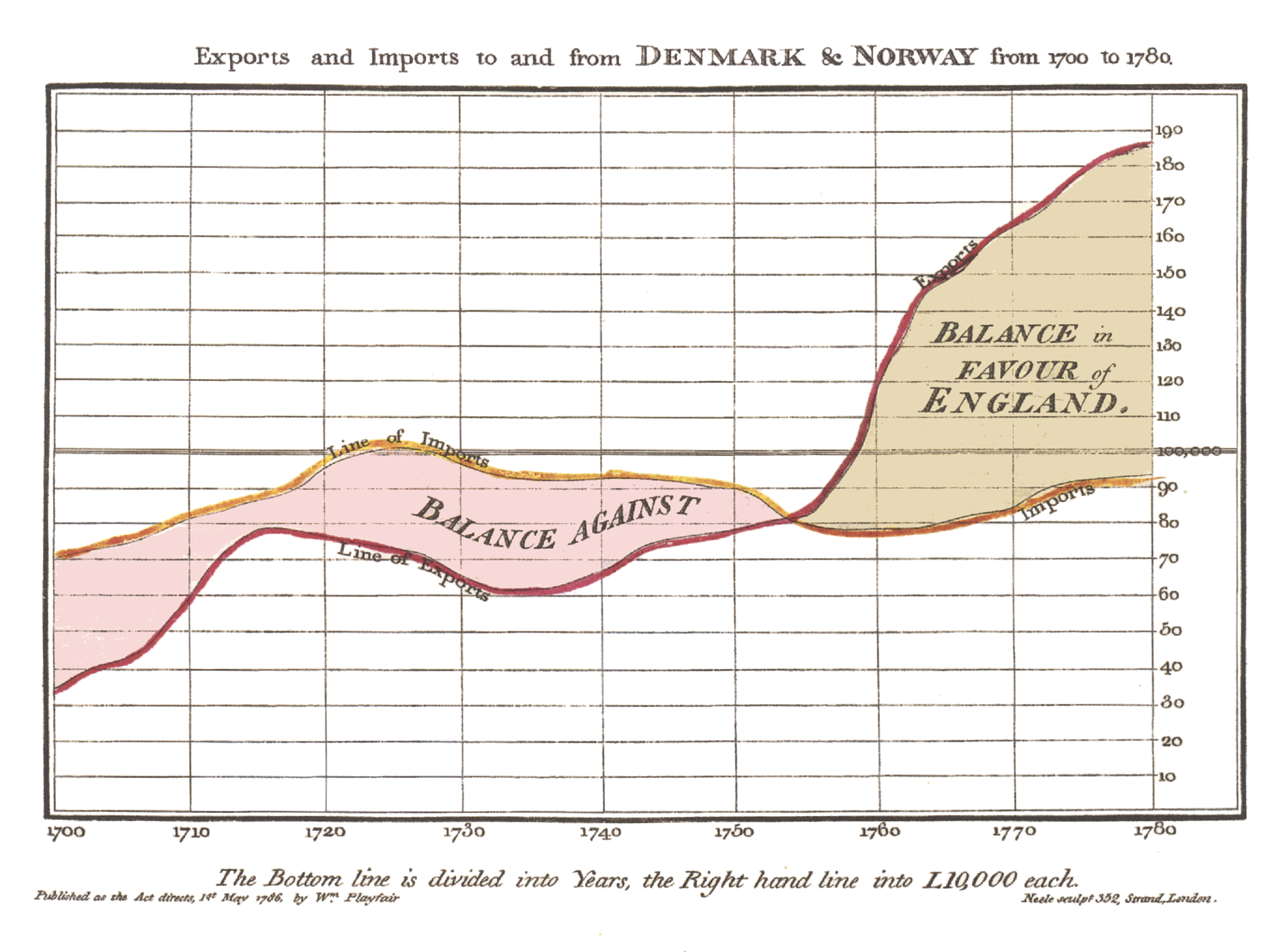