This is a guest post from, Marc Gedansky, a well-known sales and marketing consultant in the Business Intelligence space. Marc writes and speaks frequently on a variety of issues that influence technology providers and users, and is based in Cambridge, MA. I am fortunate to know Marc as Business Intelligence and Data Visualization expert and as my friend for many years.
Recently I noticed that internet (thanks to big data waves and to easy to use Data Visualization tools) is polluted with a lot of useless Dashboards and I spoke with Marc about this topic. Turned out he has a a very good explanation for it and he was kind enough to share his opinion on this blog as a guest blogger.
__________________________________
Dashboards – why are so many useless?
“Perfection is achieved, not when there is nothing more to add, but when there is nothing left to take away.” – Antoine de Saint-Exupery
Most dashboards are designed with no clue as to the meaning and/or importance of this quote.
(BTW, even though this is a blog about data visualization, I (M.G.) won’t show any poorly designed dashboard examples, as they are ubiquitous. Trying to find them is about as difficult as trying to find leaves

on the ground in New England during the Fall).
I view dashboards every day; on software company sites, news sites, financial sites, and blogs. Since dashboards can distill so much information and display it in such a small space, they hold the potential of quickly delivering valuable insights; of cutting through the “data clutter” to immediately reveal important trends or truths.
So why then, are most dashboards crammed with so many charts, dials, and graphs that they overwhelm you? Just because you can fit a half-dozen on a screen, why is there a need to do it? (This approach reminds me of my friend Geoff, who, upon hearing that Hellmann’s was coming out with mayonnaise that had half the calories remarked, “great, now I can eat twice as much”.)
I think there can only be two reasons.
1. The designer/developer wants to show off their expertise with Qlikview, or Spotfire, or Tableau, or X product.
2. The designer/developer does not care about the average person, and wants to build smart software for brilliant users.
That attitude reminds me of a meeting I attended at a software company a few years ago. The head of development was upset because he was being asked to make his software “easy to use”. He called it “dumbing down”, and complained that it would be less challenging for his development team to build “software for idiots”. At this point, the President of the company interjected, “if our customers are smart enough to write us a check, then they are smart enough to use our software. And the onus for them to be able to use our software is on us, not on them.”
Want an example of “dumbed down” software. Remember Alta Vista?
I am sure they employed tons of bright people. I can only imagine the passionate debates over what the screen should look like. And, whoever the “winners” were, they could tell their friends to go to the Alta Vista link and brag to them that it was their design ideas that were used. They were responsible for the brilliant idea to place the “Directory” where it is, or to use the words “Useful Tools” instead of just “Tools”. Images below I took from web archive of October 1999, using “The Wayback Machine” (http://www.archive.org/web/web.php) :

And then along came this simply idiotic search engine. Boy, did the AltaVista folks get a good laugh at the simpletons who designed this! Talk about “dumbed down”!

By the way, what’s a share of AltaVista stock going for these days?
OK, some of you will say I am being unfair here, because I have the advantage of being able to look back at who won the search engine “war”. To those of you who say/think that, I leave you with one final quote, from George Santayana, “Those who do not remember the past are condemned to repeat it”.
By The way, this is what Google has now (almost the same search box as 12 years ago! [Andrei Pandre: And by the way it is patented, see it here: http://mashable.com/2009/09/02/google-search-patent/):

and current AltaVista Search box came much closer to Google, but still has extra details:


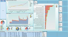
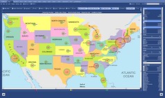

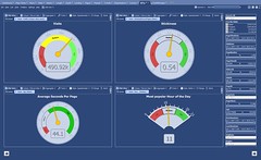
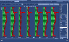
September 20, 2011 at 9:59 am
[…] Proliferation of Useless Dashboards […]
September 28, 2011 at 12:12 am
There’s another reason for this phenomenon:
3. The designer/developer doesn’t know any better.
July 19, 2012 at 9:21 am
Alta Vista’s design was really not all that bad. It was a great search engine, easy to use. If you wanted to find something on the web, AV was the place to go. It would bring back data no other engine would find–and relevant data, too. They may have lost to Google for other reasons. Google can go too far in their minimalist approach. At times they leave off cues that a user expects, which makes their product harder, not easier to use. Nonetheless, I am a big fan of Google.
Agree with Jon regarding designer/developer not knowing any better. Designing dashboards requires an analytical and artistic mind. Not everyone has those combinations.